As someone who’s always been a bit of a design enthusiast, I have to admit – I used to be terrified of color. The thought of straying too far from my beloved neutrals filled me with a sense of unease. But recently, I’ve had a bit of an awakening. It all started when I stumbled upon the most delightful Instagram post from the team at Highland Homes.
They had transformed a plain bathroom with the most unexpected pops of color, and I was instantly smitten. From there, I dove headfirst into a rabbit hole of design inspiration, uncovering all sorts of clever ways to infuse color into even the most neutral of spaces. And let me tell you, my friends at Sofa Spectacular are about to be in for a real treat.
Embracing the Power of Unexpected Color
You know the typical go-to’s for adding color, right? The accent wall, the dramatic stripe, the contrasting throw pillows. But as much as I love those classic moves, I have to admit – they can start to feel a little, well, predictable. That’s why I’m so excited to share some truly innovative ways to liven up your space with unexpected pops of color.
Interior Doors: A Sneaky Splash of Hue
Let’s start with something that’s often overlooked: the humble interior door. Sure, everyone’s painting their front door these days, but what about the ones inside your home? Painting a pocket door, for example, is such a fun and sneaky way to add a splash of color. When the door is closed, the color is hidden, but the moment you slide it open, BOOM – instant perk-up for the room.
And you don’t even have to go all-out and paint the entire door. Try just painting the edge for a subtle, peekaboo effect. It’s a simple trick that can make a big impact, and it’s the perfect way to dip your toes into the world of colorful accents.
The Forgotten Fifth Wall: Ceilings and Floors
Now, let’s talk about the oft-neglected “fifth wall” – the ceiling. I know, I know, painting a ceiling can feel like a bit of a commitment. But hear me out. A boldly colored ceiling can add so much depth and dimension to a space, instantly elevating the whole room. And the best part? It’s an unexpected touch that catches the eye in all the right ways.
But the ceiling isn’t the only forgotten fifth wall worth considering. What about the floor? Yep, that’s right – painting the floor can be a game-changer. Whether it’s a vibrant pattern or a solid hue, a pop of color underfoot can instantly transform the entire feel of a space.
Baseboards: The Unsung Heroes of Color
And let’s not forget about those unsung heroes of the design world – the baseboards. We’re so used to seeing them in classic white, but what if we flipped the script? Painting your baseboards in a contrasting color can create a stunning visual effect, drawing the eye up and around the room in a way that’s anything but predictable.
Imagine a room with crisp white walls and rich, ebony baseboards. Or how about a space with soft gray walls and cheerful, sunshine-y yellow baseboards? The possibilities are endless, and the impact can be truly transformative.
Bathroom Cabinets: A Blank Canvas for Color
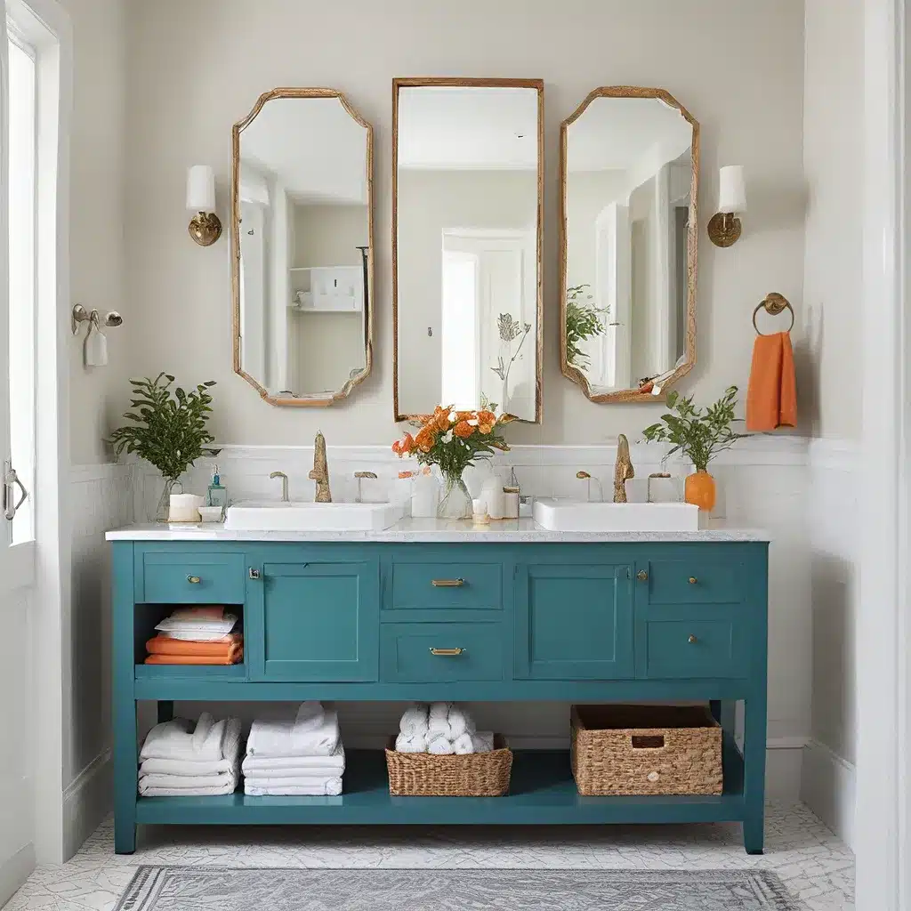
Now, let’s talk about one of my favorite unexpected places to play with color: the bathroom. Sure, we’re all used to seeing those classic white or beige vanities, but why not mix things up a bit? Bathroom cabinets are the perfect blank canvas for a pop of personality.
As the team at Quality Bath so eloquently puts it, “When it comes to designing a bathroom, functionality is key, but that doesn’t mean the aesthetic has to fall to the wayside.” Preach it, my friends!
Unexpected Cabinet Colors for the Win
So what are some of the best bathroom cabinet color options to consider? Well, the sky’s the limit, really. Classic navy, like the stunning example from ATX Interior Design, is a timeless choice that can instantly elevate a space. Or how about a deep ruby red, as seen in this Canadian home from Ashley Montgomery Design? Talk about a bold and beautiful statement.
For those who love a more neutral vibe, warm white cabinets with black accents and metal hardware, as showcased by Becca Interiors, can be equally stunning. And let’s not forget about soothing shades of blue and green, which can infuse a sense of tranquility into your bathroom oasis.
The Beauty of Unexpected Color Combinations
But the real magic happens when you start mixing and matching unexpected color combinations. Take, for example, the olive green cabinets paired with a neutral space from Brophy Interiors. Or the periwinkle cabinetry combined with creamy beige walls and floral wallpaper in this stunning bathroom from Interior Impressions.
And let’s not forget about the British design prowess on display in this London pied-à-terre from Studio Peake, where shades of blue, orange, and moss come together in perfect harmony.
Bringing It All Together: Creating a Cohesive Palette
Now, I know what you might be thinking: “But what if I’m not a ‘color person’? How do I make sure these unexpected pops of hue don’t make my space feel, well, a little too ‘out there’?” Fear not, my friends, I’ve got you covered.
The key is to create a cohesive color palette that ties everything together. Start by identifying a few core colors that you’re drawn to, and then build out from there. Maybe it’s a soothing blue-green like the one used in this bathroom from Brophy Interiors, or a warm, earthy mix of teal, white, and black à la Kendall Wilkinson Design.
Once you’ve established your foundation colors, you can start to layer in pops of unexpected hues – whether it’s a bold yellow or a moody indigo – in a way that feels intentional and cohesive. The key is to strike the right balance, ensuring that your space feels vibrant and energetic without veering into the realm of overwhelming.
Embracing the Unexpected: A Journey of Self-Discovery
And you know what the best part is? This whole process of embracing unexpected pops of color is really a journey of self-discovery. It’s about pushing the boundaries of your comfort zone, and in the process, uncovering a whole new side of your design aesthetic.
So, my friends at Sofa Spectacular, I encourage you to take a walk on the wild side. Experiment with bold hues and unexpected combinations. Surprise and delight your senses with pops of color in the most unexpected places. Who knows, you might just discover a whole new side of your design personality in the process.
