Discovering the Power of Color
Ah, color – the unsung hero of interior design. You know, I used to think color was just, well, color. A simple aesthetic choice to make a space look nice. But the more I’ve learned about the psychology of color, the more I’ve realized it’s so much more than that. It has the power to evoke emotions, set a mood, and completely transform the entire feel of a room.
As the founder of Sofa Spectacular, a custom sofa company in the UK, I’ve seen firsthand how color can make or break a space. That’s why I’m on a mission to educate everyone I can about the unexpected color combinations that can create truly dramatic decor impact.
The Emotive Power of Color
You know that old saying, “a picture is worth a thousand words”? Well, I’d argue that color is worth even more. As filmmaker Noam Kroll explains, color has an incredible ability to influence the way we feel. Warm tones like oranges and reds evoke feelings of comfort and coziness, while cool blues and greens can create a sense of calmness and serenity.
It’s not just about the temperature of the color, either. The intensity and saturation also play a huge role. Vibrant, saturated hues tend to energize and excite, while muted, desaturated shades have a more subdued, melancholic feel. And don’t even get me started on the psychological impact of complementary color pairings – that’s where the real magic happens.
Complementary Color Combos: Opposites Attract
When it comes to creating a dramatic color scheme, complementary colors are where it’s at. These are the hues that sit directly opposite each other on the color wheel, like red and green, blue and orange, or yellow and purple. As Canva’s color experts explain, the contrast between these opposites creates an inherent tension and visual interest that’s simply captivating.
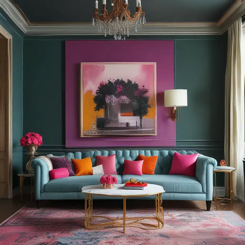
But here’s the twist – you don’t have to go all-in on the complementary vibe to make a statement. In fact, I find that the most impactful color combos often involve just a hint of complementary action, balanced with more harmonious shades. Think a bold, saturated blue sofa paired with accents of warm terracotta and mustard yellow. Or how about a moody charcoal sectional grounded by pops of vibrant tangerine and deep plum?
The key is to find that perfect balance between contrast and cohesion. Too much complementary action and the space can feel chaotic and overwhelming. But too little, and you miss out on that delicious visual drama altogether. It’s all about experimenting, playing with proportions, and trusting your gut.
Unexpected Color Pairings for Dramatic Effect
Now, I know what you’re thinking – “But Noam, won’t bold color combos just make my space look like a circus?” Not necessarily! Some of the most unexpectedly stunning palettes come from colors you’d never think to pair together.
Take, for example, the combination of dusty rose and deep forest green. On paper, it might sound like an odd couple. But when executed with intention, it creates a moody, sophisticated vibe that’s oh-so-chic. Or how about pairing a rich, jewel-toned teal with warm, earthy terracotta? The contrast is eye-catching, yet the underlying warmth keeps the look grounded and cozy.
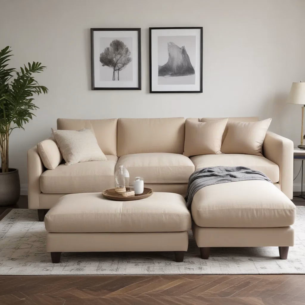
And let’s not forget about the power of monochromatic schemes with a twist. Who says all-white rooms have to be boring? Try layering in varying shades of ivory, from crisp cotton to creamy linen. Or for a more dramatic take, experiment with a moody palette of charcoal, slate, and gunmetal. The nuanced tonal differences add depth and dimension, without feeling flat or one-dimensional.
Balancing Bold and Neutral
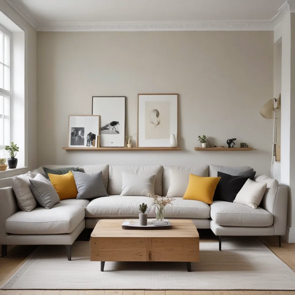
Of course, not everyone is ready to dive head-first into a sea of vibrant, saturated hues. And that’s totally okay! One of my favorite ways to dip a toe into the world of dramatic color is by pairing bold, statement-making shades with more neutral, grounding tones.
Think a rich, velvety forest green sofa anchored by warm wood tones and soft, natural textiles. Or an modern, architectural sectional in a bold, saturated blue, complemented by muted taupe and greige accents. The bold color provides the visual punch, while the neutral elements keep the look balanced and refined.
The beauty of this approach is that it allows you to experiment with color without feeling like you’re committing to a full-blown rainbow explosion. You can start small, with just a few punchy accent pieces, and gradually work your way up to more daring color combinations as you gain confidence.
Embrace the Unexpected
At the end of the day, color is all about taking risks and embracing the unexpected. It’s about tapping into your intuition, playing with proportions, and finding that perfect sweet spot between contrast and harmony. Because when you do, the results can be nothing short of magic.
So go forth, my friends, and let your color freak flag fly! Pair that emerald green velvet sofa with a punchy mustard yellow rug. Mix and match bold stripes and florals with reckless abandon. Heck, why not try an all-pink color scheme for a change? The possibilities are endless, and I promise – the rewards are oh-so-worth it.
After all, as the founder of Sofa Spectacular, I live and breathe this stuff every single day. And let me tell you, there’s nothing quite like the thrill of seeing a space transform from drab to fab, all thanks to the magic of unexpected color. So what are you waiting for? Go forth and get colorful!
