Shake Up Your Space with Bold Color Pairings
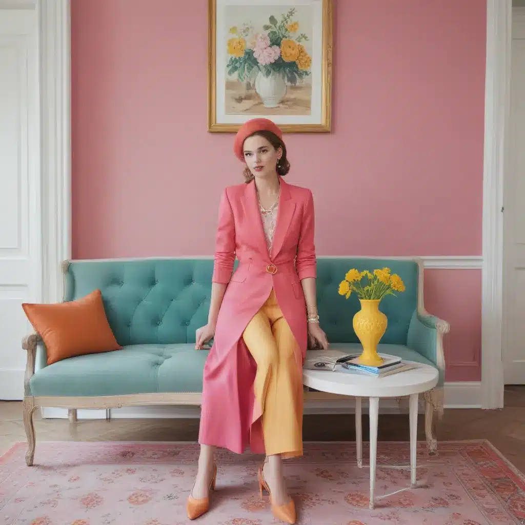
You know what they say – if it ain’t broke, don’t fix it. But what if I told you that sometimes, the most unexpected color combinations can take your space from “nice” to utterly breathtaking? As a self-proclaimed color enthusiast, I’m here to make a case for thinking outside the box when it comes to decorating.
Hear me out. Sure, classic pairings like blue and white or black and gray have their place. They’re reliable, easy on the eyes, and can create a sense of calm and cohesion. But what if we infused a little more personality into our homes? What if we embraced colors that initially seem like they’d clash, but end up complementing each other in the most delightful way?
Pinterest has long been a source of inspiration for me when it comes to unexpected color combinations. From fashion to home decor, the platform is a treasure trove of ideas that challenge the status quo. And you know what they say – if it works on your outfit, it can work in your living room, right?
Rediscover the Classic Red and Green
Let’s start with a pairing that’s often relegated to the holiday season: red and green. Now, I know what you’re thinking – “Caitlin, those are Christmas colors! Aren’t they a bit too…festive for year-round use?” Not so fast, my friend. When done right, red and green can create a cozy, inviting atmosphere that has nothing to do with Santa or sleigh bells.
Take a cue from Emily Henderson, who made a compelling case for this dynamic duo. From farmhouse-inspired spaces to full-on maximalist retreats, she’s proven that red and green can work seamlessly in a variety of design styles. The key is to play with different tones and textures – think muted, earthy hues alongside vibrant, high-energy shades.
One of my favorite examples is a room featuring a rich, Bordeaux-colored Bočan chair against a sea of lush, verdant furnishings. The contrast is striking, but the warm wood accents and ornate detailing help tie the whole look together. It’s a masterclass in making a bold statement without going overboard.
Embrace the Eclectic
But red and green aren’t the only unexpected color combo that can breathe new life into your space. What about pairing olive green with coral? Or blending kelly green and terra-cotta? The possibilities are endless, and the results can be nothing short of showstopping.
Take, for instance, the room with the hand-painted mural and candy apple red cabinetry. The kelly green accents, from the pendant light to the tray of roses, keep the space from feeling too heavy or moody. It’s a balance of old and new, classic and contemporary – and it works so wonderfully well.
And then there’s the office setup that manages to seamlessly blend blue, yellow, and green. The chalkboard-colored walls provide a neutral backdrop, allowing the vibrant upholstery and pops of color to truly shine. It’s a masterclass in eclectic design, proving that pretty really does look good next to pretty.
Go All-In with Commitment
Of course, if you’re feeling bold, you can always take your color exploration to the next level. Case in point: the two kitchens that embrace red and green with gusto. One features rich, jewel-toned cabinetry and a playful, 90s-inspired vibe, while the other boasts a more modern, streamlined aesthetic. Both, however, are united by their unabashed love of this dynamic color pairing.
And let’s not forget the office that takes the red and green theme to new heights. From the coffee table under the desk to the plant-filled light fixture, every corner of this space is a testament to the power of unexpected color. It’s a room that refuses to play it safe, and the result is nothing short of mesmerizing.
Wallpaper Wonderland
But perhaps my favorite way to incorporate bold color combinations is through the use of wallpaper. Whether it’s the striking striped pattern in the bathroom or the eclectic, maximalist moment in the entryway, wallpaper has a way of transforming a space and infusing it with personality.
Take, for example, the room with the green-trimmed fireplace and oak-patterned wallpaper. The muted, earthy tones create a sense of warmth and coziness, while the juxtaposition of the classic and contemporary elements keeps the space feeling fresh and modern.
And then there’s the hotel suite that takes the red and green theme to new heights. From the striped headboard to the terra-cotta-colored lamps, every detail in this space feels considered and intentional. It’s a masterclass in creating a cohesive, yet visually interesting, environment.
Dare to Be Different
At the end of the day, the key to making unexpected color combinations work is to embrace your personal style and have fun with it. Don’t be afraid to take risks, experiment, and push the boundaries of what you think “goes together.” Because let’s be real – when has playing it safe ever resulted in a truly memorable, awe-inspiring space?
So, what are you waiting for? Head over to Sofa Spectacular and start exploring the endless possibilities of color. Who knows – maybe that bold, unexpected pairing is the key to taking your living room from “nice” to, well, Sofa Spectacular.


