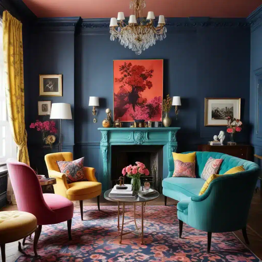
The Art of Unexpected Pairings
As a furniture specialist, I’ve seen countless trends come and go. But there’s something truly special about the current wave of eccentric chic that’s sweeping through interior design. It’s all about embracing the unexpected, and nowhere is this more evident than in the world of color combinations. Gone are the days when we played it safe with neutral palettes and tried-and-true color schemes. Today, it’s all about pushing boundaries and creating spaces that are as unique as the individuals who inhabit them.
I remember walking into a client’s home recently and being absolutely blown away by their living room. The walls were a deep, rich purple, paired with a mustard yellow sofa that shouldn’t have worked but somehow did. The effect was striking, sophisticated, and undeniably chic. It got me thinking about how we can all be a little bolder in our color choices, especially when it comes to our sofas and the spaces around them.
Let’s face it, sofas are often the centerpiece of our living spaces. They’re where we relax, entertain, and spend a good portion of our time at home. So why not make them a true reflection of our personality? By experimenting with quirky color combos, we can create living spaces that are not just comfortable, but conversation starters in their own right.
Bold Blues and Zesty Oranges: A Match Made in Design Heaven
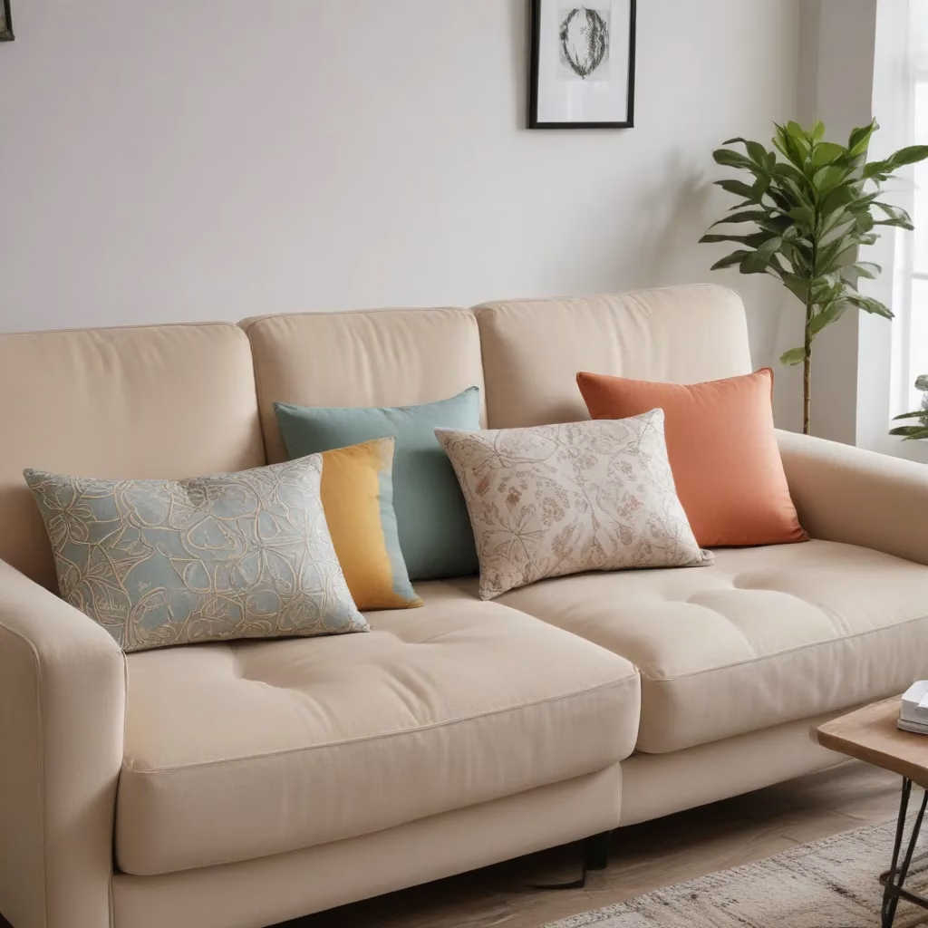
One of my favorite quirky color combinations that I’ve been recommending to clients lately is the pairing of bold blues with zesty oranges. At first glance, you might think these colors are too vibrant to work together, but trust me, the results can be stunning.
Picture this: a deep, navy blue sofa adorned with bright orange throw pillows. The contrast is striking, yet there’s a harmony to it that’s hard to explain. The coolness of the blue is perfectly balanced by the warmth of the orange, creating a dynamic that’s both energizing and soothing at the same time.
I recently helped a client select a teal blue velvet sofa for their sunroom. We paired it with burnt orange curtains and accessories, and the effect was nothing short of magical. The room felt alive, vibrant, and incredibly inviting. It’s a combination that works particularly well in spaces that get a lot of natural light, as the sunlight plays off the colors in the most beautiful way.
Passionate Purples and Lively Limes: An Unexpected Delight
Another quirky combo that’s been gaining traction is the pairing of passionate purples with lively limes. Now, I know what you’re thinking – purple and green? Really? But hear me out. When done right, this combination can create a space that’s both regal and refreshing.
I’ve found that the key to making this work is to choose the right shades. A deep, aubergine purple paired with a bright, apple green can create a look that’s both sophisticated and playful. I recently worked on a project where we used a plush, purple velvet sofa as the focal point of the room. We accented it with lime green throw pillows and a matching armchair. The result was a space that felt both luxurious and lively.
This combination works particularly well in spaces that need a bit of energy. I’ve used it in home offices and creative spaces to great effect. The purple brings a sense of calm and focus, while the lime adds a burst of creativity and inspiration.
Ravishing Reds and Mellow Yellows: A Bold Statement
Now, let’s talk about a combination that’s not for the faint of heart: ravishing reds and mellow yellows. This is a pairing that can really make a statement, and it’s perfect for those who want their living space to reflect their bold personality.
I recently worked with a client who wanted to create a truly unique living room. We started with a bright red leather sofa – a bold choice in itself. But instead of playing it safe with neutral accents, we decided to go all out and pair it with mellow yellow walls and accessories. The result was a room that felt warm, inviting, and full of energy.
The key to making this combination work is to balance the intensity of the red with softer, more muted yellows. Think butter yellow or pale gold rather than bright, sunny shades. This creates a harmonious look that’s bold without being overwhelming.
Gorgeous Greens and Pretty Pinks: A Fresh Take on Femininity
For those who love a touch of femininity in their decor but want to avoid the typical pastels, I’ve been recommending the combination of gorgeous greens and pretty pinks. This pairing offers a fresh take on feminine decor that’s both sophisticated and unexpected.
I recently helped a client redecorate their bedroom, and we chose a forest green velvet headboard as our starting point. We paired this with blush pink walls and accessories, creating a space that felt both cozy and refreshing. The deep green brought a sense of nature and calm to the room, while the pink added a soft, romantic touch.
This combination works wonderfully in bedrooms, but I’ve also used it to great effect in living rooms and dining areas. A sage green sofa paired with dusty pink curtains and throw pillows can create a living space that’s both elegant and inviting.
Tantalizing Teals and Sunny Saffrons: A Coastal-Inspired Quirk
If you’re looking for a color combination that brings a bit of coastal chic to your space, consider pairing tantalizing teals with sunny saffrons. This unexpected combo brings together the calming blues of the ocean with the warmth of the sun, creating a space that feels both relaxing and invigorating.
I recently worked on a beach house project where we used this color scheme to great effect. We started with a teal blue sofa as the centerpiece of the living room. Instead of going with the expected whites and beiges for accents, we decided to spice things up with saffron yellow throw pillows and a matching area rug. The result was a space that felt fresh, modern, and unmistakably beachy without falling into cliché coastal decor tropes.
This color combination works particularly well in spaces with lots of natural light. The teal brings a sense of calm and serenity, while the saffron adds warmth and energy. It’s a perfect balance for a space where you want to both relax and feel invigorated.
Moody Mauves and Electric Indigos: A Sophisticated Edge
For those who prefer a more sophisticated, edgy look, I’ve been recommending the combination of moody mauves and electric indigos. This pairing brings together the softness of mauve with the intensity of indigo, creating a look that’s both dramatic and refined.
I recently helped a client redesign their home office, and we used this color scheme to create a space that was both professional and inspiring. We started with mauve walls as a soft, neutral base. Then, we added an electric indigo sofa as a bold focal point. We tied the look together with accessories in both colors, creating a cohesive space that felt both calming and energizing.
This combination works particularly well in spaces where you want to create a sense of drama without going too dark. The mauve provides a soft, warm backdrop, while the indigo adds depth and intensity. It’s a perfect balance for spaces where you need to focus and feel inspired.
Charming Corals and Cool Cobalts: A Tropical Twist
If you’re looking to bring a bit of tropical flair to your space, consider pairing charming corals with cool cobalts. This unexpected combination brings together the warmth of coral with the depth of cobalt, creating a look that’s both vibrant and sophisticated.
I recently worked on a sunroom project where we used this color scheme to create a space that felt like a tropical getaway. We started with a coral sofa as the centerpiece of the room. Then, we added cobalt blue curtains and accessories to create contrast and depth. The result was a space that felt bright, cheerful, and unmistakably tropical without resorting to cliché palm tree prints or beach-themed decor.
This color combination works particularly well in spaces where you want to create a sense of warmth and energy. The coral brings a feeling of warmth and comfort, while the cobalt adds a refreshing coolness. It’s a perfect balance for a space where you want to both relax and feel invigorated.
Playful Patterns: Taking Quirky Combos to the Next Level
Now that we’ve explored some unexpected color pairings, let’s talk about how to take these quirky combos to the next level with playful patterns. Mixing patterns can be intimidating, but when done right, it can add depth, interest, and personality to your space.
I recently worked with a client who wanted to create a truly unique living room. We started with a navy blue sofa with a subtle geometric pattern. Instead of playing it safe with solid-colored accessories, we decided to mix in floral prints in shades of orange and yellow. The result was a room that felt eclectic, sophisticated, and full of personality.
The key to mixing patterns successfully is to vary the scale. Pair large-scale patterns with smaller, more intricate ones. This creates visual interest without overwhelming the space. Also, try to stick to a consistent color palette across your patterns. This helps tie the look together and prevents it from feeling chaotic.
Texture Play: Adding Depth to Your Quirky Color Scheme
When working with bold, quirky color combinations, texture becomes even more important. It adds depth and interest to your space, preventing the colors from feeling flat or overwhelming.
In a recent project, we paired a bright yellow velvet sofa with purple walls. To add depth and interest to the space, we incorporated a variety of textures. We added a chunky knit throw in a deep plum color, silk cushions in various shades of yellow and purple, and a shaggy rug that incorporated both colors. The result was a space that felt rich, layered, and incredibly inviting.
Don’t be afraid to mix different textures within your color scheme. Smooth silks, plush velvets, rough linens, and nubby wools can all work together to create a space that’s as interesting to touch as it is to look at.
Bringing It All Together: Creating a Cohesive Space with Quirky Colors
While we’ve been focusing on bold, unexpected color combinations, it’s important to remember that the goal is to create a cohesive, livable space. Here are a few tips I always share with my clients when we’re working with quirky color schemes:
-
Use neutral accents: Incorporate some neutral elements to give the eye a place to rest. This could be through wood furniture, white trim, or a neutral-colored rug.
-
Repeat colors throughout the space: If you’re using a bold color on your sofa, repeat that color in smaller doses throughout the room. This could be through artwork, cushions, or small accessories.
-
Consider the flow of your home: While it’s fun to have different color schemes in different rooms, think about how the colors will look as you move from one space to another. You want there to be a sense of flow and connection.
-
Don’t forget about lighting: The way your quirky color combo looks can change dramatically depending on the lighting. Always test your colors in different light conditions before committing.
-
Trust your instincts: At the end of the day, your home should reflect your personality. If a color combination speaks to you, go for it!
Remember, the beauty of interior design is that there are no hard and fast rules. What matters most is that you create a space that you love and that feels like home. So go ahead, embrace those quirky color combos, and let your personality shine through in your decor!
For more inspiration and expert advice on creating your perfect living space, visit Sofa Spectacular. We’re always here to help you bring your unique vision to life.
