Ah, the age-old dilemma of designing a living space that’s both visually appealing and uniquely you. As a custom sofa company in the UK, we know all too well the challenges our customers face when trying to curate the perfect color palette for their homes. But fear not, my friends, for today I’m here to guide you on an exciting journey – one that will have you stepping outside the boring beige box and embracing the unexpected.
Opposites Attract: The Beauty of Complementary Colors
When it comes to color combinations, we often find ourselves gravitating towards the safe and familiar. Blues and whites, greens and neutrals, the usual suspects. But what if I told you that some of the most stunning palettes are born when we dare to mix things up? Complementary colors, those hues that sit directly opposite each other on the color wheel, can create a truly dynamic and captivating look.
Take, for instance, the striking pairing of a soft, soothing mid-blue with a bright, energetic tangerine. As Simon Temprell, interior design lead at Neptune, explains, “It works because it contrasts the cool blues on one side of the wheel with the warm oranges on the other.” The result? A balanced and harmonious space that’s anything but ordinary.
But the magic doesn’t stop there. Venture beyond the typical navy and bright orange and explore the world of ice blue and rust, or burgundy and sunny yellow. These unexpected combinations can inject a sense of whimsy and personality into any room, transforming even the most staid of spaces into something truly special.
Embracing the Earthy: The Allure of Brown and Green
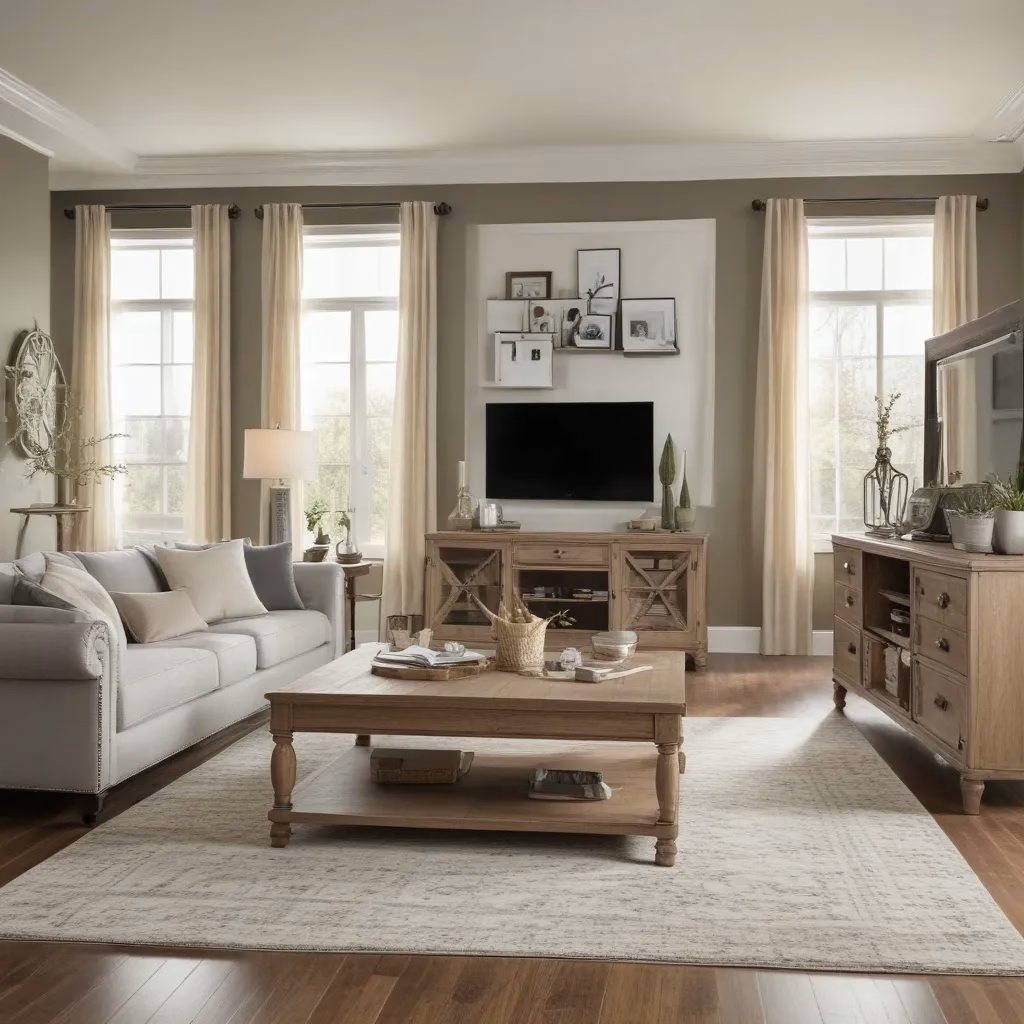
Now, I know what you’re thinking: “Brown and green? Isn’t that just a bit… muddy?” Well, my friend, prepare to have your mind changed. As Patrick O’Donnell, international brand ambassador at Farrow & Ball, so eloquently puts it, “Greens always exude calm, an essential state of mind for our busy lives.” And when you pair those soothing hues with the warmth and grounding presence of brown, magic happens.
Whether you opt for a muted palette of soft sage and warm chocolate, or a bolder combination of vibrant lime and deep, chocolatey browns, the result is a space that feels authentically connected to the natural world. It’s a color scheme that’s as versatile as it is inviting, seamlessly blending into a wide range of design styles – from rustic and organic to modern and classic.
So, the next time you find yourself drawn to the earthy tones of the great outdoors, don’t be afraid to bring them indoors. After all, what better way to create a serene and grounded oasis in the midst of our hectic lives?
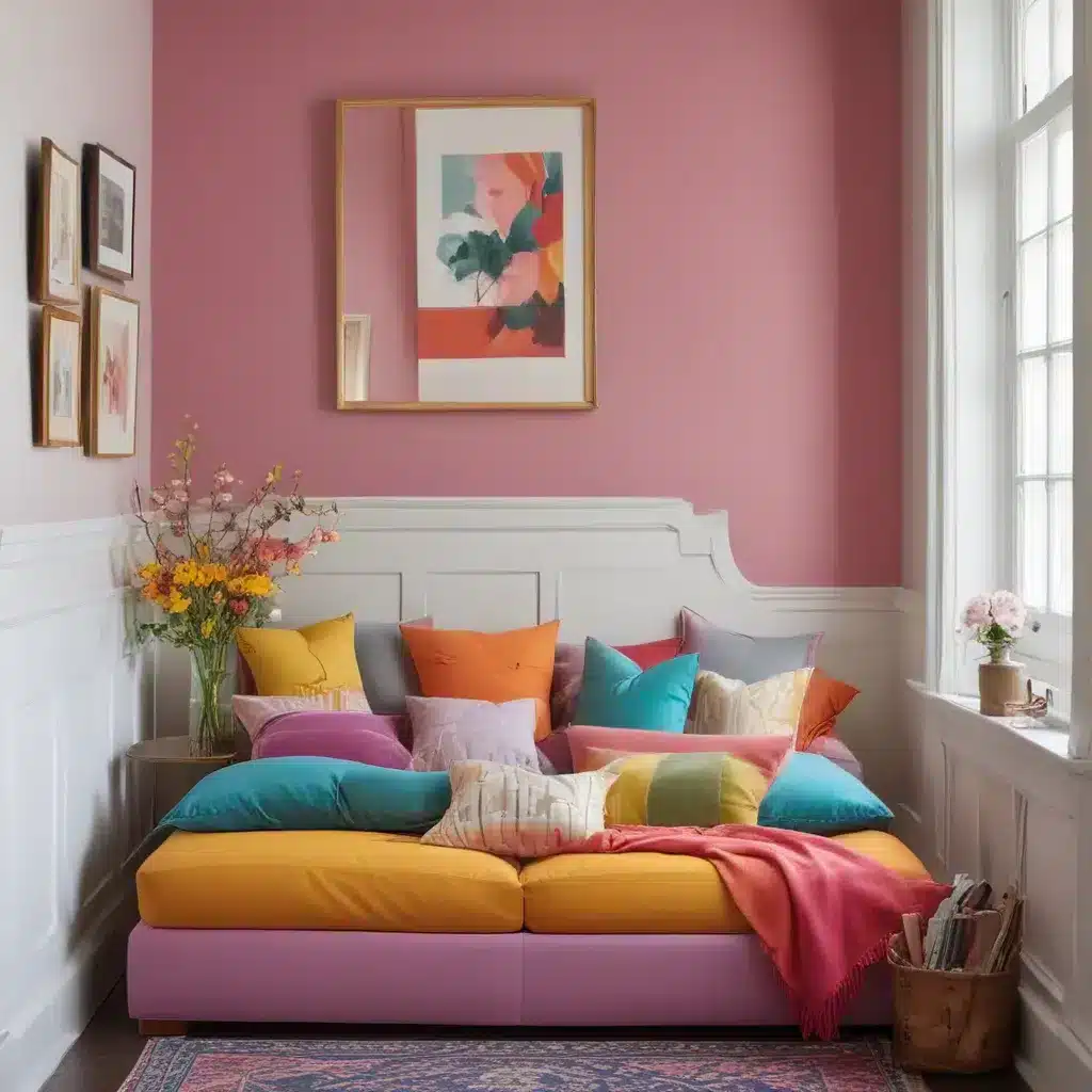
Perennial Pairings: Embracing Pink and Green
Now, I know what you’re thinking: “Pink and green? Isn’t that a bit… juvenile?” Well, my friend, prepare to have your mind changed. As Bethany Adams, a designer with a knack for unexpected pairings, explains, “The combination of pink and green might evoke thoughts of springtime and floral motifs, but this vibrant pairing can bring a playful yet sophisticated charm to any space.”
The key, of course, lies in the specific shades and textures you choose. Soft, muted pinks paired with fresh, leafy greens can create a whimsical and romantic aesthetic, while bold fuchsias and vivid lime hues can lend a more energetic and modern feel. And don’t be afraid to experiment – Bethany suggests exploring everything from pistachio and dark pinks to burgundy reds and dusky pinks to find the perfect balance for your personal style and space.
So, whether you’re drawn to the soft and feminine or the bold and daring, don’t be afraid to let your pink and green freak flag fly. After all, at Sofa Spectacular, we believe that the most beautiful homes are the ones that celebrate the unexpected.
The Drama of Red and Green
Now, I know what you’re thinking: “Red and green? Isn’t that a bit… Christmassy?” Well, my friend, prepare to have your mind changed. As Ruth Mottershead, creative director at Little Greene, explains, “Bold color combinations like red and green can create a sense of drama and excitement in a room, making it feel alive and energetic.”
But the key to pulling off this unexpected pairing is all in the execution. Instead of reaching for the traditional holly-and-mistletoe vibe, consider more muted iterations like a mossy green or a mid-green-blue tone, paired with rich, wine reds or an orange-based terracotta. The result is a space that’s bold, vibrant, and anything but ordinary.
And don’t be afraid to get creative with how you incorporate these colors. Ruth suggests introducing them in smaller ways, like painting the woodwork and skirting, or adding a bold, painted line as a design detail. Or, for a truly layered and considered look, embrace a mix of shades, like the deep, evocative Cape Red from Little Greene paired with the jewel-toned Mid Azure Green.
So, the next time you find yourself drawn to the drama of red and green, remember: it’s not just for Christmas. With the right approach, these bold hues can breathe new life into your living space, creating a look that’s as unique as you are.
Conclusion: Embrace the Unexpected
At the end of the day, the secret to creating a truly captivating and personal living space lies in your willingness to step outside the box. Whether you’re drawn to the striking contrast of complementary colors, the soothing harmony of earthy tones, or the vibrant energy of unexpected pairings, the key is to let your creativity shine.
So, take a deep breath, grab a color wheel, and get ready to embark on a design adventure like no other. Because at Sofa Spectacular, we firmly believe that the most beautiful homes are the ones that celebrate the unexpected. So, what are you waiting for? It’s time to step outside the box and let your true colors shine.
