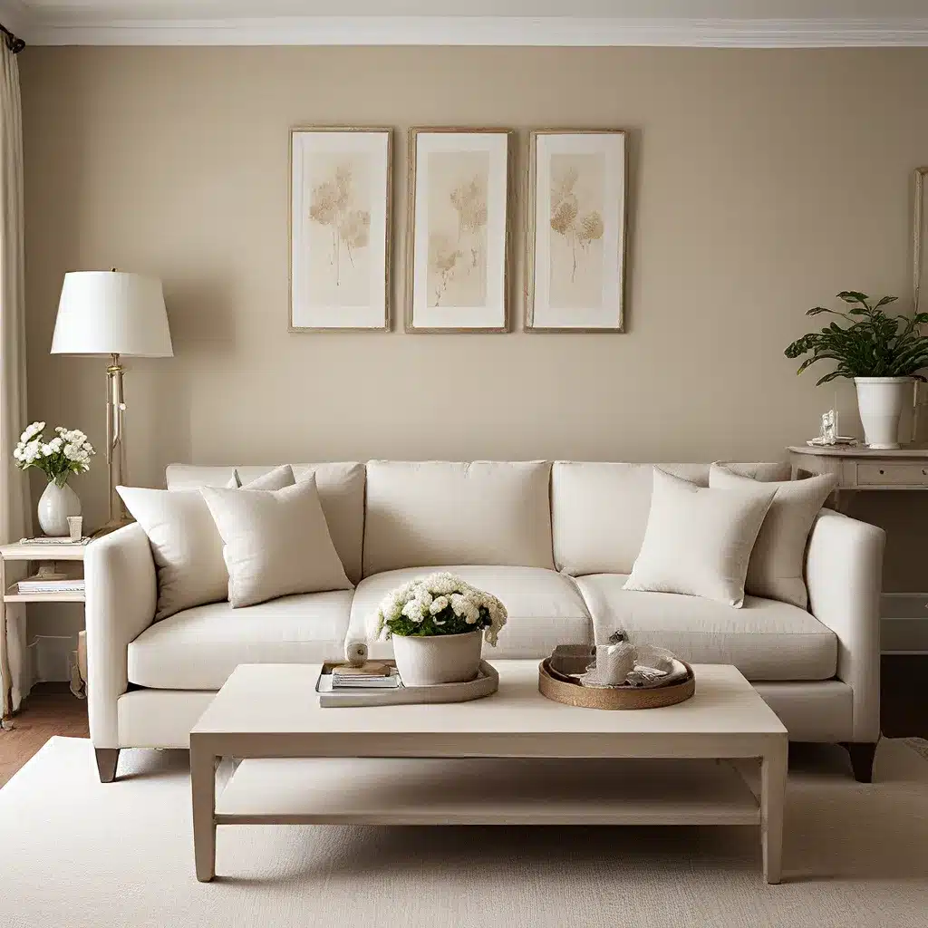
As an avid follower of design trends, I’ve always been intrigued by the ebb and flow of color preferences in the world of home decor. And let me tell you, one neutral that’s been making waves lately is the ever-elusive taupe. Now, I know what you’re thinking – taupe? Isn’t that just a fancy word for beige? Well, my friends, let me assure you that there’s so much more to this versatile hue than meets the eye.
Defining the Elusive Taupe
First things first, let’s get our terminology straight. According to design guru Maria Killam, taupe is the neutral category that sits between violet gray and pink beige on the color wheel. It has those alluring violet or pink undertones, but with a lower yellow component than its pinker cousin, pink beige. And let’s not forget the green-toned neutrals that are sometimes also referred to as taupe – those are a whole different beast, with their own unique characteristics.
Now, the reason taupe has been so popular lately is that it offers a warmer alternative to the ever-present gray trend. It’s a happy medium between the coolness of gray and the earthy warmth of beige, making it a go-to choice for those looking to inject a little more coziness into their spaces. But as with any neutral, there are pros and cons to consider when incorporating taupe into your decor.
The Highs and Lows of Taupe
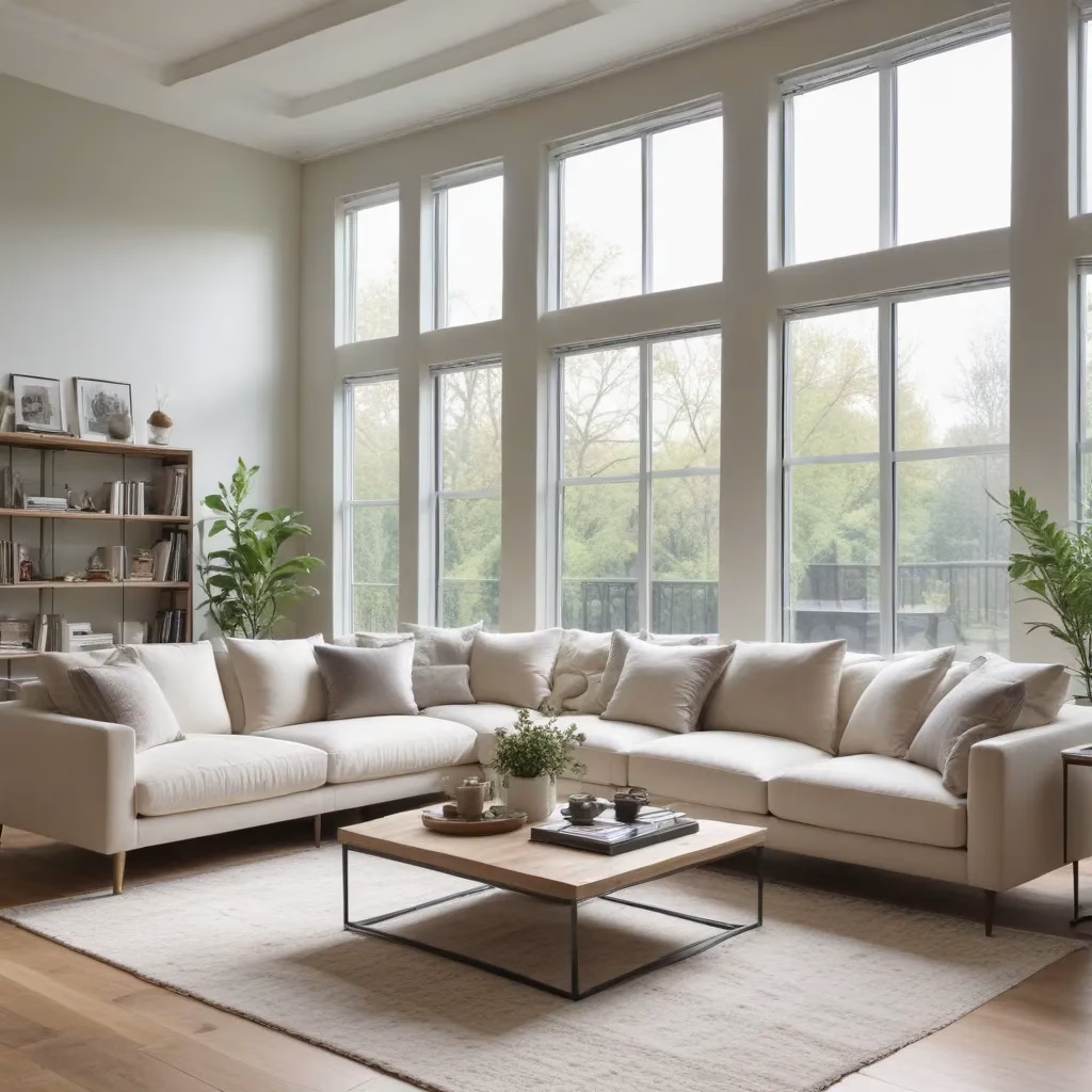
On the plus side, taupe can be an incredibly sophisticated and versatile choice. Its subtle blend of undertones means it can play nicely with a wide range of accent colors, from calming blues and greens to vibrant pinks and oranges. And let’s not forget the timeless appeal of pairing taupe with creamy whites and natural wood tones – a recipe for that effortless, elevated look we all crave.
However, the very qualities that make taupe appealing can also be its downfall. You see, those warm undertones can sometimes come across as a bit “dirtier” or “earthier” than their cooler gray counterparts. And if you’re not careful, a taupe-heavy space can start to feel a little one-note and monotonous.
Decorating with Taupe: Dos and Don’ts
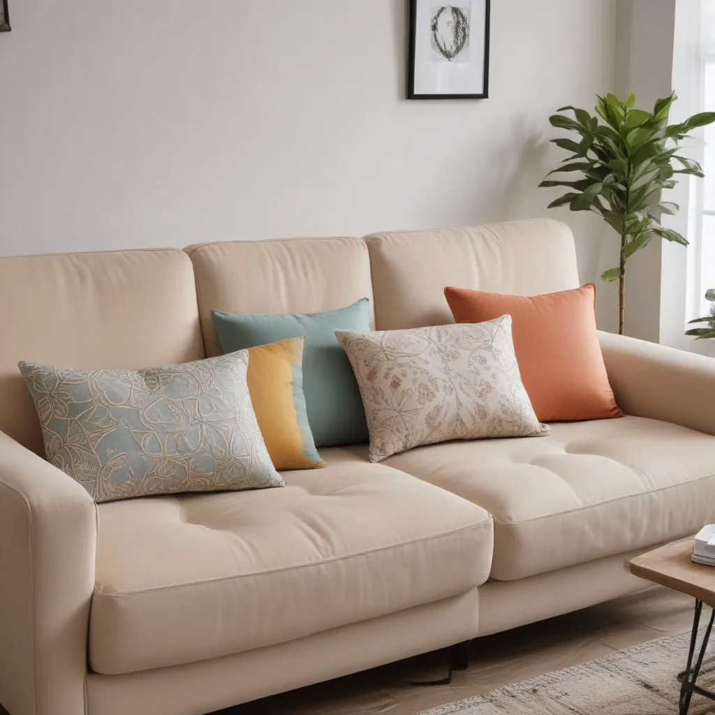
So, how does one navigate the tricky waters of taupe? Well, my friends, it all comes down to balance and contrast. When working with taupe, be sure to incorporate plenty of crisp, clean whites to keep things feeling fresh and airy. And don’t be afraid to mix in some bolder, more vibrant accents to prevent your space from falling into a taupe-y abyss.
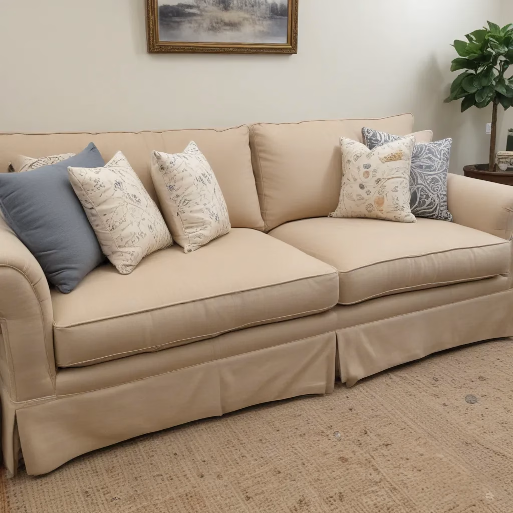
Sofa Spectacular, for example, offers a range of taupe-based sofas that can serve as the perfect jumping-off point for your neutral-inspired decor. But the key is to not let the taupe take over – pair it with pops of color, rich wood tones, and textural elements to keep things interesting.
And when it comes to those all-important hard finishes, like flooring and tile, Maria Killam warns us to tread carefully. After all, these are the elements that can really lock you into a particular color palette for the long haul. So, unless you’re absolutely certain that taupe is your forever-love, it might be wise to opt for a more timeless, neutral option – one that won’t have you itching to repaint or refinish in a few years’ time.
Embracing the Subtlety of Taupe
Now, I know what you’re thinking – if taupe is so tricky to work with, why bother? Well, my friends, that’s where the true beauty of this neutral lies. When done right, a taupe-inspired space can exude a level of sophistication and serenity that’s simply unmatched.
Think about it – those soft, muted tones create an almost meditative atmosphere, allowing your eyes to rest and your mind to wander. And with the right accents, you can infuse just the right amount of warmth and coziness into your home, without sacrificing that effortless, modern aesthetic.
So, if you’re feeling drawn to the siren call of taupe, I say go for it! Just be sure to approach it with a discerning eye and a willingness to experiment. And remember, the true magic happens when you strike the perfect balance between the taupe and its complementary hues. Trust me, once you’ve nailed that delicate equilibrium, you’ll be hard-pressed to ever go back to plain old beige.
Embracing the Evolving Nature of Design
Of course, as with any design trend, it’s important to keep in mind that taupe, like all neutrals, is subject to the ever-changing tides of fashion. What’s hot today may very well be out tomorrow, and that’s okay. The beauty of design is that it’s an ever-evolving landscape, constantly shifting and transforming to reflect the zeitgeist of the times.
So, rather than getting too attached to any one color or style, I encourage you to embrace the fluidity of the design world. Be open to experimentation, stay curious about emerging trends, and above all, trust your own intuition. After all, the true mark of a timeless space is one that reflects your unique personality and sensibilities, no matter what the design gurus may be touting.
At the end of the day, the real joy of decorating with neutrals like taupe lies in the journey of discovery. So, grab your paint swatches, dive into those design blogs, and let your creativity run wild. Who knows – you might just stumble upon the perfect taupe-inspired oasis that you never knew you needed.
