The Foundation of Pattern Mixing
When it comes to creating a visually stunning living space, the art of mixing patterns can be a game-changer. As a furniture specialist, I’ve seen firsthand how the right combination of patterns can transform a room from mundane to magnificent. But let’s be honest – it’s not always easy to get it right. How do you mix patterns without making your space look like a circus tent?
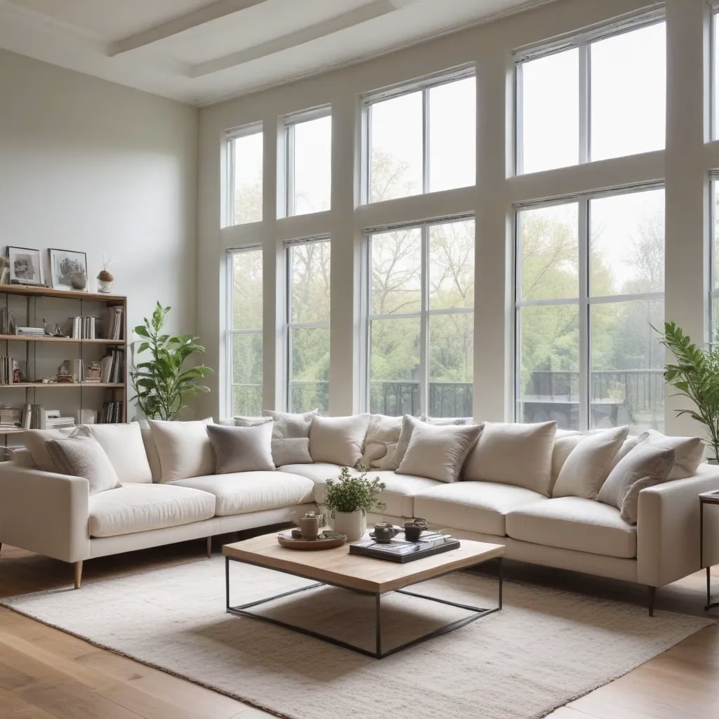
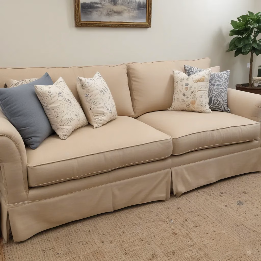
The key lies in understanding the basics. First and foremost, you need to establish a solid foundation. In my experience, starting with a neutral base is always a safe bet. Think of it as a blank canvas that allows your patterns to shine without competing for attention. I often recommend choosing a neutral-colored sofa as your anchor piece. This doesn’t mean you’re limited to beige or gray – there are plenty of sophisticated neutral options out there.
Once you have your neutral foundation, it’s time to choose your dominant pattern. This is where you can really let your personality shine through. Maybe it’s a bold floral print on your curtains or a striking geometric design on your area rug. Whatever you choose, make sure it’s something you absolutely love because it’s going to set the tone for the entire room.
Balancing Act: Scale and Color
Now that we’ve got our foundation and dominant pattern sorted, let’s talk about the balancing act of mixing patterns. One of the most common questions I get from clients is, “How do I make sure my patterns don’t clash?” The answer lies in understanding scale and color.
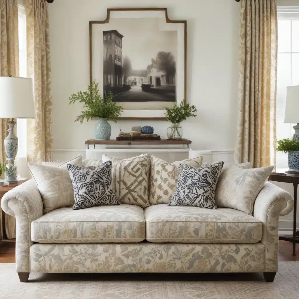
When it comes to scale, the rule of thumb is to mix patterns of different sizes. If your dominant pattern is large and bold, pair it with smaller, more subtle patterns. For example, if you’ve chosen a sofa with a large floral print, you might want to add throw pillows with a smaller geometric pattern. This creates visual interest without overwhelming the eye.
Color is equally important in pattern mixing. I always advise my clients to find a common color thread that runs through all their chosen patterns. This doesn’t mean everything has to be matchy-matchy, but having a cohesive color scheme will tie everything together beautifully. For instance, if your dominant pattern features shades of blue and green, look for complementary patterns that incorporate these colors in some way.
Remember, the goal is to create a harmonious look, not a perfect match. Don’t be afraid to experiment with different combinations – sometimes the most unexpected pairings can yield the most stunning results!
Texture: The Often Overlooked Element
When we talk about mixing patterns, it’s easy to focus solely on visual designs. But let me let you in on a little secret: texture is just as important as pattern when it comes to creating a rich, layered look in your living space. As a furniture specialist, I’ve seen many rooms transformed simply by incorporating different textures.
Think about it – a room with smooth leather sofas, sleek metal accents, and glossy surfaces can feel cold and uninviting. But add in some plush velvet throw pillows, a chunky knit blanket, and a shaggy area rug, and suddenly the space feels warm and welcoming. The key is to mix and match different textures to create depth and interest.
When choosing textures, consider how they’ll interact with your patterns. A heavily textured fabric can act as a pattern in itself, even if it’s a solid color. For example, a corduroy sofa in a neutral shade can provide a wonderful contrast to patterned throw pillows. Or, you might pair a smooth, patterned upholstery with textured curtains for an interesting juxtaposition.
Don’t forget about natural textures, too. Woven baskets, wooden furniture, and plants can all add layers of texture to your space. The goal is to create a tactile experience that complements your visual patterns.
The Rule of Three: A Designer’s Secret Weapon
As we delve deeper into the world of pattern mixing, let me share with you one of my favorite design principles: the rule of three. This simple yet effective guideline has helped me create countless harmonious interiors for my clients.
The rule of three suggests that patterns work best when used in groups of three. Why three, you ask? Well, it’s all about balance. Two patterns can sometimes feel incomplete or matchy-matchy, while four or more can quickly become overwhelming. Three, however, is the sweet spot that allows for variety without chaos.
Here’s how I typically apply this rule:
- Choose your dominant pattern (remember, this is your showstopper)
- Select a secondary pattern that complements the first but doesn’t compete with it
- Add a third pattern that’s more subtle and acts as an accent
For example, you might have a sofa with a large floral print (dominant), throw pillows with a medium-scale geometric design (secondary), and a small polka dot pattern on a lampshade (accent). The key is to vary the scale and style of each pattern while maintaining a cohesive color scheme.
But remember, rules are made to be broken! While the rule of three is a great starting point, don’t be afraid to experiment. Sometimes, the perfect room might call for two patterns or even four. Trust your eye and your instincts.
Negative Space: The Unsung Hero of Pattern Mixing
In our excitement to mix patterns, it’s easy to forget about the importance of negative space. But let me tell you, as someone who’s seen countless living rooms, negative space can be the unsung hero of a well-designed room.
What do I mean by negative space? Simply put, it’s the areas in your room that are free from pattern or strong visual elements. These “blank” spaces give the eye a place to rest and prevent your room from feeling too busy or overwhelming.
In practice, this might mean leaving some solid-colored elements in your room. Perhaps it’s a plain white wall, a solid-colored throw, or even just some empty space on a bookshelf. These areas of visual calm help to highlight and frame your carefully chosen patterns, making them stand out even more.
I often advise my clients to think of their room as a composition. Just as a good photograph needs both subject and background, your room needs both patterns and negative space to create a balanced, pleasing overall effect.
Don’t underestimate the power of a well-placed solid color amidst your patterns. It can serve as a visual palette cleanser, allowing each pattern to shine in its own right.
Pattern Mixing in Different Rooms
Now that we’ve covered the basics of pattern mixing, let’s talk about how this principle can be applied in different rooms of your home. After all, what works in a living room might not be quite right for a bedroom or a home office.
In the living room, you have the most freedom to experiment with bold patterns. This is typically the largest room in the house and can handle more visual interest. I often encourage my clients to use their sofa as a starting point. A patterned sofa can be a great anchor for the room, or if you prefer a solid-colored sofa, you can use it as a neutral base and add patterns through curtains, rugs, and accessories.
Bedrooms, on the other hand, should feel calm and restful. This doesn’t mean you can’t use patterns, but you might want to keep them a bit more subdued. Consider using patterns in your bedding, but balance it with solid-colored walls and curtains. Or, if you love a bold wallpaper, keep your bedding simple and elegant.
In the dining room, a patterned tablecloth or placemats can add visual interest without overwhelming the space. Just be sure to keep your dinnerware simple if you’re going for a bold pattern on the table.
Home offices can benefit from patterns too, but remember that this is a space for focus and productivity. Consider using patterns in small doses, like on a cushion for your office chair or in a piece of wall art.
Remember, the key is to create a cohesive look throughout your home. While each room can have its own unique feel, there should be elements that tie everything together. This might be a color scheme that runs throughout the house or a particular style of pattern that appears in different forms in each room.
Seasonal Pattern Mixing: Keeping Your Space Fresh
One of the things I love most about pattern mixing is how it allows you to easily update your space with the changing seasons. As someone who’s helped countless clients refresh their homes, I can tell you that swapping out a few key patterned pieces can completely transform the feel of a room.
In the spring and summer, you might lean towards lighter, brighter patterns. Think floral prints, cheerful stripes, or playful polka dots. These patterns can bring a sense of freshness and vitality to your space, perfect for those long summer days.
As we move into fall and winter, you might want to switch to richer, more cozy patterns. Plaids, herringbone, and more abstract, moody prints can create a warm, inviting atmosphere for those chilly evenings.
Here’s a quick guide to seasonal pattern mixing:
| Season | Pattern Ideas | Color Palette |
|---|---|---|
| Spring | Florals, Stripes | Pastels, Fresh Greens |
| Summer | Tropical Prints, Geometric | Bright Blues, Sunny Yellows |
| Fall | Plaids, Herringbone | Warm Oranges, Deep Reds |
| Winter | Abstract Prints, Textured Solids | Rich Jewel Tones, Crisp Whites |
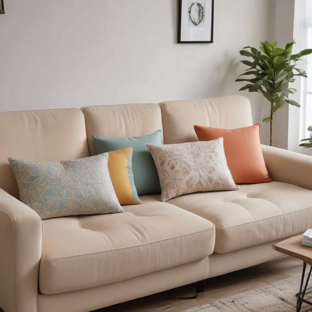
Remember, you don’t need to completely redecorate each season. Often, simply changing out throw pillows, blankets, or even just artwork can make a big difference. It’s all about creating layers that you can add or remove as the seasons change.
One of my favorite tips is to invest in a neutral sofa (like those you can find at Sofa Spectacular) and then use seasonal patterns in your accessories. This gives you the flexibility to change up your look without breaking the bank.
Common Pattern Mixing Mistakes to Avoid
In my years as a furniture specialist, I’ve seen my fair share of pattern mixing mishaps. While there’s no one “right” way to mix patterns, there are certainly some common pitfalls to avoid. Let’s talk about a few of these and how to steer clear of them.
First up is the “matchy-matchy” syndrome. This is when everything in the room matches too perfectly. While it might seem like a safe bet, it can actually make your space feel flat and uninteresting. The solution? Mix things up! Don’t be afraid to combine different styles of patterns or introduce unexpected color combinations.
Another common mistake is going overboard with patterns. Yes, we want to mix patterns, but there is such a thing as too much of a good thing. If every surface in your room is covered in a different pattern, it can quickly become overwhelming. Remember the importance of negative space we talked about earlier? That’s your secret weapon against pattern overload.
Scale confusion is another issue I often see. This happens when all the patterns in a room are of a similar scale, making it hard for the eye to distinguish between them. The fix is simple: vary the scale of your patterns. Mix large-scale patterns with medium and small-scale ones for a more balanced look.
Ignoring the room’s purpose is a mistake I’ve seen even seasoned decorators make. While a riot of patterns might look great in a living room, it might not be the best choice for a bedroom where you want to create a calm, restful environment. Always consider the function of the room when choosing your patterns.
Lastly, don’t forget about lighting! I’ve seen beautifully mixed patterns fall flat because the lighting in the room wasn’t considered. Natural light can change how patterns and colors appear throughout the day, so be sure to view your patterns under different lighting conditions before making final decisions.
The Future of Pattern Mixing: Trends to Watch
As we wrap up our deep dive into the world of pattern mixing, let’s take a moment to look ahead. What’s on the horizon for pattern mixing in interior design? As someone who keeps a close eye on industry trends, I’m excited to share some predictions with you.
One trend I’m seeing more and more is the blending of traditional and modern patterns. Think classic florals paired with contemporary geometric designs. This juxtaposition creates a fresh, eclectic look that feels both timeless and current.
Another emerging trend is the use of oversized patterns. We’re talking big, bold prints that make a real statement. These larger-scale patterns can be particularly effective in smaller spaces, contrary to what you might think. They can actually make a room feel larger and more impactful.
Texture-as-pattern is also gaining momentum. We’re seeing a lot of interest in textured wallpapers, 3D tiles, and fabrics with raised patterns. These add depth and interest to a space without relying solely on color or print.
In terms of color, there’s a move towards more muted, earthy tones. Think terracotta, sage green, and warm neutrals. These colors provide a beautiful backdrop for pattern mixing, allowing the patterns themselves to take center stage.
Sustainable and ethically sourced patterns are becoming increasingly important to consumers. We’re seeing a rise in patterns inspired by nature and traditional crafts, often produced using eco-friendly methods.
Lastly, digital printing technology is opening up new possibilities for pattern design. We’re seeing more intricate, detailed patterns that wouldn’t have been possible with traditional printing methods. This is allowing for even more creativity and personalization in pattern mixing.
As always, the key to successfully incorporating these trends is to stay true to your personal style. Don’t be afraid to experiment, but remember that the best-designed spaces are those that reflect the personality and lifestyle of the people who live in them.
Pattern mixing is an art form that’s constantly evolving, and that’s what makes it so exciting. Whether you’re a seasoned pro or just starting out, there’s always something new to learn and try. So go forth and mix those patterns with confidence!


