Mix and Match: Coordinating Patterns on Your Chaise Longue
Have you ever walked into a room and felt like something was just… off? The colors might be on point, but the overall look and feel just doesn’t seem to come together quite right. It’s a struggle that many of us face when decorating our homes – how do you create a cohesive, stylish space without it feeling stuffy or like it came straight out of a catalog?
As an interior designer with over 20 years of experience, I’ve learned a thing or two about the art of mixing and matching patterns. And let me tell you, it’s not as easy as it looks! But with the right approach, you can take your custom chaise longue from blah to bold, and make your living room the envy of all your friends.
The Power of Patterns
One of my greatest talents (and passions) as a decorator is the ability to pair fabrics and wallcoverings in a way that makes multiple patterns look effortlessly coordinated. I often tell my clients, “Hey, we’re ordering this piece custom – the manufacturer is covering it just for you, so let’s pick something that only you could have.” The results on installation day are always so rewarding, when the client sees how all the nuances of color and pattern come together.
Now, I know what you’re thinking – “But won’t that make my chaise longue look too ‘out there’ and hard to match with other pieces?” This is a common concern that I hear from clients, and I totally understand the hesitation. After all, you want your custom furniture to be versatile and work with your existing decor, right?
Well, let me let you in on a little secret: with the right guidance, mixing patterns can actually make your chaise longue (and the rest of your room) more flexible and easier to work with. The key is to approach it in a thoughtful, strategic way.
Layering for Luxury
The first step is to choose your “hero” pattern – this is the biggest, boldest print that will be the focal point of your custom chaise. It could be a gorgeous floral, an abstract geometric, or even a playful animal print (more on that later!). The important thing is that it has an open background, so it doesn’t feel too busy or overwhelming.
Once you’ve got your main event sorted, it’s time to start layering in some supporting players. Look for a medium-scale pattern that complements the colors and feel of your hero print. Maybe it’s a subtle stripe or a delicate lattice. This will add depth and visual interest without competing for attention.
And let’s not forget the small fry! Incorporating a petite-scale print, like a sweet ditzy or a simple polka dot, helps break up all the larger patterns and create a cohesive flow. Think of it as the glue that binds everything together.
As interior designer Eric Ross explains, “Every fabric scheme should have a small scale, medium scale, and large scale. This change of size in patterns keeps the overall scheme from being too fussy.”
Mixing Moods and Mediums
But patterns aren’t the only way to add visual intrigue to your custom chaise. Texture is just as important in creating a layered, dynamic look.
Think about incorporating different materials, like lush velvet, nubby boucle, or sleek leather. As designer Maria Killam suggests, “Adding texture and subtle layered interest is the surefire way to a warm and inviting space that feels finished yet anything but formulaic.”
And don’t be afraid to get a little playful with your accents! A touch of whimsical animal print, for example, can add a fun, unexpected element that keeps things from feeling too stuffy. Just be sure not to go overboard – as they say, less is more.
Finding the Right Balance
Now, I know what you’re probably thinking – “Okay, this all sounds great, but how do I make sure it doesn’t end up looking like a hot mess?” It’s a valid concern, and one that I’ve helped countless clients navigate over the years.
The key is to find the right balance between unity and variety. You want your custom chaise to feel cohesive and intentional, but not so matchy-matchy that it looks like it came straight out of a catalog. As Sherry Petersik of Young House Love explains, “Rooms that coordinate have varied textures, prints, materials, and tones that work together and appear balanced and cohesive.”
One of my favorite tricks is to choose a color scheme and then sprinkle in a third, unexpected hue. Maybe it’s a pop of terra cotta in the throw pillows, or a hint of deep blue in the artwork. This added element of surprise keeps things feeling fresh and dynamic.
And don’t be afraid to mix and match your patterns, too! A little geometric print here, a touch of plaid there – it all comes together to create a space that feels curated and unique. Just remember to keep a consistent color palette to tie it all together.
Bringing It All Together
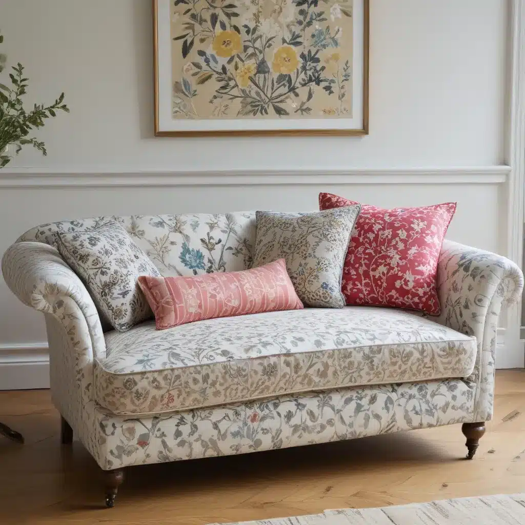
Alright, let’s put all of these tips into practice with a real-life example. Let’s say you’ve fallen head over heels for a gorgeous floral print for your custom chaise longue. It’s the perfect balance of bold and whimsical, with a dreamy color palette of soft blues and creamy whites.
To complement this hero pattern, you might choose a medium-scale stripe in a complementary hue for the throw pillows. Then, to break things up, you could add a petite polka dot pattern on a plush velvet lumbar pillow.
To anchor the whole look, you might opt for a neutral linen curtain panel and a cozy, textural jute rug. And don’t forget to tie in that unexpected pop of color – maybe a few coral-toned vases or a vibrant piece of abstract art.
The end result? A living room that feels warm, inviting, and oh-so-stylish. And the best part? Your custom chaise longue is the undisputed star of the show, perfectly coordinated yet anything but ordinary.
So, what are you waiting for? Head on over to Sofa Spectacular and start dreaming up your own custom chaise longue masterpiece. With a little creativity and a whole lot of pattern play, I guarantee you’ll end up with a space that’s nothing short of extraordinary.


