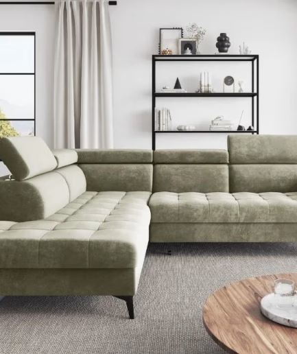
As a self-proclaimed color enthusiast, I’ve always been captivated by the power of hues to transform a space. And when it comes to the latest color trends, I can’t help but get giddy with excitement. That’s why I’m thrilled to dive into the world of jewel tones and explore how they can infuse your living spaces with a touch of drama and depth.
Embracing the Richness of Jewel Tones
Jewel tones are those deep, saturated shades that evoke a sense of luxury and opulence. Think of the deep emerald that sparkles with sophistication, the moody blues that captivate with their enigmatic charm, or the burnt orange that radiates warmth and energy. These colors are not for the faint of heart – they demand attention and make a bold statement.
But don’t be intimidated by their intensity. The key is to find the right balance and blend these jewel-inspired hues with subtlety and intention. After all, a little can go a long way in elevating the ambiance of a room.
Unlocking the Versatility of Jewel Tones
One of the things I love most about jewel tones is their sheer versatility. Whether you’re going for a contemporary, classic, or even a rustic vibe, these rich colors can seamlessly integrate with a variety of design styles.
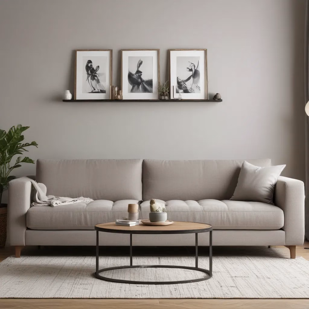
Take charcoal gray, for instance. This modern neutral can create a sleek and sophisticated backdrop, allowing other jewel-toned accents to shine. Pair it with deep emerald furnishings or moody blue textiles, and you’ve got a recipe for pure elegance.
On the other hand, terracotta with its earthy undertones can lend a warm, cozy feel to a space. Combine it with warm beige and dusty rose for a soothing, nature-inspired palette that radiates comfort and refinement.
And let’s not forget about the versatility of lavender – a soft, soothing hue that can inject a touch of chic tranquility into any room. Imagine it paired with sage green and crisp White Dove for a serene, spa-like atmosphere.
Mastering the Art of Color Combinations
One of the keys to successfully incorporating jewel tones is to strike the right balance between bold and harmonious. It’s all about finding that sweet spot where the colors complement each other and create a cohesive, visually appealing space.
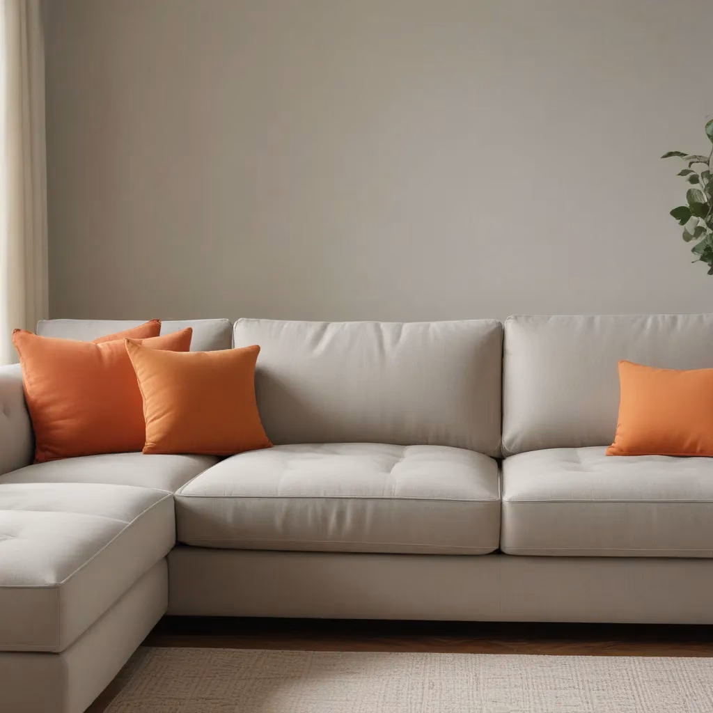
For a truly head-turning look, consider pairing complementary colors like blue and orange or purple and yellow. The contrast between these hues will add a dynamic, eye-catching element to your design.
On the other hand, if you prefer a more calming, serene vibe, opt for analogous color schemes. Pair blue and green or yellow and orange for a harmonious, nature-inspired palette that promotes a sense of tranquility.
And don’t be afraid to mix in some warm neutrals like beige or white to balance out the intensity of the jewel tones. These softer shades can act as a beautiful backdrop, allowing the richer hues to take center stage.
Embracing the Emotional Impact of Color
As a designer, I firmly believe that color has the power to evoke emotions and shape the atmosphere of a space. And when it comes to jewel tones, the impact is undeniable.
These rich, saturated hues have a way of commanding attention and imbuing a room with a sense of drama and luxury. Deep emerald, for instance, radiates sophistication and elegance, while moody blues can create a soothing, introspective ambiance.
But it’s not just about the visual appeal. Jewel tones can also tap into our primal connection with nature, tapping into our innate desire for comfort and rejuvenation. Sage green, for example, can transport us to a serene forest, while terracotta evokes the warmth and stability of the earth.
By thoughtfully incorporating these hues into your living spaces, you have the power to shape the emotional experience of those who inhabit them. Whether you’re looking to energize, soothe, or inspire, jewel tones offer a versatile palette to work with.
Bringing Jewel Tones to Life in Your Home
So, how can you bring the captivating allure of jewel tones into your own home? The possibilities are endless, my friend.
Start by identifying the mood you want to create in each room. Do you crave a cozy, intimate vibe in your living room? Opt for a rich burnt orange or dusty rose as an accent wall or in your upholstery. Looking to infuse your bedroom with a sense of tranquility? Lavender and sage green could be the perfect pairing.
Don’t be afraid to experiment and play with different combinations. Canva’s color palette generator can be a valuable tool in helping you discover unexpected color harmonies that speak to your personal style.
And remember, when it comes to jewel tones, a little can go a long way. Introduce them gradually, perhaps through accessories, throw pillows, or even a statement piece of furniture. Sofas Spectacular has a stunning selection of jewel-toned sofas that could be the perfect starting point for your color journey.
The beauty of jewel tones lies in their ability to transform a space and evoke a lasting emotional response. So, why not embrace the drama and depth that these rich, captivating hues have to offer? Your home – and your senses – will thank you.
