Tricking the Eye: Interior Design Secrets for a Spacious Illusion
As a proud owner of a cozy (read: tiny) cottage in the English countryside, I know a thing or two about the challenges of decorating small spaces. It’s all about creating the right visual illusion – making that wee abode feel like a sprawling manor through the power of design. And I’m here to share my top tricks to help you do the same in your home.
Scale It Down
When it comes to furnishing a petite room, it’s all about proportions, my friends. If a piece of furniture is brushing up against the walls, top to bottom or side to side, it’s simply too large for the space. Leave a little breathing room between your furnishings and the boundaries of the room to create an airy, open feel.
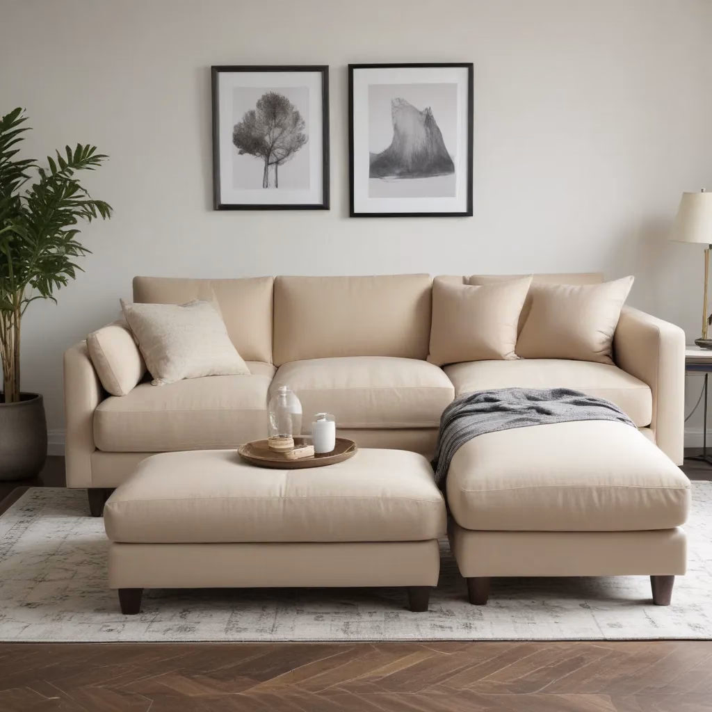
Now, I know the temptation to fill that limited square footage with big, cozy pieces. But resist! Those overstuffed sofas and chunky armchairs will just make the room feel claustrophobic. Opt instead for sleek, streamlined silhouettes that won’t dominate the space. A slim sofa will give you just as much seating as its plump counterpart, but with a much lighter footprint.
And don’t be afraid to go vertical with your statement pieces. Hanging a large work of art or mirror on the wall will add drama without encroaching on your precious floor space. As the design pros at Remodelista put it, “Don’t consume valuable living space by putting it on the floor.”
Keep It Low-Profile
Furniture that sits closer to the ground has a magical way of creating a sense of openness in a room. In the bedroom, consider a loft bed or even just a mattress on the floor. And in the living area, embrace your inner ’60s era with low-slung, midcentury-inspired pieces.
As Remodelista notes, “Furniture that is lower to the ground will create a feeling of openness in a room simply by the fact that they leave more space above them.” The higher the ceilings, the more dramatic this effect will be.
But it’s not just the furniture itself that matters – the placement is key too. Remodelista designer Michaela Scherrer used a low bed and art hung towards the bottom of the walls to emphasize the height of her small bedroom. The result? A spacious, airy retreat.
Show Off Those Legs
Speaking of midcentury modern, those iconic pieces have another trick up their sleeve when it comes to making a room feel bigger – their leggy silhouettes. Furniture that allows light and air to flow underneath it creates a sense of movement and openness, tricking the eye into perceiving more space.
As the design duo behind Workstead put it, “Furniture that is streamlined allows light and air to flow not just over but also under and around it so that it appears to float in space.” Think sleek, leggy sofas, chairs, and even the humble butterfly chair.
And don’t forget the power of mirrors to further enhance that spacious illusion. Not only do they reflect light, but they also reflect the view, doubling the visual depth of the room. As Remodelista notes, “It’s like doubling a room.”
Lighten Up
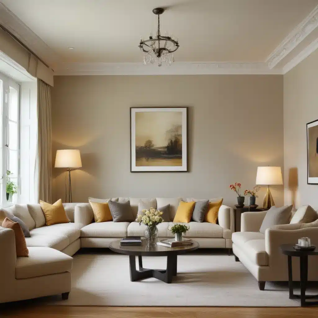
When it comes to color, lighter is almost always better for making a space feel bigger. Remodelista cites the reflective properties of white as a key factor, explaining that it “opens up a room making it feel airy and light, calm and serene.”
But don’t just stop at the walls – carry that lightness through to the ceiling as well. Painting the walls and ceiling the same pale shade will blur the boundaries, causing the eye to travel upwards and creating an enveloping sense of spaciousness.
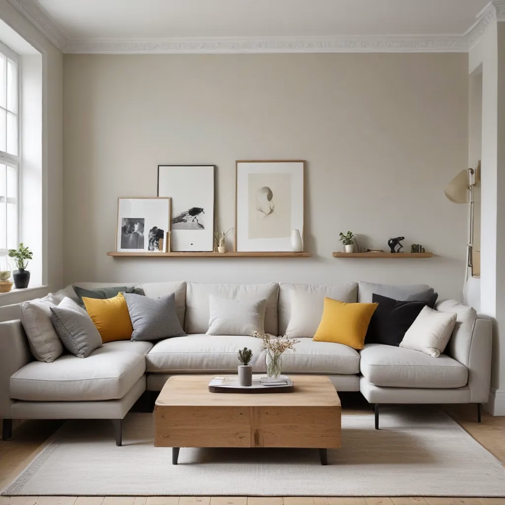
Of course, an all-white palette can sometimes feel a bit stark. To warm things up, pair your bright whites with natural wood tones or cozy textiles. The key is to keep the overall look clean and uncluttered. After all, as Remodelista puts it, “Small spaces are all about editing.”
Emphasize the Vertical (and Horizontal)
Speaking of creating the illusion of height, one of my favorite tricks is to draw the eye upwards with strategic vertical elements. Floor-to-ceiling bookcases, tall headboards, or even a single, striking light fixture can all do the trick.
But don’t neglect the horizontal plane either. Running wood paneling or shiplap across the walls and ceiling creates a seamless transition that emphasizes the room’s width and height. As Remodelista design writer Tiina Laakonen explains, “The effect is a seamless transition from wall to ceiling that emphasizes the height and the width of the room.”
Clear a Path
When dealing with a small space, the natural instinct is to push all the furniture up against the walls to maximize the floor area. But this can actually have the opposite effect, making the room feel cramped and claustrophobic.
Instead, try grouping your furniture to one side of the room, leaving a clear pathway through the middle. As Remodelista’s Sarah Lonsdale discovered in her Napa Valley bungalow, “Sometimes it is better to group the furniture on one side of the room so people can pass through unhindered.”
This visual trick gives the illusion of more space, allowing the eye to travel easily through the room. And bonus – it also makes it easier to, you know, actually move around without constantly bumping into things.
Embrace Breezy Fabrics
When it comes to textiles, heavy, weighty fabrics can make a room feel closed-in and oppressive. But lightweight, airy materials like linen, sheer voile, and gauzy cotton have the opposite effect.
Pair those breezy fabrics with reflective surfaces like mirrors and high-gloss paint, and you’ve got a recipe for visual expansion that would make even a palace feel spacious.
Simplify, Simplify, Simplify
At the end of the day, the key to making a small room look bigger is restraint. The more stuff you cram into a limited space, the more cluttered and claustrophobic it will feel. As Remodelista puts it, “Small spaces are all about editing.”
So be ruthless with your décor, my friends. Ditch the knickknacks, limit your artwork to just a few statement pieces, and resist the urge to fill every nook and cranny. As the design experts at HK Interiors advise, “The more you can open it up and let it breathe, the larger the space will feel.”
And remember, just because you’ve got a petite footprint doesn’t mean you can’t create a grand, luxurious-feeling space. With a little strategic editing and the right visual tricks, you can transform even the coziest of cottages into a sprawling manor – at least in the eyes of your guests.
So embrace your inner minimalist, Sofa Spectacular fans, and get ready to live large in your (seemingly) spacious abode.


