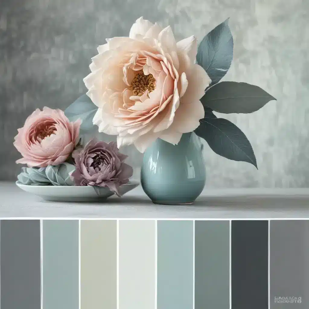
Embracing the Art of Color Coordination
In the ever-evolving landscape of interior design, the importance of color cannot be overstated. Savvy homeowners and interior enthusiasts in the UK are increasingly aware that the right color palette can transform a space, evoking specific moods and emotions. As we move into 2024, the pursuit of harmonious color schemes has become a central focus for those seeking to create truly breathtaking living environments.
Researching the latest trends and consumer preferences, it’s clear that British homeowners are gravitating toward color palettes that strike a delicate balance between timeless elegance and contemporary flair. Gone are the days of stark, monochromatic rooms; today’s design enthusiasts crave a more layered, nuanced approach to color that reflects their personal style and the unique character of their homes.
One of the most pivotal factors in achieving this harmonious balance lies in understanding the principles of color theory. By mastering the strategic placement of hues on the color wheel, homeowners can unlock a world of design possibilities, seamlessly blending shades that complement and enhance one another.
Uncovering the Power of Color Harmony
At the heart of color harmony lies the concept of geometric relationships on the color wheel. This visual tool, which arranges primary, secondary, and tertiary colors in a rainbow-like sequence, serves as a roadmap for identifying the most pleasing color combinations.
Direct Harmony (Complementary Colors): Also known as complementary colors, direct harmony pairs your key color with the hue that sits directly opposite on the color wheel. This bold, striking approach can create a visual impact, but it requires a delicate touch to ensure the effect doesn’t become overwhelming. Classic examples of direct harmony include red and green, blue and orange, as well as yellow and purple.
Split Complementary Harmony: Building on the principle of direct harmony, split complementary harmony involves selecting the two colors adjacent to the complement of your key color. This approach offers a softer, more nuanced alternative to the stark contrast of direct harmony, allowing for a more harmonious and eye-pleasing aesthetic.
Analogous Harmony: Analogous harmony brings together colors that sit side by side on the color wheel, creating a cohesive and soothing palette. Often found in nature, this color scheme evokes a sense of calm and comfort, making it a popular choice for cozy and inviting living spaces.
Triadic Harmony: Triadic harmony, on the other hand, involves selecting three colors that are evenly spaced around the color wheel. This vibrant, visually striking approach can be highly engaging, particularly when one hue is used as the dominant color, with the other two serving as accents.
Navigating the Nuances of Color Choice
As homeowners in the UK explore these color harmony principles, they’re also becoming increasingly attuned to the subtleties that can influence the overall impact of their chosen palette. Factors such as saturation, tone, tint, and shade play a crucial role in determining the mood and ambiance of a room.
Saturation: The intensity or vibrancy of a color can dramatically impact the overall feel of a space. Highly saturated hues can create a bold, energetic atmosphere, while more muted tones can lend a sense of tranquility and sophistication.
Tone: The warmth or coolness of a color, often determined by the underlying undertones, can significantly shape the character of a room. Warm tones, such as reds, oranges, and yellows, can evoke a cozy, inviting ambiance, while cool tones, like blues and greens, can instill a sense of serenity and calmness.
Tint: The addition of white to a pure color results in a lighter, more pastel-like tint, which can impart a softer, more delicate feel to a space. Tinted hues are often favored for creating airy, soothing environments.
Shade: Conversely, the introduction of black to a pure color produces a deeper, richer shade, which can lend a sense of drama and elegance to a room. Shaded hues are often used to ground a color scheme and create depth and contrast.
By thoughtfully considering these nuances, UK homeowners can fine-tune their color choices, ensuring that each element harmonizes seamlessly with the overall design vision.
Trends and Preferences in the UK Sofa Market
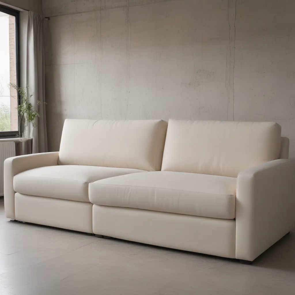
As the heart of the living room, the sofa plays a pivotal role in shaping the color palette and overall aesthetic of a space. In the UK, consumers are increasingly gravitating toward sofas that not only offer superior comfort but also seamlessly integrate with the broader design scheme.
Embracing Natural Materiality: One of the standout trends in the UK sofa market is a heightened appreciation for natural materials. Leather, linen, and velvet have emerged as top choices, as homeowners seek to bring a sense of warmth and tactility to their living spaces. These natural fabrics not only add visual interest but also contribute to the overall comfort and durability of the sofa.
Soft and Sumptuous Silhouettes: Alongside the emphasis on natural materials, UK consumers are drawn to sofas with soft, inviting silhouettes that exude a sense of luxurious comfort. Plush, generously proportioned cushions and rounded, deep-seated designs are becoming increasingly popular, catering to the desire for a cozy and enveloping seating experience.
Harmonious Color Pairings: When it comes to sofa color, British homeowners are embracing palettes that seamlessly integrate with the broader design scheme of their homes. Muted, earthy tones like sage green, taupe, and dusty blue are particularly sought after, as they lend a sense of timeless elegance and effortless sophistication. Vibrant, saturated hues are also making their mark, often used as accent pieces to inject a bold, dynamic energy into the space.
Multifunctional Versatility: In the face of evolving lifestyle needs and the desire for adaptable living spaces, UK consumers are increasingly drawn to sofas that offer multifunctional versatility. Modular designs, convertible sofa beds, and pieces with hidden storage compartments are gaining popularity, catering to the diverse needs of modern households.
Harmonizing Sofas with Interior Design Trends
As homeowners in the UK curate their living spaces, they’re recognizing the critical role that the sofa plays in setting the tone and establishing a cohesive design aesthetic. By aligning sofa selections with the latest interior design trends, they can create visually stunning and harmonious environments that reflect their personal style.
Blending Old and New: One of the prevailing trends in UK interior design is the seamless integration of traditional and contemporary elements. Pairing a timeless, button-tufted sofa with sleek, modern accent pieces or juxtaposing a mid-century-inspired silhouette with vintage-inspired decor can result in a visually captivating and well-balanced space.
Embracing Natural Textures: In line with the sofa market’s emphasis on natural materials, British homeowners are incorporating a variety of rich textures into their living spaces. Mixing linen, velvet, and leather sofas with woven elements, such as rattan chairs or jute rugs, can create a warm, organic ambiance that is both inviting and visually striking.
Cultivating Cozy Comfort: The desire for cozy, inviting living spaces has become a driving force in UK interior design. Homeowners are curating sofa arrangements that foster a sense of comfort and relaxation, often pairing plush, oversized pieces with plush throws, fluffy pillows, and cozy area rugs. This layered approach to texture and comfort helps to create a welcoming, enveloping atmosphere.
Connecting with Nature: Biophilic design, which emphasizes the integration of natural elements into the built environment, is gaining traction in the UK. Homeowners are incorporating lush, verdant accents, such as potted plants and floral arrangements, to complement their sofa choices, creating a harmonious, nature-inspired aesthetic.
Embracing Versatile Layouts: With the increasing emphasis on multifunctional living spaces, UK homeowners are exploring flexible sofa arrangements that can adapt to their evolving needs. Modular sectional sofas, for instance, can be rearranged to accommodate different activities, from intimate conversation areas to more expansive entertaining spaces.
By thoughtfully aligning their sofa selections with these design trends, UK homeowners can curate living spaces that are not only visually captivating but also reflective of their personal style and lifestyle preferences.
Unlocking the Secrets of Successful Color Coordination
As homeowners in the UK navigate the world of color harmony and sofa selection, there are a few key principles that can help them achieve a truly harmonious and visually stunning living space.
Start with a Focal Point: Identify a key color or element in the room that you want to highlight, and then build your color scheme around it. This could be the dominant hue of your sofa, a striking piece of artwork, or a vibrant accent wall.
Embrace Complementary Contrasts: While direct complementary colors can be bold and impactful, split complementary or analogous harmonies offer a more subtle and soothing approach. Experiment with these color relationships to create a sense of visual interest and balance.
Vary Tones and Textures: Incorporate a mix of warm and cool tones, as well as a range of textures, to add depth and dimension to your color scheme. This can help prevent a space from feeling flat or one-dimensional.
Introduce Neutral Elements: Incorporating neutral hues, such as beige, gray, or white, can provide a calming base that allows your accent colors to shine. These neutral elements can also help to ground the overall design and create a sense of cohesion.
Pay Attention to Lighting: The way a color is perceived can vary dramatically based on the type and intensity of lighting in the space. Adjust your lighting accordingly to ensure that your chosen colors are showcased in the best possible way.
Embrace Flexibility and Experimentation: Color trends and preferences are constantly evolving, so be open to trying new combinations and making adjustments over time. The joy of design lies in the journey of exploration and self-expression.
By embracing these principles and drawing inspiration from the latest trends, British homeowners can create living spaces that are not only visually stunning but also deeply reflective of their unique personalities and design sensibilities.
Conclusion: Elevating the Everyday with Color Harmony
As we’ve explored, the art of color coordination is a powerful tool in the hands of savvy UK homeowners and interior design enthusiasts. By understanding the principles of color harmony and applying them thoughtfully to their living spaces, they can transform the everyday into the extraordinary.
From the carefully curated sofa that serves as the centerpiece of the room to the carefully chosen accents that bring the space to life, every element of the design plays a crucial role in creating a harmonious and visually captivating environment. By embracing natural materials, soft silhouettes, and thoughtful color pairings, homeowners can craft living spaces that not only exude comfort and sophistication but also reflect their personal style and the unique character of their homes.
As the UK market continues to evolve and consumer preferences shift, the role of color in shaping the design landscape will only become more pronounced. By staying attuned to the latest trends, experimenting with bold color combinations, and harnessing the power of color harmony, homeowners can unlock a world of design possibilities, elevating the everyday and creating spaces that truly inspire.
Remember, the journey of design is a continuous exploration, and the beauty of color lies in its ability to transform, evoke, and connect. So, embrace the power of color, and let it be your guide in creating the harmonious, visually stunning living spaces that you’ve always dreamed of. Visit https://sofaspectacular.co.uk/ for more inspiration and guidance on your design journey.


