As a self-proclaimed color enthusiast, I’ve always had a soft spot for the bold and the vibrant. Give me a room full of rich jewel tones or a quilt bursting with kaleidoscopic patterns, and I’m in design heaven. But lately, I’ve found myself drawn to the elegant allure of neutral palettes. Now, before you write me off as a traitor to the color cause, hear me out.
There’s something undeniably chic and sophisticated about a space that embraces the nuanced beauty of neutrals. Sure, they may not scream for attention like their more vivacious counterparts, but when done right, they can create a serene and harmonious backdrop that allows other design elements to truly shine. And let’s be honest, neutrals are downright versatile – they effortlessly adapt to changing trends and personal preferences, making them a smart choice for those of us who like to switch up our style on the regular.
But here’s the secret that sets my neutral-loving heart aflutter: the right pops of color. Because let’s be real, a room filled with nothing but beige and gray would be about as exciting as watching paint dry. No, the true magic happens when you strategically weave in vibrant accents that bring the whole space to life.
The Power of Neutral Hues
As I delved deeper into the world of neutral color palettes, I discovered that they’re not just visually appealing – they also have some pretty impressive psychological benefits. According to color expert Karen Haller, neutral tones like white, beige, and gray can actually help create a sense of security and calm. In uncertain times, these soothing shades can provide a much-needed respite, acting as a cozy cocoon that shields us from the outside world.
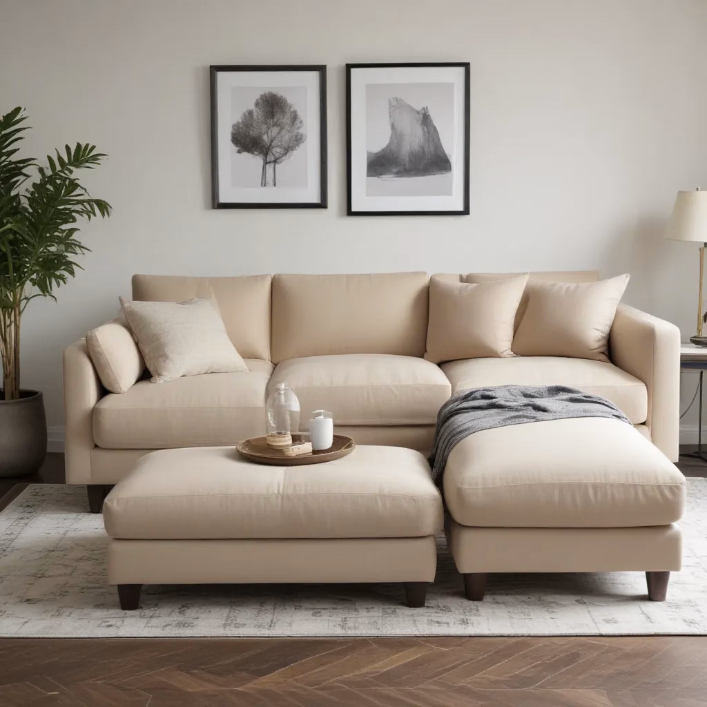
But it’s not just about creating a tranquil oasis. Neutral colors also have the power to visually expand a space and maximize natural light, making even the most cramped quarters feel airy and open. And let’s not forget their timeless appeal – neutral palettes have a way of lending an air of sophistication and elegance to any setting, seamlessly blending with a wide range of design styles.
The Art of Balancing Neutrals and Pops of Color
Now, I know what you’re thinking: “Okay, Janice, you’ve convinced me that neutrals have their place, but how do I keep things from feeling too bland?” That, my friends, is where the strategic use of color accents comes into play.
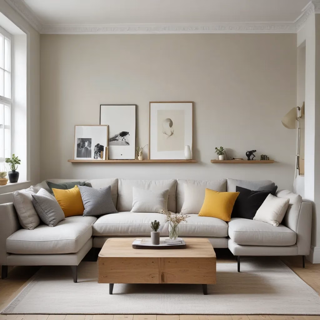
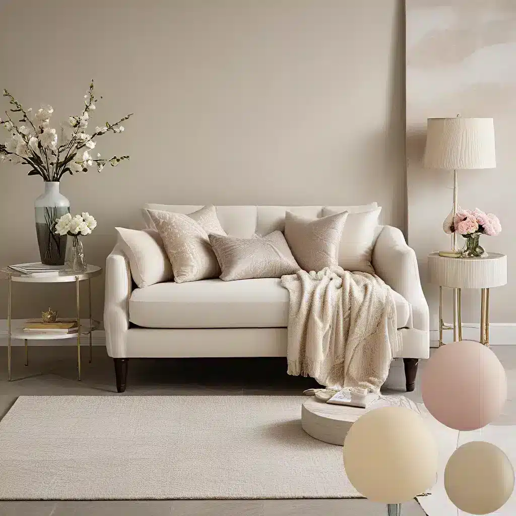
One of my favorite tricks is to layer different shades of neutral – think crisp whites, warm taupes, and cool grays – to create depth and visual interest. Then, I’ll sprinkle in vibrant pops of color through statement pieces, textiles, and accessories. It’s all about finding the perfect balance, where the neutrals provide a tranquil foundation and the bold hues add a touch of personality.
Take, for example, my Cool Tone Scrappy Plaid-ish Quilt. While the overall palette leans heavily on blacks, whites, and grays, the pops of blue and green keep the design from feeling monotonous. And in my Field Study Sweet Life Quilt, the neutral background fabrics in creams and taupes act as a canvas for the vibrant feature prints, creating a harmonious yet visually stimulating composition.
Neutral Inspiration: Bringing the Concept to Life
But don’t just take my word for it – let’s take a peek at some real-life examples that showcase the power of blending neutrals and color. Shaker Kitchen from DeVOL, for instance, effortlessly combines crisp white cabinets with warm gray countertops and backsplash, elevating the space with a touch of industrial chic. And in the Livingroom of Interiors Blogger Kimberly Duran of Swoothworthy, the gray sofa and walls provide a serene foundation, while the pops of mustard yellow and teal breathe life into the room.
Even in our own Sofa Spectacular showroom, we’ve embraced the power of this harmonious pairing. Our Union Table and Brooklyn Chairs from Furniture Choice strike the perfect balance, with the gray tones of the furniture creating a calming backdrop for the vibrant pops of color in the artwork and accessories.
Exploring the Endless Possibilities of Neutral Palettes
As I delve deeper into the world of neutral color schemes, I’m continually amazed by the endless possibilities they offer. From the cool, moody allure of Hurricane to the warm, cozy charm of Sunday Tea, there’s a neutral hue to suit every design aesthetic and personal preference.
And the best part? Neutral palettes are incredibly versatile, allowing you to easily switch up your look without breaking the bank. Whether you’re refreshing your living room with a new sofa or giving your bedroom a much-needed facelift, these sophisticated shades provide the perfect foundation for you to build upon.
Of course, as with any design choice, it’s important to consider the psychological impact of your color selections. As Karen Haller astutely pointed out, gray interiors can sometimes feel draining and energy-depleting if not balanced properly. That’s why it’s crucial to incorporate the right pops of color and texture to create a sense of warmth and vibrancy.
Embracing the Art of Personalization
But perhaps the most exciting aspect of neutral palettes is the opportunity they provide for personalization and self-expression. By strategically layering in your favorite accents, you can transform a neutral space into a true reflection of your unique style and personality.
Take my Desert Flowers Childrens Quilt, for example. Though the beige background serves as a calming canvas, the pops of gold and vermillion in the retro-inspired floral motifs instantly elevate the design, infusing the space with a bold and chic desert vibe. Or consider the Ice Ice Baby Quilt, where the soft periwinkle and lavender hues dance gracefully against the gray and white backdrop, creating a serene and tranquil atmosphere.
Ultimately, the key to mastering the art of neutral palettes is to embrace the power of personalization. By thoughtfully incorporating your favorite colors, textures, and patterns, you can transform a neutral space into a true reflection of your unique style and personality. And who knows, you might just discover a newfound appreciation for the elegant beauty of harmonious hues.
So, my fellow design enthusiasts, are you ready to embark on a journey of neutral exploration? Whether you’re a lifelong color devotee or a self-proclaimed neutral aficionado, I encourage you to get creative, have fun, and let your personality shine through. After all, a touch of bold color can certainly be the secret ingredient that takes your neutral-inspired space from chic to utterly captivating.
