The Art of Color Coordination in Interior Design
As a furniture specialist with years of experience, I’ve seen firsthand how the right color palette can transform a living space. It’s not just about picking colors you like; it’s about creating a harmonious blend that reflects your personality and enhances the overall ambiance of your home. Let’s explore how to achieve this delicate balance.
Color coordination is the foundation of any well-designed interior. It’s about understanding how different hues interact and complement each other to create a cohesive look. When done right, it can make your space feel larger, more inviting, and even affect your mood positively.
I remember working with a client who was adamant about using bold, contrasting colors in her living room. She wanted to combine deep purple with bright yellow, thinking it would create a vibrant atmosphere. While these colors can work together, they need to be balanced carefully. We ended up using a softer shade of purple for the walls and introducing yellow through accent pieces like throw pillows and artwork. The result was stunning – a room that felt both energetic and sophisticated.
Understanding Color Schemes
When it comes to creating a harmonious color palette, understanding different color schemes is crucial. Let’s break down some popular options:
Complementary Color Schemes
Complementary colors sit opposite each other on the color wheel. This scheme creates a high-contrast look that can be quite striking when used correctly. For example, pairing blue and orange can create a visually appealing space that feels balanced and energetic.
In my experience, complementary schemes work best when one color is dominant and the other is used as an accent. I once helped design a home office where we used a deep blue for the walls and incorporated orange in the desk accessories and artwork. The result was a space that felt both professional and creative.
Analogous Color Schemes
Analogous colors are next to each other on the color wheel. This scheme creates a more serene and comfortable atmosphere. For instance, combining shades of blue, green, and purple can result in a calming environment perfect for bedrooms or relaxation areas.
I’ve found that analogous schemes are particularly effective in open-plan living spaces. By using different shades of the same color family, you can create a sense of flow and continuity throughout the area while still defining separate zones.
Monochromatic Color Schemes
A monochromatic scheme uses variations of a single color. This approach can create a sophisticated and cohesive look. Don’t mistake monochromatic for boring – by varying the intensity and adding different textures, you can create depth and interest.
One of my favorite projects involved a monochromatic living room in shades of gray. We used a light gray for the walls, a slightly darker tone for the sofa, and incorporated various textures through rugs, curtains, and throw pillows. The result was a space that felt both modern and cozy.
The 60-30-10 Rule: A Guide to Color Distribution
When it comes to applying your chosen color scheme, the 60-30-10 rule is a handy guideline. Here’s how it works:
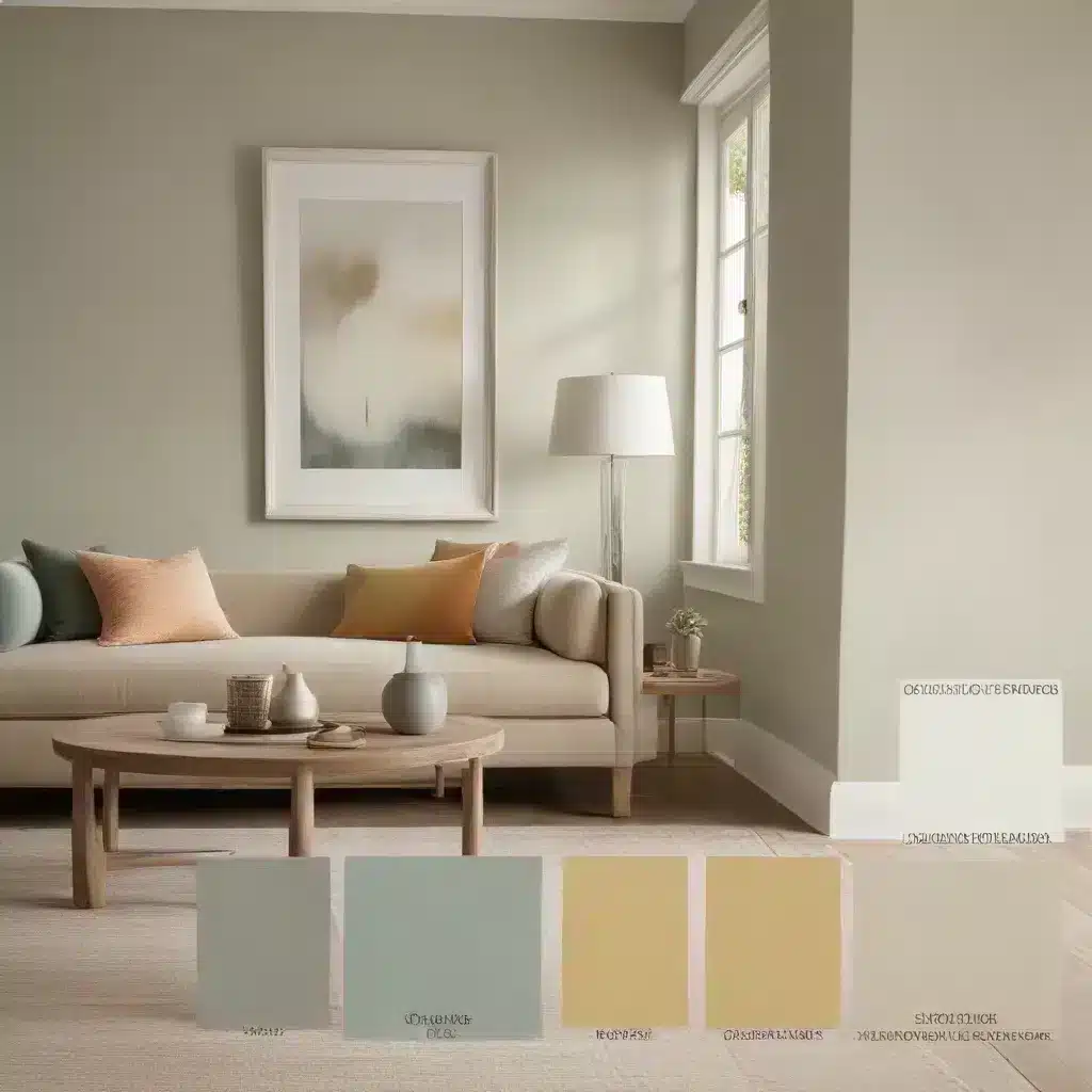
- 60% – Dominant Color: This is your main color, typically used for walls and large furniture pieces like sofas.
- 30% – Secondary Color: Use this for smaller furniture items, curtains, or an accent wall.
- 10% – Accent Color: This adds pop through accessories like pillows, artwork, or small decor items.
Let’s look at how this might play out in practice:
| Element | Color | Percentage |
|---|---|---|
| Walls & Sofa | Soft Beige | 60% |
| Curtains & Armchair | Sage Green | 30% |
| Pillows & Artwork | Coral | 10% |
This distribution creates a balanced look that’s pleasing to the eye. Of course, rules are made to be broken, and once you understand the principles, you can adjust them to suit your style.
Considering Light and Space
The way colors appear can vary greatly depending on the lighting in your room. Natural light, artificial light, and even the direction your windows face can all impact how a color looks.
I always recommend testing paint samples in different areas of the room and observing them at various times of day before making a final decision. What looks perfect in the store might appear completely different in your home.
Additionally, the size and layout of your space should influence your color choices. Lighter colors can make a small room feel more spacious, while darker hues can add coziness to larger areas. In a recent project, we transformed a narrow hallway by using a light, warm neutral on the walls and introducing pops of color through artwork and a runner rug.
Integrating Color Through Furniture and Accessories
Your furniture and accessories play a crucial role in bringing your color scheme to life. Here are some tips I’ve learned over the years:
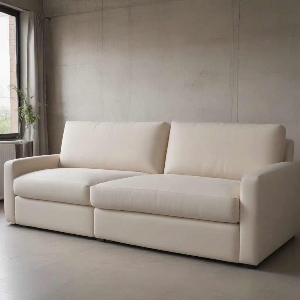
- Start with a neutral base: A neutral sofa, for example, gives you flexibility to change your color scheme through accessories.
- Use accent chairs for color: An accent chair in a bold hue can be a great way to introduce color without overwhelming the space.
- Layer with textiles: Throw pillows, blankets, and rugs are perfect for adding color and texture.
- Don’t forget about wood tones: The color of your wooden furniture should be considered part of your overall palette.
Remember, your color choices should reflect your personal style and the mood you want to create in your space. Don’t be afraid to experiment and have fun with it!
Creating Flow Between Rooms
One of the challenges in creating a harmonious home is ensuring a smooth transition between different rooms. Here are some strategies I’ve found effective:
Consistent Color Theme
While each room can have its own unique character, maintaining a consistent color theme throughout your home creates a sense of cohesion. This doesn’t mean every room should look the same, but rather that there should be a common thread tying them together.
For example, you might use different shades of blue throughout your home – a light blue in the living room, a deeper navy in the dining room, and a soft blue-gray in the bedroom. This creates a subtle connection between spaces while allowing each room to have its own identity.
Gradual Color Transitions
Another approach is to gradually shift your color palette as you move from one room to another. This works particularly well in open-plan spaces or adjacent rooms.
I once worked on a project where we transitioned from a warm beige living room to a sage green kitchen. We achieved this by using beige with green undertones in the transitional space, creating a seamless flow between the two areas.
Using Neutral Connecting Spaces
Hallways and entryways can serve as neutral zones that tie different color schemes together. By keeping these areas in neutral tones, you create a visual break that allows for more varied color choices in individual rooms.
In one home, we used a light gray in the hallways to connect a blue living room with a yellow dining room. The neutral hallway provided a subtle transition that made the color changes feel natural and intentional.
The Psychology of Color in Interior Design
As a furniture specialist, I’ve learned that color choices go beyond mere aesthetics – they can significantly impact our mood and behavior. Here’s a brief overview of how different colors can affect the atmosphere of a room:
- Blue: Calming and serene, perfect for bedrooms or bathrooms.
- Green: Associated with nature and renewal, great for creating a refreshing atmosphere.
- Yellow: Energetic and uplifting, but use sparingly as it can be overwhelming in large quantities.
- Red: Stimulating and passionate, best used as an accent color in social spaces.
- Purple: Often associated with luxury and creativity, can add a touch of elegance to a room.
- Orange: Warm and inviting, can create a cozy atmosphere in living rooms or dining areas.
When choosing colors for your space, consider not just how they look, but how they make you feel. A color that energizes you might be perfect for a home office but less suitable for a relaxing bedroom.
Balancing Trends with Timeless Design
As someone who’s been in the furniture industry for years, I’ve seen trends come and go. While it’s fun to incorporate current color trends, it’s important to strike a balance with timeless elements to create a space that won’t feel dated in a few years.
One approach I often recommend is to use trendy colors in easily changeable elements like throw pillows, artwork, or small decor items. This allows you to update your space without a major overhaul when trends shift.
For larger pieces and wall colors, consider opting for more neutral or classic choices. A well-made sofa in a timeless color can serve as a foundation for your room’s design for years to come, adapting to changing color schemes around it.
The Role of Texture in Color Perception
When we talk about color in interior design, we often focus on hue, but texture plays a crucial role in how we perceive color. Different textures can make the same color appear warmer or cooler, more muted or vibrant.
For instance, a smooth, glossy surface will reflect light differently than a rough, matte one, even if they’re the same color. This is why I always encourage my clients to consider texture when selecting fabrics, wall finishes, and decor items.
In one project, we created depth in a monochromatic bedroom by using various textures. The walls were painted in a flat finish, the curtains were a shimmery silk, and we added a plush velvet headboard. Although everything was in shades of gray, the room felt rich and layered due to the variety of textures.
Adapting Color Schemes to Different Lighting Conditions
Natural light changes throughout the day, and this can significantly impact how colors appear in your space. Here’s how to work with different lighting conditions:
North-Facing Rooms
North-facing rooms tend to receive cooler, bluish light. To counteract this:
– Use warmer colors to create balance
– Opt for colors with yellow or red undertones
– Consider using lighter shades to brighten the space
South-Facing Rooms
South-facing rooms benefit from warm, direct sunlight. In these spaces:
– Cool colors can help balance the warmth
– You can experiment with both light and dark shades
– Be cautious with yellows and reds, as they can appear more intense
East-Facing Rooms
East-facing rooms receive bright morning light but can feel cooler in the afternoon:
– Use flexible color schemes that work well in both warm and cool light
– Consider using different colors on opposite walls to balance the changing light
West-Facing Rooms
West-facing rooms receive warm afternoon light but can be darker in the morning:
– Opt for colors that look good in both cool and warm light
– Be mindful of how intense the afternoon sun can make colors appear
Remember, artificial lighting also plays a role. LED, fluorescent, and incandescent bulbs all affect color perception differently. Always test your color choices under the specific lighting conditions of your room before making a final decision.
Conclusion: Creating Your Perfect Color Palette
Crafting a harmonious color palette for your home is a journey of self-expression and creativity. It’s about finding the right balance between personal preferences, color theory principles, and practical considerations like lighting and space.
Don’t be afraid to experiment and trust your instincts. Your home should be a reflection of your personality and style. Whether you prefer bold, vibrant colors or soft, muted tones, the key is to create a space that feels welcoming and comfortable to you.
Remember, there are no hard and fast rules in interior design. While guidelines like the 60-30-10 rule can be helpful, they’re meant to be a starting point, not a strict formula. Feel free to adapt and adjust as you see fit.
Lastly, if you’re feeling overwhelmed or unsure, don’t hesitate to seek professional advice. A good interior designer or color consultant can help you navigate the complexities of color theory and create a palette that truly brings your vision to life.
Your home is your canvas – have fun with it, and let your colors shine!


