The Illusion of Spaciousness
I’ll admit it – I used to be a New Yorker. Living in those tiny, cozy apartments, I got quite skilled at the art of making a small space feel, well, less small. And now that I’m a Cape Cod cottage owner, I’ve had to put those tricks into practice all over again.
The reality is, not everyone has the luxury of sprawling, open-concept homes. Most of us have to work with what we’ve got – rooms that feel a little cramped, a little claustrophobic. But the good news is, there are plenty of interior design tricks that can help you hack the system and make your space feel a whole lot bigger than it actually is.
It all comes down to a little optical illusion. By employing some strategic techniques, you can trick the eye into perceiving more space, more airiness, more freedom of movement. And the best part? These aren’t complicated, high-budget renovations. These are simple, budget-friendly design hacks that any homeowner can implement.
So if you’re ready to expand your horizons (or at least the perceived horizons of your humble abode), let’s dive in. Here are my top tips for enlarging your rooms with a few strategic decor moves.
Scale It Down
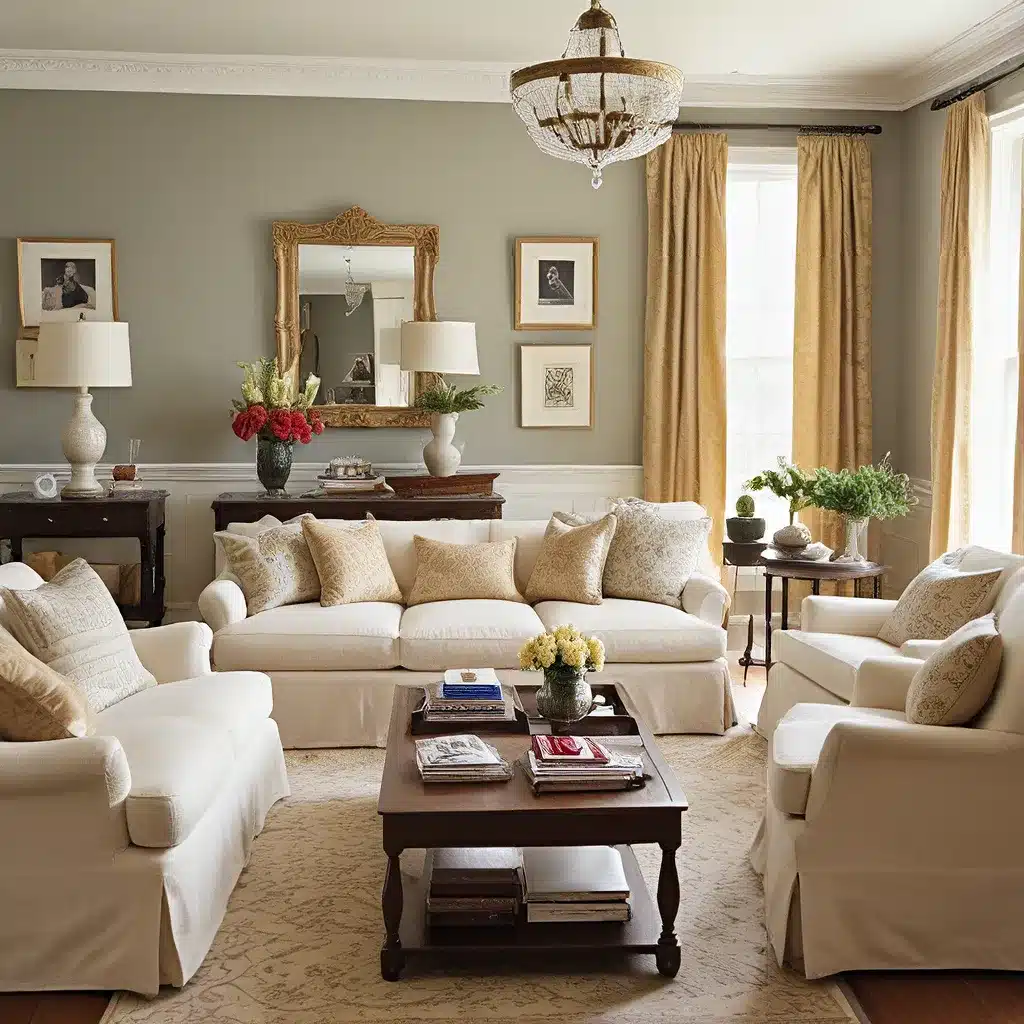
One of the biggest mistakes people make when decorating a small space is going big with the furniture. Oversized sofas, bulky armchairs, and chunky coffee tables can quickly make a room feel cramped and claustrophobic.
Instead, you want to focus on proportions. Opt for furniture that’s appropriately scaled for the room’s dimensions. As the experts at Remodelista put it, “If a piece brushes up against the boundaries of the room either up and down or sideways, it’s too large.”
The key is leaving a bit of breathing room around your pieces. Give them a few inches of clearance from the walls so your eye can travel freely around the space. The only exception? Your bed. Remodelista suggests a queen-sized bed nestled between two walls can actually create a cozy, cave-like effect.
But beyond just the dimensions, you also want to be mindful of the overall weight and heft of your furniture. Chunky, overstuffed pieces tend to visually “eat up” more of the room. Instead, opt for sleeker, more streamlined silhouettes that allow light and air to flow around them.
Think mid-century modern with its low-slung, leggy designs. Or go for a delicate, butterfly chair that seems to almost float in the space. Anything that creates a sense of openness and movement will work wonders in making the room feel larger.
Keep It Low-Profile
Building on the idea of proportions, another key trick is to keep your furniture low to the ground. As Remodelista notes, “Furniture that is lower to the ground will create a feeling of openness in a room simply by the fact that they leave more space above them.”
In the bedroom, consider a loft bed or even just a mattress directly on the floor. In the living room, embrace your inner Mad Men with low-profile, mid-century pieces. Or if your tastes lean more towards the romantic, 19th-century furniture with its lower profiles can also do the trick.
The idea is to create a sense of vertical space – the more open area you have above your furnishings, the airier and more expansive the room will feel. And don’t forget to carry this principle through to your decor, too. Hang artwork and mirrors at a lower level so they relate to the furniture, further reinforcing that sense of spaciousness.
Emphasize Movement
It’s not just about the furniture itself, but how it interacts with the rest of the room. One of the best ways to make a space feel larger is to create a sense of flow and movement.
Think about how your gaze moves through the space. Are there clear, unobstructed pathways? Or is the room cluttered with too many pieces, causing your eye to dart haphazardly around?
Strategically placing your furniture, using mirrors to reflect light and views, and incorporating vertical and horizontal elements can all help guide the eye in a more purposeful, expansive way. The result? A room that feels larger, more open, and more cohesive.
Embrace the Vertical
Speaking of vertical elements, don’t underestimate the power of emphasizing height in a small space. Just as low-profile furniture can create a sense of openness, anything that draws the eye upward can also work wonders.
Remodelista cites examples like tall shelves, vertical wood paneling, and even a bare hanging light bulb as ways to accentuate a room’s verticality. The key is that these elements create a feeling of movement and flow, guiding the eye up and creating the illusion of more space.
You can also play with horizontal elements to achieve a similar effect. Remodelista showcases a bedroom where designer Tiina Laakonen ran horizontal shiplap all the way up the walls and ceiling. The seamless transition creates a sense of expansiveness, drawing the eye across the width and height of the room.
The takeaway? Don’t be afraid to layer in some strategic vertical or horizontal elements. It’s an easy way to heighten the perceived size of your space.
Let the Light In
When it comes to making a room feel bigger, one of the most powerful tools at your disposal is natural light. As the Washington Post article states, “Remove the blinds and allow light to flow into your space. If possible, add some skylights to the room so that light can stream in from above.”
Natural light has a remarkable way of opening up a space, making it feel airy, bright, and expansive. And when you pair that with reflective surfaces like mirrors, you amplify the effect even further. The article notes that “mirrors help reflect and bounce light from the windows”, creating the illusion of increased volume.
Of course, not everyone has the luxury of ample natural light. In those cases, strategic artificial lighting can also do the trick. The key is to use multiple light sources rather than relying on one harsh overhead fixture. Table lamps, floor lamps, and even recessed lighting can work together to create a more diffuse, ambient glow that makes the space feel larger and more open.
Minimize Clutter
You know what they say – less is more. And when it comes to making a room look bigger, that old adage couldn’t be more true. As the experts at HK Interiors put it, “Clutter is the enemy of small spaces.”
Every extra knick-knack, piece of artwork, or random tchotchke you add to the mix is just another visual obstacle standing in the way of that sought-after sense of openness. The more you can streamline and simplify your decor, the larger your room will feel.
HK Interiors recommends grouping decor items in threes or fives, and placing them on trays to create a more cohesive, less cluttered look. They also suggest limiting artwork to one or two large-scale pieces, rather than a scattered gallery wall.
And let’s not forget about storage. Vertical shelving units, baskets, and other hidden-away solutions can be lifesavers when it comes to keeping clutter at bay. The more you can tuck away out of sight, the more open and airy your space will feel.
The Power of Paint
You know the old saying – “a fresh coat of paint can work wonders.” Well, when it comes to making a room look bigger, that couldn’t be more true. As the Washington Post article explains, “Light and dark colors creating contrast can give a room depth.”
The key is to use those contrasting shades strategically. lighter, more reflective colors like whites, creams, and light grays can help open up a space and make it feel airier and more expansive. As the article notes, “White’s reflective qualities help to open a space and make it appear light and airy.”
But don’t be afraid to experiment with bolder, darker hues as well. The Washington Post article suggests that “dark and bright white colors that open up a room in contrast creates the illusion of a much larger area.” The key is to use those darker shades selectively – perhaps an accent wall or a painted door – to create depth and drama without overwhelming the space.
And when it comes to narrow rooms, the experts have a clever trick. Paint the shorter walls a slightly darker shade than the longer ones to make the room appear more square-shaped and balanced. It’s a simple optical illusion that can work wonders.
So whether you go light and bright or dark and moody, the right paint palette can be the secret weapon in your quest for a more spacious, open-feeling home.
Bringing It All Together
At the end of the day, making a small room look and feel bigger is all about creating the right visual cues. It’s about tricking the eye, guiding the gaze, and strategically manipulating the elements of design to give the illusion of more space.
From appropriately scaled furniture to carefully curated decor, natural light to strategic paint colors, there are so many tools in the interior designer’s toolkit. And the best part? You don’t have to be a design pro to put them to work.
With a little creativity and a discerning eye, any homeowner can transform their cramped quarters into an airy, expansive oasis. And who knows – maybe you’ll even forget you’re living in a small space at all.
So what are you waiting for? Get out there, start experimenting, and watch your rooms expand before your very eyes. The possibilities are endless when you know how to play with perception.
And of course, if you need a little extra inspiration or advice, you know where to find us. We’re always happy to lend a hand in your quest for the perfect Sofa Spectacular home.


