Unlocking the Potential of Awkward Spaces
I’ll admit it – when it comes to interior design, I’m a bit of a rebel. While most designers swear by the “rules” of decorating, I’ve always believed that rules are meant to be broken. And when it comes to tackling those tricky, awkward room shapes, I’ve found that thinking outside the box can lead to some truly inspired solutions.
As the in-house designer for Sofa Spectacular, a custom sofa company in the UK, I’ve had my fair share of experience working with challenging room layouts. From narrow galley-style living rooms to L-shaped spaces with oddly placed fireplaces, I’ve learned that with a little creativity and an open mind, you can transform even the most perplexing floor plans into functional and fashionable havens.
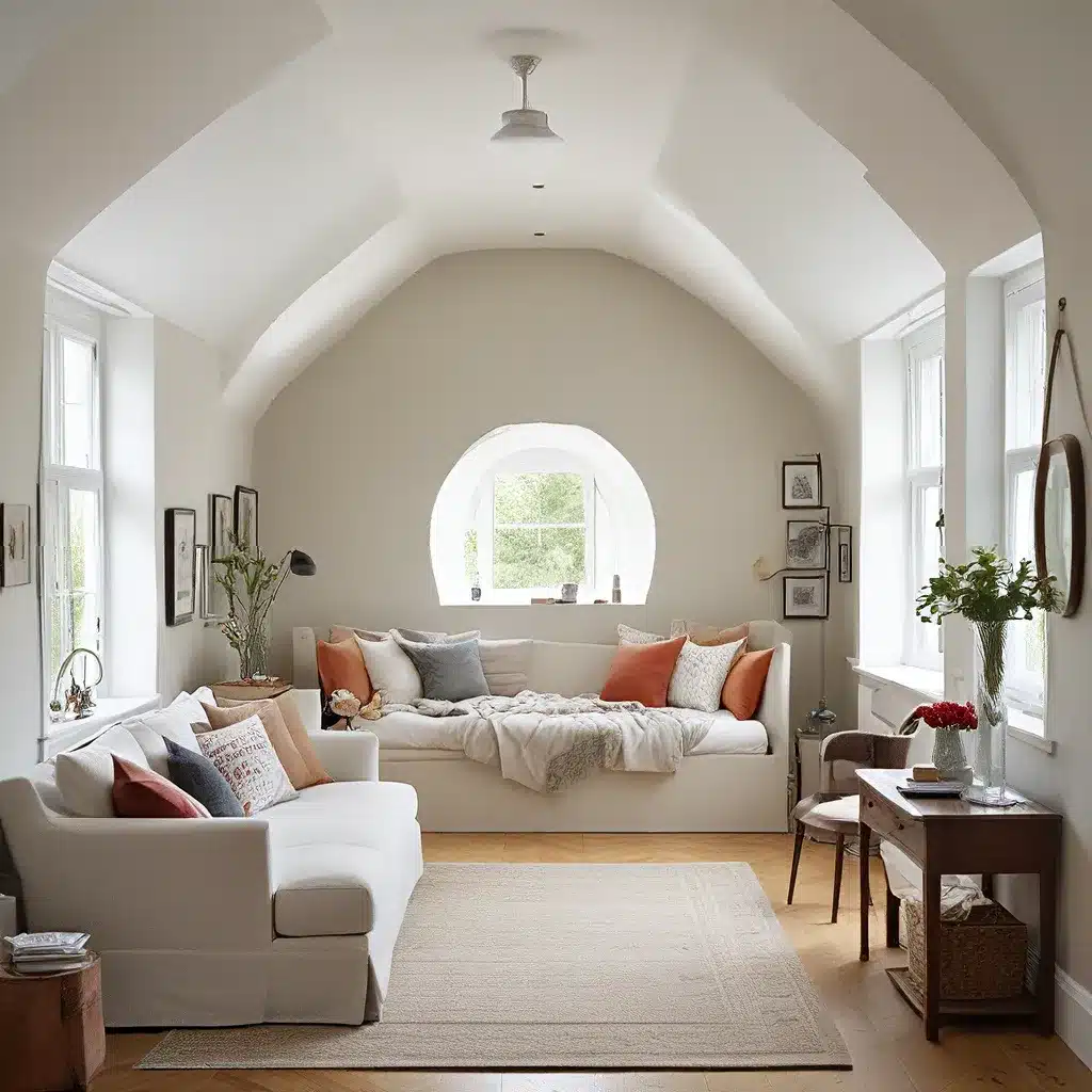
As one designer puts it, “Living rooms come in all sorts of shapes and sizes – some are more straightforward and obvious, others are awkward or tricky.” But rather than letting those tricky dimensions defeat you, I say embrace them! With the right furniture arrangement and a dash of design savvy, you can turn those “problem” areas into the highlights of your space.
Angle It Up
One of the key rules that I often find myself breaking is the one about avoiding angled furniture in small or awkward rooms. Conventional wisdom dictates that angled pieces can disrupt the flow of a space and create wasted, hard-to-use areas. But I’ve found that with a little strategic planning, angled furniture can actually be the secret to unlocking the potential of a tricky layout.
Take, for example, the L-shaped living room. This floor plan can be a real head-scratcher, with its odd corners and lack of clear focal points. But by anchoring the space with a pair of angled sofas, you can create a cozy, conversation-friendly arrangement that makes the most of the room’s unique shape. The key is to ensure that the angled pieces work together as a cohesive group, maintaining that all-important sense of balance and symmetry.
Another designer notes, “The furniture is angled and balanced. The sofas are mirrored across and the chair is angled into the corner at the same angle as the sofa. On closer inspection, the entire furniture group is a classic perpendicular and symmetrical arrangement, just turned into the corners of the room.” By embracing the angles and playing with the room’s geometry, you can turn an awkward layout into a chic and inviting space.
Float Your Furniture
Another rule that I’ve found worth breaking is the one about keeping furniture against the walls in narrow or oddly shaped rooms. As one designer explains, “Narrow rooms are notoriously tricky to layout. You must make sure the furniture is not so deep that it pops off the wall too far. You must keep in mind that there’s usually a long wall that could have awkward empty spots if you don’t plan the composition of furniture correctly.”
But rather than hugging the walls and leaving those empty pockets, I’ve found that “floating” the furniture in the center of the room can be a game-changer. By positioning key pieces like sofas and chairs in the middle of the space, you can create a sense of balance and flow that simply wouldn’t be possible if everything was pushed up against the walls.
One designer showcases this approach beautifully, dividing a long, narrow room into distinct zones – a library area, a conversational seating group, and a dedicated work zone. By floating the sofas in the center of the room, they’ve created a cozy, intimate layout that still allows for ample circulation around the edges.
The key is to choose appropriately scaled furniture, like smaller “studio” or loveseat-sized sofas, to ensure that the floating pieces don’t overwhelm the space. With a little creativity and a willingness to challenge the status quo, you can transform even the most narrow, awkward room into a masterful study in space planning.
Embrace the Dark Side
Another rule that I love to break is the one about avoiding dark colors in small or oddly shaped rooms. Conventional wisdom dictates that light, airy palettes are the way to go in tight spaces, but I’ve found that a moody, sophisticated color scheme can actually work wonders.
Take, for example, this London Victorian with its beautifully appointed bedroom. On paper, it might sound like a recipe for disaster – dark walls, dark furniture, dark everything. But the end result is a space that feels cozy, calming, and utterly sophisticated. The key is in the execution – by keeping the palette monochromatic and playing up the room’s architectural details, the designer has created a haven that envelops you in warmth and elegance.
As the in-house designer for Sofa Spectacular, I often encourage our clients to think beyond the typical white-and-beige color schemes and embrace their bold, daring sides. With the right furniture, lighting, and styling, a dark, moody palette can transform even the most awkward space into a refined, sophisticated retreat.
Float It, Flank It, or Fill It
When it comes to storage in small, tricky rooms, I’ve found that the old rules about placement and scale often need to be thrown out the window. Take this bedroom makeover, for example. Conventional wisdom would dictate that lining up all the dressers and wardrobes along one wall is a design no-no, creating a “discount furniture store” vibe that can make a small space feel even more confined.
But in this case, the designer has found a way to make it work by keeping the pieces light and airy in color, breaking up the long wall with some open shelving, and incorporating clever details like the frosted glass doors. The result is a storage-packed bedroom that feels spacious, serene, and anything but cluttered.
Another approach I love is to “float” the storage pieces, positioning them perpendicular to the walls to create a sense of flow and openness. As one designer notes, “The addition of the media console and new position for the TV bring the room together nicely. Now the chair has a scale-appropriate position and the small drink table helps to create the perfect functional secondary seating option.”
And in those spaces where you simply have to line up the storage against a wall, I recommend flanking the pieces with taller elements like bookcases or armoires. This helps to create a sense of balance and visual interest, breaking up the monotony of a long, uninterrupted wall of furniture.
Let’s Get Creative!
At the end of the day, when it comes to designing for tricky, awkward room shapes, I believe that the only rule that truly matters is this: there are no rules. By approaching each space with an open mind and a willingness to experiment, you can unlock the hidden potential in even the most perplexing of floor plans.
So whether you’re dealing with an L-shaped living room, a narrow galley-style space, or a bedroom with too many doors and not enough wall space, I encourage you to embrace the challenge. Get creative with your furniture placement, play with color and texture, and don’t be afraid to break a few “rules” along the way.
After all, as the old saying goes, rules are made to be broken. And when it comes to interior design, a little rule-breaking can go a long way in transforming your home into a true reflection of your unique style and personality.
So what are you waiting for? Let’s get started on unlocking the creative potential of your tricky room shapes!


