Creating Zones of Function in a Compact Open Floor Plan
I’ve been spending an awfully lot of time up in our loft since shutting down our Airbnb back in June. It’s been so lovely – this room is the sunniest space in our house, and it has my all-time favorite detail: ceiling fans. I know, I know, not the most exciting feature, but for some reason, I’m a huge sucker for them. Maybe it’s because growing up, my older brothers had them in their rooms, and I always wanted one too.
It wasn’t until my 23rd birthday, after I’d been living back at my parents’ place for a few years, that I finally got my own ceiling fan. However, I got married and moved out a year later, so the shining season of living with a ceiling fan in my bedroom was short-lived. Anyway, our attic is the one space in our house with ceiling fans, so I take advantage whenever I can.
All that to say, I’ve been spending a lot of time up here as opposed to sitting in my very dark office, and yesterday I was struck by how incredibly functional this space is. There’s nothing particularly special about the room itself – it’s just a big 800 sq ft box with an A-frame ceiling line. But because we wanted it to function as a sort of complete home-away-from-home for our guests, we were super intentional about the pieces we put in here and how we set them up.
Defining Distinct Zones in an Open Layout
We needed the space to be a bedroom, living area, and dining area all in one, so we had to figure out how to create zones with our furniture that would help accomplish that goal. Believe it or not, in this single room, we have eight different zones, each serving a specific function. It’s essentially a tiny house, minus the bathroom and full kitchen.
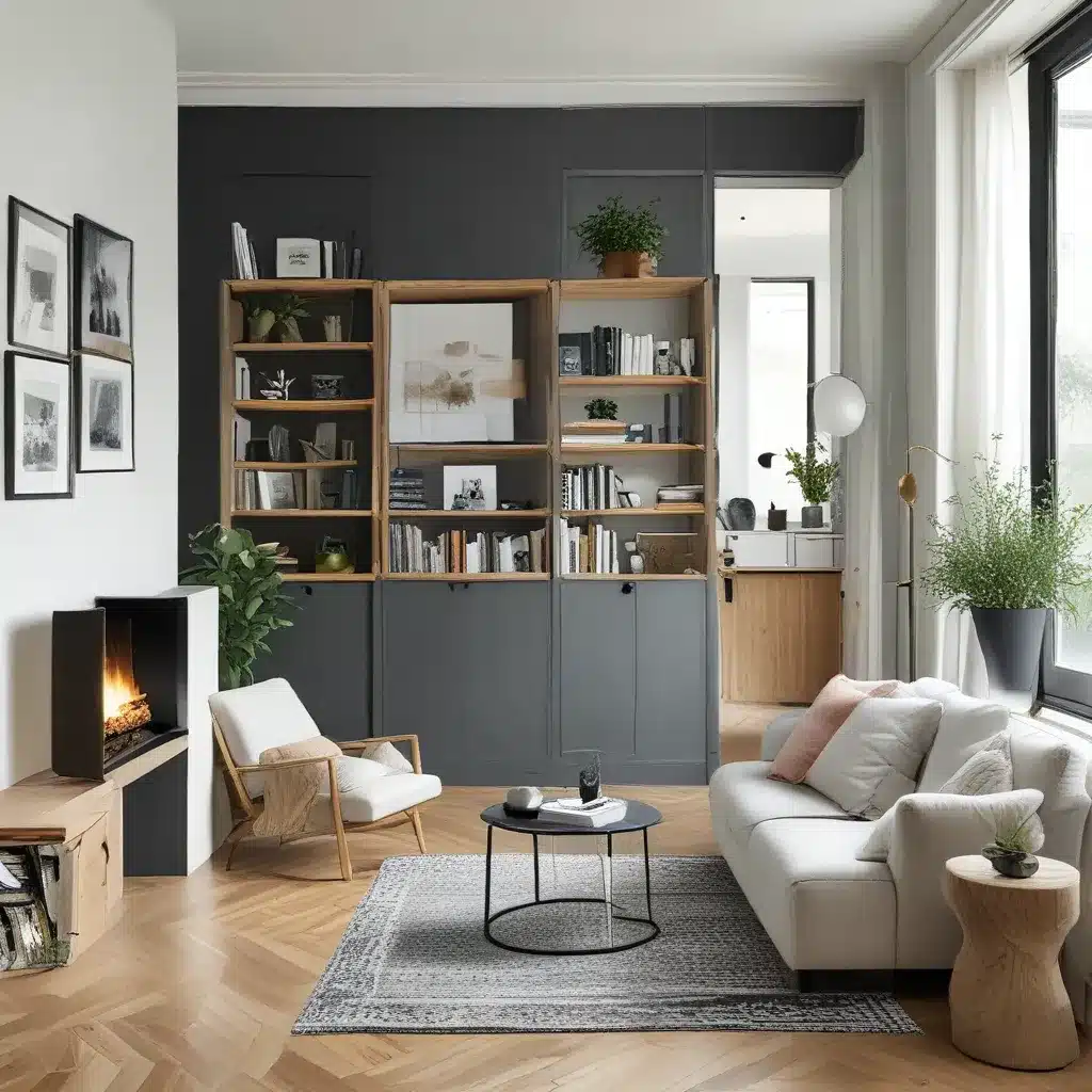
What I also love about this area is that it’s a great example of how you can do a lot with just furniture. Sometimes, you may think you need to add walls or move walls or do some major overhaul, when really, what you need is to be a little more intentional with your space planning.
Take a look at the floor plan below to see how I’ve broken out the zones, and then we’ll talk through the function of each one and how we pulled it off.
The Dining Zone
First up is the dining area. Our loft has the original pine subfloor, which was painted a light bluish-grey by a previous owner. It’s definitely not super level – oh, the character of an old house! – but it gives the space a vintage studio feel, which I really love.
Since the flooring throughout the space is unified, the easiest way to designate zones was by using area rugs. Of course, I didn’t do a rug in every zone – that would have been way too many rugs – but at least for the larger gathering spots, that did the trick nicely.
For the dining area, I found a simple wood-top, metal-frame table and bench set and centered that on a square 7ft x 7ft area rug. The rug grounds the dining area and also makes the uneven floor a little more forgiving, so the furniture doesn’t wobble. Additionally, we hung a plug-in pendant light above the dining table, making it feel a little more permanent and giving the space some vertical interest. I hid the pendant cord behind the window curtains to keep the look clean.
The Lounge Zone
Beside the dining area, I created a small grouping with a comfy upholstered chair, a large piece of art, and a potted plant on a stand. Maybe this is a little small to be considered its own zone, but in a space like this, every area counts, so hear me out.
If you think of this loft as a home in and of itself, someone could sit over here after dinner, reading a book, while their partner sat on the couch, working at their laptop. It provides an alternative landing place, utilizes a corner that would’ve gone unused, and creates a nice visual beyond the dining area. I say it qualifies as its own zone.
The Kitchenette Zone
Just beside the dining area, we utilized a former bedroom dresser as the base for our kitchenette. We had thought about putting in an actual kitchenette with plumbing, a stovetop, etc., but we nixed the idea because it would have been expensive, and we like that this space currently gives us a lot of options, so we’re not tied to one thing long-term.
Instead, we created a perfectly functional kitchenette out of all stand-alone pieces. Atop the dresser/sideboard, we have a microwave, coffee maker, and set of dishes, along with a hot water pot and coffee/tea fixings (not all of these are pictured, but they are there now, I promise). Beside the dresser, we placed a mini-fridge and a tall trash bin. I was especially excited about this fridge because it actually looks like a miniature refrigerator, unlike the mini-fridge I had way back in my college dorm room.
The Cozy Nook Zone
This is my favorite of the zones. In the dormer space, we created the coziest little coffee/reading nook. Using an extra-shaggy rug, we made this into an area you’d want to curl up on the floor or prop your feet up on the little table with a cup of coffee.
Another thing I love about this little space is that it feels like a separate room or a little mini play-house for kids. I’ve always had a thing for miniature anything. It has walls on three sides, and because we’ve grounded it with the rug and oriented it toward the window, it feels very private when you land in there. Plus, it has a fantastic view of the park for people-watching.
The Bedroom Zone
The bedroom finds itself smack in the middle of our loft space. Because our attic is an A-frame, finding a wall to put the headboard against wasn’t an easy thing to do, since the ceilings meet the wall just two feet above the floor. However, there’s one strange bit of wall that juts out into the room – I’m pretty confident it’s where our plumbing stack runs up to the roof – and it gave me the perfect place to anchor the headboard without it feeling like it was floating out in the middle of the room. Thank you, plumbing stack!
The bed is also nicely oriented so that you can view the TV while lying in bed, and when you wake up, you have a lovely sunny view of Madison Ave out the window in the reading nook.
The Wardrobe Zone
While the attic does have a closet, you have to crouch to get inside because the ceilings are slanted. Because of this, it wouldn’t be functional for storing clothing or anything that gets regular use. We wanted to add a functional and beautiful place for guests to hang their clothes, coats, and other garments.
I’d been loving the concept of open closet storage for a while, so I bopped around the internet until I found the perfect clothing rack for the space. I also made sure to create a comfortable walkway – at least three feet – behind the sofa, so that accessing clothing wouldn’t feel cramped. I like that this piece brings a little height variation into the space. Other than the hanging lamp and curtains, it’s the tallest item in the room. Remember, in design, it’s important to consider your vertical planes as much as your horizontal ones.
The Office Zone
In the back corner of the loft, we created a workspace with a desk, chair, and task lamp. We anticipated that the space would be used by business travelers at times, so we wanted a spot for them to work that wasn’t the dining area. I also imagined individuals taking little stay-cation/writing/creative retreats in the loft and thought this would be the perfect spot to jot down some thoughts, poems, or plans.
Placing a vintage piece of art on the wall above, we created a nice visual vignette that felt grounded, cozy, and separate.
The Living Zone
Lastly, we have our living area. Again, we used a large area rug to anchor this zone and centered up our seating area with the large window on the north side of the room. Here, we placed a vintage sofa and set of chairs, a side table, and a live-edge coffee table. Additionally, we used a simple, low-profile, modern-style credenza as our entertainment center and placed our TV and speakers on top.
I floated this credenza fairly far from the wall so it wouldn’t feel too far away from the couch. This also keeps people from walking too close to the ceiling and bumping their heads – I’ve done it one too many times.
I like that the sofa creates a natural barrier to the closet and office areas. When dealing with a large open area like this, think about how you can use functional furniture pieces to suggest natural boundaries between different zones.
Harmonizing the Rug Patterns
Because I used three large area rugs in this space, I needed to think about how they would play with one another. I didn’t want to do all solids, but I still wanted to maintain a lighter, natural-toned color palette. I decided to go with three natural-tone rugs, each in a slightly different pattern.
You’ve probably heard me say it before, but when mixing patterns, you want to use coordinating or complementary color palettes and vary the scale of your patterns so they don’t fight with each other. In our case, we went with similar tones in each rug and varied our pattern sizes – our largest rug has a very subtle, almost texture-like pattern, the dining rug has a mid-sized pattern, and the nook rug has a larger, more pronounced pattern. This combination allowed the rugs to have a nice conversation with each other, but not overtake the rest of the room. I’m very happy with the way the rugs played out.
The Benefits of Zoning
I love a lot of variety in my environment, and creating zones is a great way to give yourself lots of options within a single space. You can work from the table for a few hours, hop over to the reading nook, then plop on the couch – it’s great for creativity.
Zones are also helpful if you have multiple people utilizing a space who may need to accomplish different tasks at the same time. If this room were just one large seating area, it might be difficult for more than one or two people to use the space without disrupting each other. Zones help you make sense of your space, designate how to use each area, and make the space more functional for everyone.
So, how have you utilized zones in your own space? Or do you have a room where you might try implementing this concept? I’d love to hear all about it, so share in the comments below!
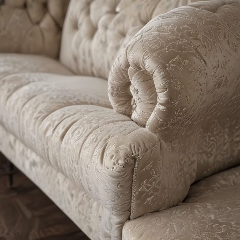
And if you’re looking for more inspiration on how to make the most of your living space, be sure to check out Sofas Spectacular, our custom sofa company based right here in the UK. We’re always happy to help you find the perfect piece to anchor your zones and make your home feel truly tailored to your lifestyle.


