The Secret to Visually Stunning Interiors
Imagine walking into a room that instantly captivates you – a space that feels perfectly balanced, visually harmonious, and incredibly inviting. What’s the secret behind this harmonious design? It all comes down to mastering the principles of scale and proportion in interior design.
By understanding these fundamental concepts, we can create spaces that not only look stunning but also feel comfortable and engaging. So, let’s dive in and uncover the magic behind proportions and scale, and how you can apply these principles to choose the perfect sofa size for your space.
The Yin and Yang of Scale and Proportion
At the heart of any well-designed interior lies a delicate balance between scale and proportion. Scale refers to the relationship between an item and the space it occupies, while proportion is the relationship between different objects in a room – especially in a large room, where balance is crucial.
Achieving the perfect harmony between scale and proportion is like finding the yin and yang in your space. It’s about ensuring that each element, from the furniture to the decor, fits seamlessly within the overall proportions of the room. Get it right, and you’ll have a visually captivating, comfortable, and inviting environment. Get it wrong, and your space can feel disjointed, overwhelming, or simply underwhelming.
Proportion: The Key to Cohesive Designs
Proportion is the secret sauce that brings a room together, creating a sense of unity and visual rhythm throughout the space. By considering the relationship between the various elements – furniture, accessories, and architectural features – you can craft a harmonious and aesthetically pleasing environment.
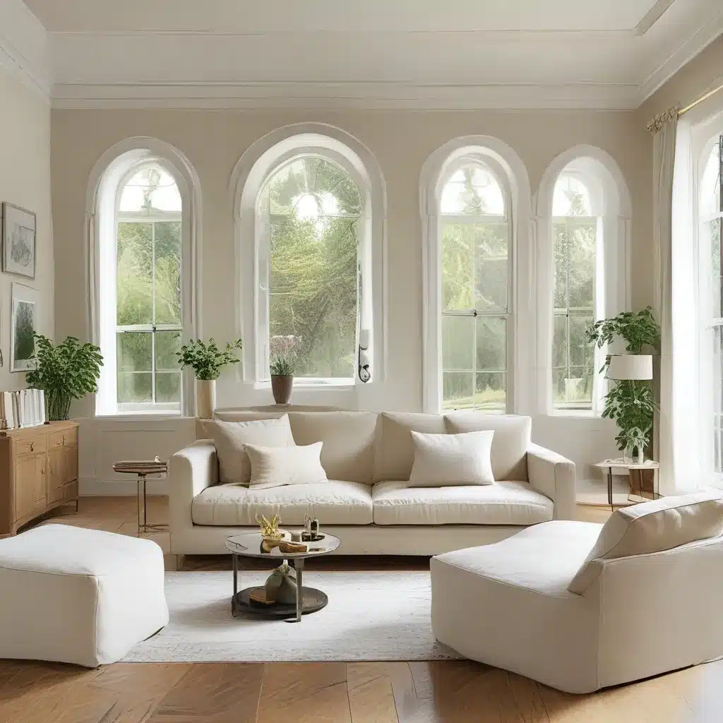
Imagine walking into a room where the sofa is too large for the space, dwarfing the other furnishings. Or picture a small chair getting lost in a vast, open room. These are classic examples of proportion gone awry, and they can quickly make a space feel off-balance and uncomfortable.
On the flip side, when you get the proportions right, the room comes alive. The eye moves seamlessly through the space, and the different elements work together to create a cohesive, visually engaging design. It’s like listening to a perfectly composed symphony – each instrument playing its part to create a harmonious whole.
Mastering the Art of Scale
While proportion is all about the balance between different objects, scale is all about the relationship between an item and the space it occupies. Imagine a large, overstuffed sofa in a small living room – it can feel overwhelming and make the space feel cramped. Conversely, a tiny chair in a spacious room can look lost and disconnected from the rest of the furnishings.
To achieve the right scale, accurate measurements are key. It’s not enough to go with your gut or personal preference when selecting furniture and decor. You need to consider how the size of an item will fit within the overall dimensions of the room, and how it will complement the other elements in the space.
By paying close attention to scale, you can create a visually harmonious and inviting environment that feels just right. It’s like finding the perfect pair of shoes – not too big, not too small, but just the right fit.
Balancing Act: Focal Points and Negative Space
Once you’ve got a handle on scale and proportion, there are a few other tricks up your sleeve to create a truly stunning and harmonious interior. One such trick is the strategic use of focal points.
Focal points serve as the anchors of a room, drawing the eye and creating a sense of balance. They can be architectural features, like a fireplace or a grand window, or they can be key furniture pieces, like a statement sofa or a grand piano. By arranging the space around a focal point, you can achieve a cohesive and visually engaging design.
But it’s not just about the positive space – the empty, negative space in a room is just as important. Embracing negative space can provide breathing room, balance, and visual rest, preventing the design from feeling overwhelming or cluttered.
Imagine a room with too many pieces of furniture, all vying for attention. It can feel chaotic and visually exhausting. Now, picture the same space with thoughtful use of negative space, allowing each element to shine. Suddenly, the room feels serene, balanced, and inviting.
The Power of Patterns and Colors
Patterns and colors play a crucial role in upholding proportion and balance within a space. Smaller patterns tend to work better in smaller rooms, while larger patterns can add drama and visual interest to larger spaces. Similarly, warmer hues can create a cozy, welcoming atmosphere, while cooler shades can encourage a sense of tranquility.
By considering the scale of the room and selecting appropriate patterns and colors, you can craft a visually appealing and balanced design. It’s all about finding the right harmony between the different elements, just like a skilled composer weaving together the various instruments in a symphony.
The Golden Ratio and the Rule of Thirds
If you really want to take your interior design game to the next level, look no further than the mathematical principles of the golden ratio and the rule of thirds. These principles have been used for centuries to create visually stunning and harmonious spaces.
The golden ratio, also known as the divine proportion, is a mathematical formula that can be applied to interior design to create aesthetically pleasing proportions and balance. This ratio, roughly 1.618, is widely accepted as the most visually appealing ratio for objects and spaces.
The rule of thirds, on the other hand, involves visually dividing a space or a wall into thirds, both vertically and horizontally, to create balance and visual interest. By placing key design elements along these dividing lines, you can achieve a harmonious and engaging composition.
Avoiding Common Proportional Pitfalls
Now, I know what you’re thinking – with all these principles and guidelines, it must be easy to mess things up, right? Well, you’re not wrong. Even experienced designers can sometimes fall into the trap of proportional pitfalls. But don’t worry, I’ve got your back.
One of the most common mistakes is ignoring the room’s architecture. The size, shape, and unique features of a space serve as the foundation for establishing the appropriate scale and proportion of furniture and decor. Overlooking these architectural elements can lead to imbalanced designs and a lack of harmony.
Another common pitfall is inaccurate measurements. Poorly scaled and proportioned spaces can result from a failure to accurately measure the dimensions of a room and the furniture that will occupy it. Investing in the right measuring tools and taking the time to get the numbers right can make all the difference.
Striking the Perfect Balance
Mastering the principles of scale and proportion in interior design is no easy feat, but the rewards are well worth the effort. By understanding and applying these concepts, you can create spaces that are not only visually stunning but also incredibly comfortable and inviting.
So, the next time you’re planning a room refresh or a new sofa purchase, remember the magic of proportions and scale. Measure carefully, consider the architectural elements, and embrace the power of focal points and negative space. With a little bit of practice and a whole lot of creativity, you can transform your space into a harmonious haven that leaves your guests in awe.
And who knows, maybe you’ll even find the perfect Sofa Spectacular sofa to anchor your beautifully proportioned room. Happy designing, my friends!


