The Power of Color in Furniture Design
As a furniture specialist with years of experience, I’ve seen trends come and go, but one thing remains constant: the impact of color on a room’s ambiance. When it comes to sofas, color choices can transform a space from mundane to magnificent. In recent years, I’ve noticed a shift away from the ubiquitous neutrals towards bolder, more adventurous color combinations.
Color is arguably the most potent design element at our disposal. It’s often the first thing people notice when entering a room, and it has the power to evoke emotions, set moods, and create visual interest. While patterns and textures play their part, solid colors have a unique ability to make a strong statement.
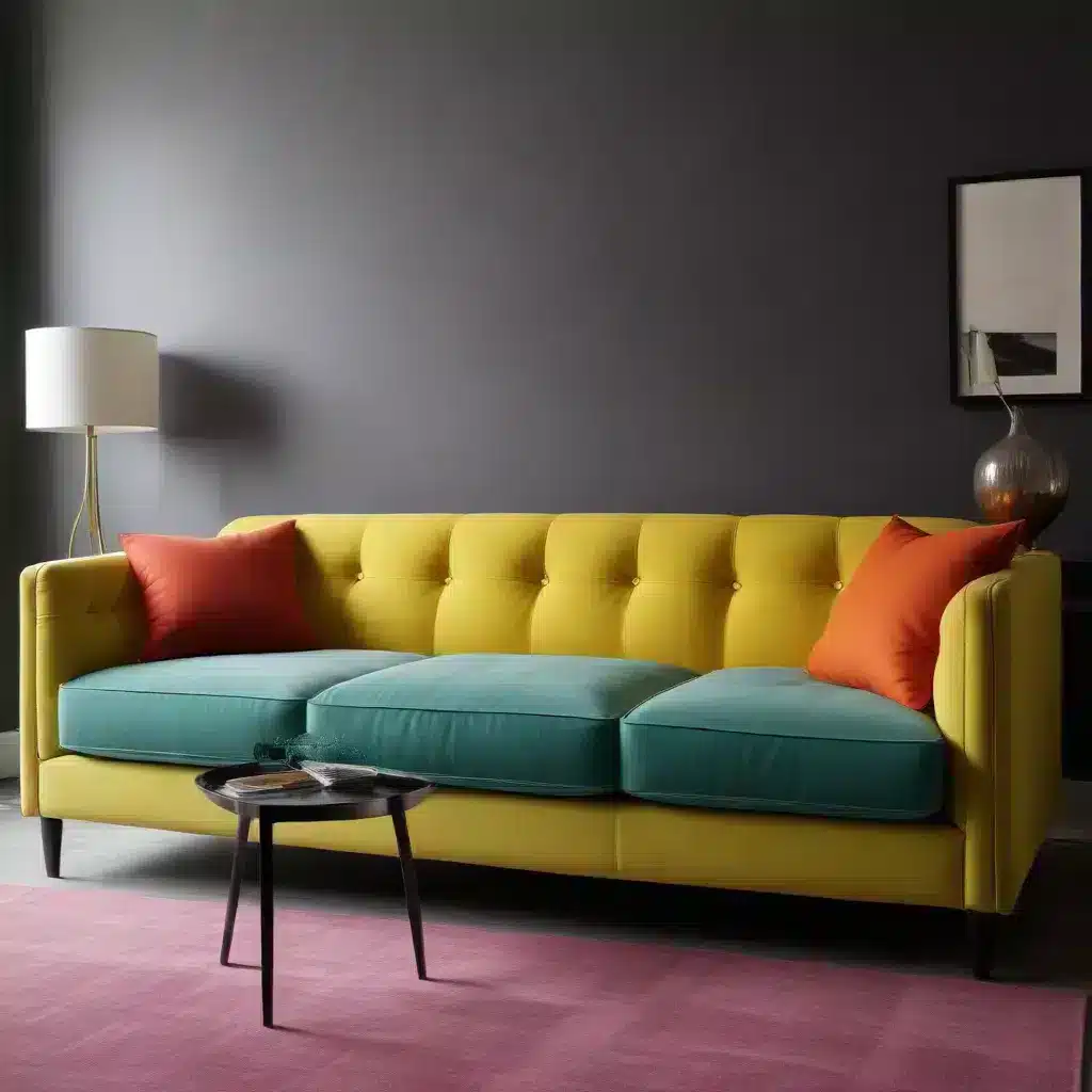
In my practice, I’ve found that homeowners are increasingly drawn to unexpected color pairings for their sofas and surrounding decor. This trend reflects a desire for personalization and self-expression in home design. By embracing unconventional color combinations, you can create a living space that’s not only visually striking but also a true reflection of your personality.
Breaking Away from Traditional Color Schemes
For years, the design world seemed to be in a monochromatic trance. White kitchens, grey sofas, and neutral palettes dominated interior spaces. While there’s undoubtedly a place for these timeless choices, I’ve been excited to see a resurgence of color in home decor, particularly when it comes to sofas.
My clients often ask me about “rules” for combining colors. The truth is, while color theory provides useful guidelines, there’s no hard and fast rule that says certain colors can’t work together. In fact, some of the most stunning interiors I’ve designed have featured seemingly disparate hues that, when combined, create a harmonious and eye-catching result.
Take, for instance, a recent project where we paired a deep teal sofa with coral and mustard accents. On paper, these colors might seem incompatible, but in practice, they created a vibrant, energetic living room that my clients absolutely adore. The key is to approach color combinations with an open mind and a willingness to experiment.
The Art of Combining Solid Colors
When working with solid colors, the possibilities are truly endless. Unlike patterns, which can sometimes limit your choices due to scale and complexity, solid colors offer a clean slate for creativity. Here’s an approach I often recommend to my clients:
- Start with a base color for your sofa. This could be anything from a rich jewel tone to a soft pastel.
- Choose two to three complementary or contrasting colors for accents. These can be incorporated through throw pillows, rugs, or wall art.
- Add depth with different shades and tints of your chosen colors.
- Incorporate neutral elements to balance the bold hues and provide visual rest.
For example, I recently designed a living room around a striking emerald green sofa. We complemented it with blush pink and deep purple accents, grounding the space with a charcoal grey rug and white walls. The result was a sophisticated yet playful room that perfectly reflected the homeowner’s personality.
Unexpected Color Pairings That Work
Over the years, I’ve discovered some surprising color combinations that consistently wow my clients. Here are a few of my favorites:
| Sofa Color | Accent Colors | Why It Works |
|---|---|---|
| Cobalt Blue | Coral and Chartreuse | The intensity of the blue is balanced by the warmth of coral and the zesty chartreuse |
| Mustard Yellow | Plum and Teal | The earthy yellow provides a perfect backdrop for the rich plum and cool teal |
| Blush Pink | Forest Green and Navy | The softness of pink is beautifully contrasted by the depth of green and navy |
These combinations might seem unconventional at first glance, but they create spaces that are both harmonious and visually interesting. The key is to balance intensity and tone, ensuring that no single color overpowers the others.
Incorporating Bold Colors in Small Spaces
Many homeowners shy away from bold colors in smaller rooms, fearing they’ll make the space feel cramped. However, I’ve found that the opposite can often be true. A well-chosen bold color can actually make a small space feel more expansive and inviting.
In a recent project, we transformed a tiny studio apartment by using a rich sapphire blue sofa as the focal point. Rather than overwhelming the space, the deep blue created a sense of depth, making the room feel larger. We complemented the sofa with crisp white walls and pops of sunny yellow in the accessories, resulting in a space that felt open, airy, and full of personality.
When using bold colors in small spaces, consider the following tips:
- Limit your palette to two or three main colors to avoid visual clutter.
- Use lighter shades on the walls to create a sense of openness.
- Incorporate plenty of natural light to balance the intensity of the colors.
- Use mirrors strategically to reflect light and color, enhancing the sense of space.
The Role of Texture in Solid Color Design
While we’re focusing on solid colors, it’s important not to overlook the role of texture in creating a well-rounded design. In fact, when working with solid colors, texture becomes even more critical in adding visual interest and depth to a space.
I often advise my clients to think about texture as another layer of color. A velvet sofa in a rich hue will reflect light differently than a linen sofa in the same shade, creating a subtle variation that adds complexity to the overall design. Similarly, mixing textures in your accent pieces can create a tactile experience that complements your color choices.
In a recent project, we paired a smooth leather sofa in a deep burgundy with nubby wool throw pillows in shades of rust and terracotta. The interplay of textures and tones created a warm, inviting space that felt both sophisticated and cozy.
Balancing Bold Colors with Neutrals
While I’m a strong advocate for bold color choices, I also recognize the importance of balance in design. Neutral elements play a crucial role in grounding a space and preventing it from feeling overwhelming or chaotic.
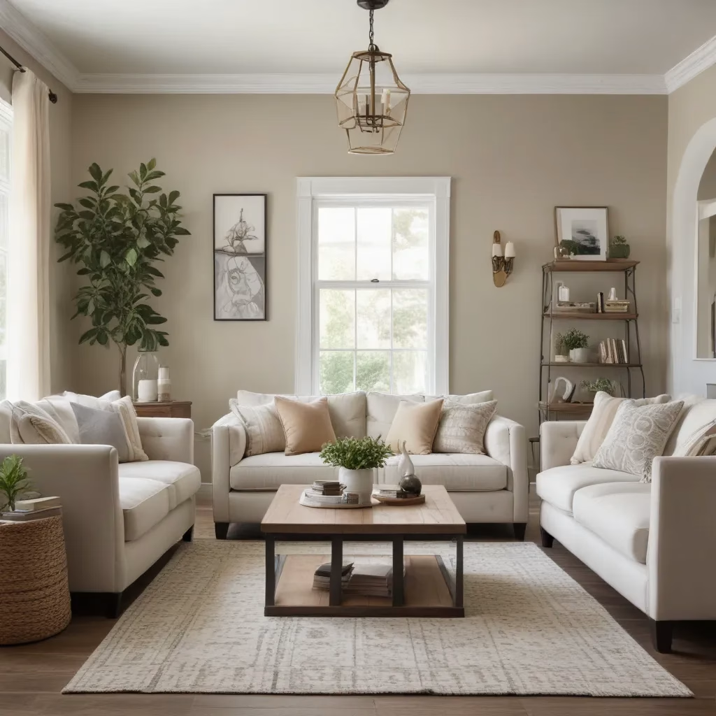
When incorporating a boldly colored sofa into a room, consider using neutral tones for larger elements like walls, floors, or large pieces of furniture. This creates a canvas that allows your colorful sofa to shine without competing for attention.
For instance, in a living room featuring a vibrant orange sofa, we used warm grey walls and a cream-colored rug to create a serene backdrop. The neutral elements helped to soften the intensity of the orange, resulting in a space that felt both energetic and relaxing.
Color Psychology in Sofa Selection
As a furniture specialist, I’ve learned that color choices are often deeply personal and can be influenced by factors beyond mere aesthetics. Color psychology plays a significant role in how we perceive and interact with our living spaces.
When selecting a sofa color, consider the mood you want to create in your room:
- Blue tones are often associated with calmness and serenity, making them excellent choices for relaxing spaces like bedrooms or reading nooks.
- Yellow and orange hues can evoke feelings of warmth and energy, perfect for social areas like living rooms.
- Green shades are linked to nature and can create a refreshing, rejuvenating atmosphere.
- Purple tones are often associated with luxury and creativity, making them great choices for home offices or artistic spaces.
Remember, these associations can vary based on cultural background and personal experiences. The most important factor is choosing colors that resonate with you and make you feel comfortable in your space.
Maintaining Bold-Colored Sofas
One concern I often hear from clients considering boldly colored sofas is maintenance. It’s true that lighter colors can be more forgiving when it comes to showing wear and tear, but with proper care, a vibrant sofa can retain its beauty for years to come.
Here are some tips I share with my clients for maintaining bold-colored sofas:
- Choose high-quality, durable fabrics that are resistant to fading and wear.
- Regularly vacuum or brush your sofa to remove dust and debris.
- Address spills immediately to prevent staining.
- Use arm and headrest covers in high-traffic areas to protect against wear.
- Consider professional cleaning once or twice a year to keep your sofa looking its best.
With these practices in place, you can enjoy your boldly colored sofa without worrying about premature aging or fading.
Adapting Color Trends to Your Personal Style
While it’s exciting to stay current with color trends, it’s equally important to choose colors that reflect your personal style and complement your existing decor. At Sofa Spectacular, we believe that your home should be a reflection of your unique tastes and lifestyle.
When working with clients, I always encourage them to consider their long-term comfort with a color choice. Trends come and go, but your sofa is an investment piece that should bring you joy for years to come. If you’re drawn to a particular trend but unsure about committing to it fully, consider incorporating it through accent pieces that can be easily changed.
For example, if you’re intrigued by the current trend of jewel tones but hesitant to invest in a sapphire blue sofa, you might opt for a neutral sofa and bring in the trend through throw pillows, artwork, or a statement chair. This allows you to experiment with bold colors without committing to a major piece of furniture.
The Impact of Lighting on Color Perception
One often overlooked aspect of color selection is the impact of lighting on how we perceive color. As a furniture specialist, I always advise my clients to consider the natural and artificial lighting in their space when choosing sofa colors.
Natural light can significantly alter the appearance of colors throughout the day. A color that looks vibrant and rich in morning light might appear muted or dull in the evening. Similarly, artificial lighting can enhance or diminish certain hues.
Before making a final decision on your sofa color, I recommend the following:
- Observe the room at different times of day to understand how the natural light changes.
- Test fabric swatches in your space under various lighting conditions.
- Consider the type of artificial lighting you use (warm vs. cool tones) and how it interacts with your chosen colors.
- If possible, view the sofa in person rather than relying solely on online images or catalog photos.
By taking lighting into account, you can ensure that your bold color choices look just as stunning in your home as they did in the showroom.
Creating a Cohesive Color Scheme
While a boldly colored sofa can serve as a fantastic focal point, it’s important to consider how it will fit into your overall color scheme. A well-designed room should feel cohesive, with colors that complement and enhance each other.
One approach I often use is the 60-30-10 rule. This guideline suggests using:
- 60% of a dominant color (often a more neutral tone)
- 30% of a secondary color
- 10% of an accent color
For example, in a room with a vibrant red sofa, you might use:
- 60% warm grey (walls, large furniture pieces)
- 30% red (the sofa)
- 10% gold or yellow (accent pieces, artwork)
This formula helps create a balanced look while still allowing your bold sofa to shine. Of course, rules are made to be broken, and some of the most interesting spaces come from pushing the boundaries of traditional color theory.
The Future of Color in Sofa Design
As we look to the future of furniture design, I’m excited by the continued evolution of color trends. We’re seeing a move towards more nuanced, complex colors that defy easy categorization. These “new neutrals” offer subtle depth and interest while still providing a versatile backdrop for changing styles.
Additionally, there’s a growing interest in colors inspired by nature, reflecting our increasing desire to connect with the outdoors. Earthy greens, warm terracottas, and deep ocean blues are likely to remain popular choices for sofas and other furniture pieces.
However, perhaps the most exciting trend is the move towards personalization. With advancements in manufacturing and an increased focus on individual expression, we’re likely to see more options for custom colors and finishes. This means you’ll have even more opportunity to create a truly unique space that reflects your personal style.
As we continue to push the boundaries of color in furniture design, I’m reminded of why I fell in love with this field in the first place. There’s something truly magical about the way color can transform a space, creating environments that inspire, comfort, and delight. Whether you’re drawn to bold, vibrant hues or subtle, sophisticated tones, there’s never been a better time to express yourself through color in your home.
In conclusion, don’t be afraid to experiment with surprising color combinations in your sofa and home decor choices. With a thoughtful approach and a willingness to trust your instincts, you can create a space that’s not only visually stunning but also a true reflection of your unique personality and style.


