As a new parent-to-be, the prospect of designing the perfect nursery can feel both exhilarating and overwhelming. After all, this room will serve as the cherished haven for your little one, a space that needs to be equal parts functional and enchanting. But fret not, my fellow decor enthusiasts, because I’m here to guide you through the process of crafting a nursery that’s not just Instagram-worthy, but truly a reflection of your family’s unique style and personality.
Laying the Foundation: Color and Mood
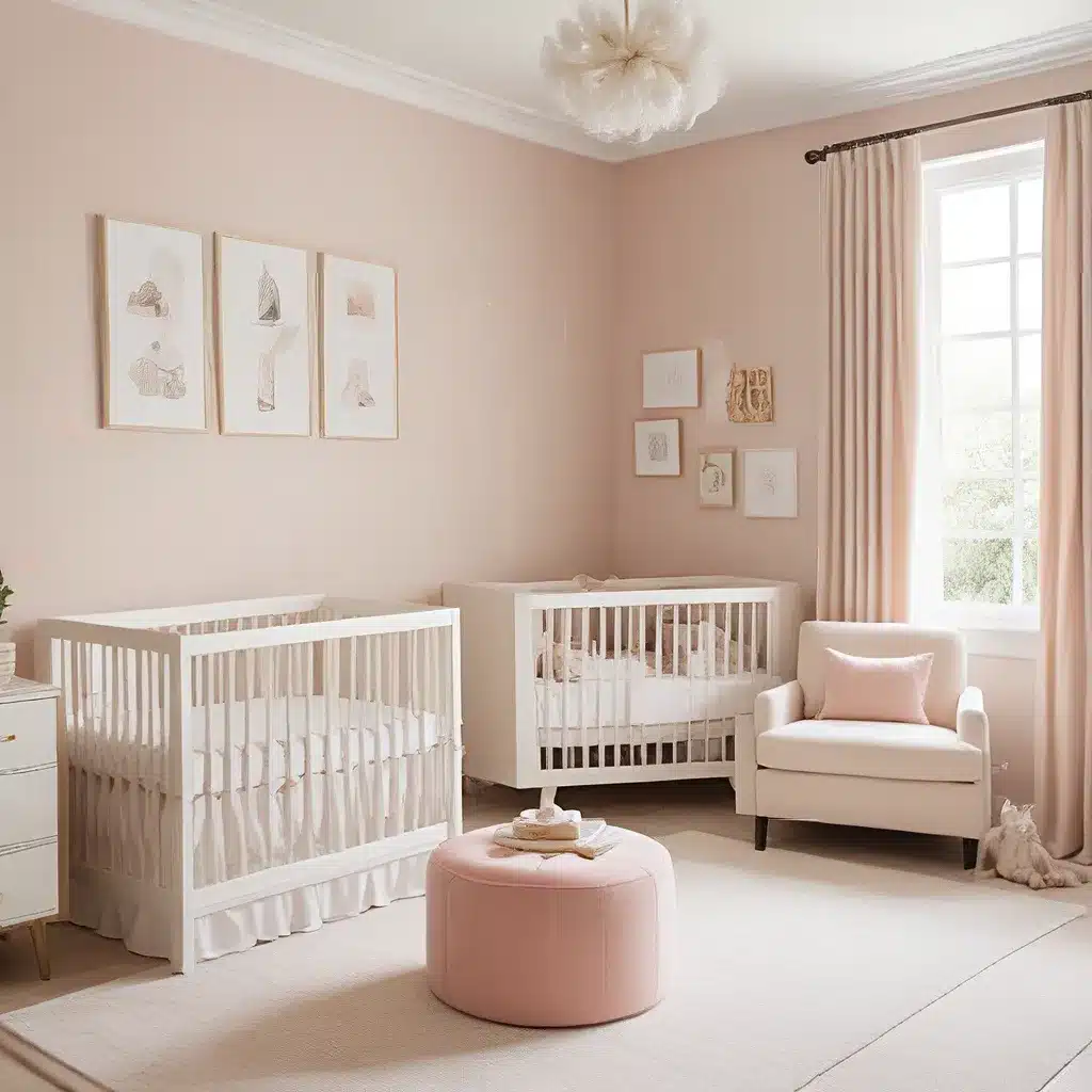
When it comes to nursery design, the color palette is the foundation upon which you’ll build your vision. Blessed Little Bungalow, the design experts I had the pleasure of working with, imparted some invaluable insights. “The walls, trim, and doors were sprayed in Benjamin Moore’s Lehigh Green-Parsley Snips in an eggshell finish,” they shared, “and the ceiling is a 50/50 mix of Farrow & Ball’s Light Blue and Benjamin Moore’s White Dove in a matte finish.” This striking combination of earthy green and serene blue instantly sets the tone for a space that’s both soothing and sophisticated.
But color isn’t just about aesthetics – it can also have a profound impact on a baby’s mood and development. “Depending on the time of day, the green can read as deep, dark green-blue or a light, forest-y hue,” the designers noted. “It’s the perfect balance of calming and energizing, creating an environment that’s both tranquil and stimulating for little ones.” By thoughtfully considering the psychological effects of color, you can craft a nursery that not only looks beautiful but also fosters a sense of comfort and well-being.
Layering Textures and Patterns
Once you’ve established your color foundation, it’s time to start layering in the textures and patterns that will bring the space to life. “I used a Calico fabric for the drapes, and the pom trim adds such a sweet little detail that truly makes them feel special,” the designer shared. The juxtaposition of the soft, billowing curtains and the playful pom-pom trim creates a delightful visual contrast, inviting you to linger and soak in the cozy ambiance.
But the textural elements don’t stop there. “I found a unicorn oushak rug on Etsy, but it wasn’t large enough to fill the room, so I went to my favorite eBay rug shop that sells manufactured damaged rugs for a deep discount and got a 10×10 seagrass rug to layer underneath.” This clever layering technique not only solves the size dilemma but also adds depth and visual interest to the space, seamlessly blending the rich, patterned rug with the natural, earthy tones of the seagrass.
Blending Old and New
One of the hallmarks of truly stunning design is the ability to skillfully blend old and new elements, and the nursery I had the pleasure of creating is no exception. “The antique bamboo dresser was a Facebook Marketplace find,” the designer revealed, “and I decided to take an asymmetrical approach to style the mirror and lamp, which I really like how it turned out.”
This delightful juxtaposition of vintage and modern pieces not only elevates the overall aesthetic but also imbues the space with a sense of timelessness. “The second chest, a beautiful French Linen Etienne dresser, which I’ve been eyeing for quite some time, was generously gifted by Frontgate,” the designer continued. “Unlike a true French antique, it has some useful modern features like smooth-gliding drawers, a power outlet, and USB port.”
By embracing a mix of old and new, you create a nursery that feels both classic and contemporary, a space that will grow and evolve with your child, seamlessly transitioning from the cozy cocoon of infancy to the vibrant exploration of toddlerhood and beyond.
Personalized Touches and Functionality
But a nursery isn’t just about creating a visually stunning space – it’s also about crafting a functional and personalized oasis. “The Metrie New traditional molding and casing throughout was here from my office makeover, which matches the molding installed in other rooms, but we added Metrie’s casing for our new closet doors and entry door,” the designer shared.
These thoughtful details not only elevate the overall aesthetic but also ensure a cohesive flow throughout the home, making the nursery feel like a natural extension of the rest of the living spaces. And speaking of functionality, the designer’s approach to the closet system is nothing short of genius. “The closet system I ordered didn’t come in time for the reveal, but I’ll share photos once everything is set up. The Sandberg Raphael light blue wallpaper in the closet is my favorite part of the room – it really makes the closet feel like a hidden gem.”
Personalized Touches and Sentimental Favorites
Of course, no nursery is complete without those heartfelt, personalized touches that truly make it a reflection of your family. “One of my favorite artists, Alexis Walter, truly created the most special commission for this room,” the designer gushed. “I sent her the color palette, and she created such a gorgeous, serene piece of art that I will forever cherish.”
And the designer’s love for unique finds doesn’t stop there. “The bunny art was a print from Saatchi, a fun play on the Radish fabric.” These thoughtful, one-of-a-kind pieces not only add visual interest but also infuse the space with a sense of warmth and personality, making it a true reflection of the family that will call it home.
Creating a Cohesive Oasis
As I’ve discovered through this incredible journey, the key to a successful nursery design is all about finding the perfect balance between function and fashion, old and new, and personal touches and cohesive styling. By working with the talented team at Blessed Little Bungalow, I was able to create a space that not only looks stunning but also feels like a true oasis for my growing family.
And the best part? I know that this nursery will continue to evolve and adapt as my little one grows. “Unlike a true French antique, the Etienne dresser has some useful modern features like smooth-gliding drawers, a power outlet, and USB port,” the designer shared. “You may be wondering if the closet door is able to fully open with the dresser there, and the answer is no, but I don’t need it to fully open. It opens wide enough, and the extra storage was more important to me in that corner than a fully opening closet door that doesn’t need to be fully opened.”
These thoughtful design decisions not only maximize the functionality of the space but also ensure that the nursery can seamlessly transition into a big-kid room, growing and adapting to my child’s changing needs and interests. It’s a space that will be a cherished sanctuary for years to come, a nurturing and inspiring environment that will foster their development and creativity.
So, whether you’re just beginning your nursery design journey or you’re looking to breathe new life into an existing space, I hope that my experience has inspired you to embrace the perfect blend of style, function, and personal touch. After all, Sofa Spectacular is here to help you create a nursery that is not just beautiful, but truly a reflection of your family’s unique story.
