Currently Empty: £0.00

When it comes to home decor, the world of neutrals can be a tricky landscape to navigate. Everybody wants that elusive “perfect neutral,” but achieving that dream hue can be easier said than done. As a self-proclaimed neutral enthusiast, I’ve learned the hard way that not all neutrals are created equal. In fact, the undertones in your neutral shades can make all the difference between a room that sings and one that just falls flat.
Mastering the Art of Neutral Tones
I’ll never forget the time a client asked me to help them pick out the “nicest neutral” for their living room walls. Little did they know, I was about to embark on a journey of color discovery that would change the way they saw neutrals forever. You see, when it comes to neutrals, there’s no such thing as a one-size-fits-all solution.
As color expert Maria Killam explains, every neutral has an underlying undertone that can range from pink and yellow to green and blue. And if that undertone doesn’t harmonize with the other neutrals in your space, you’re in for a world of pain.
“If a neutral looks like it doesn’t have an undertone, it’s because it relates to everything and because of that then looks neutral,” Killam says. “But there’s no such thing as a neutral without an undertone.”
The Perils of Mismatched Undertones
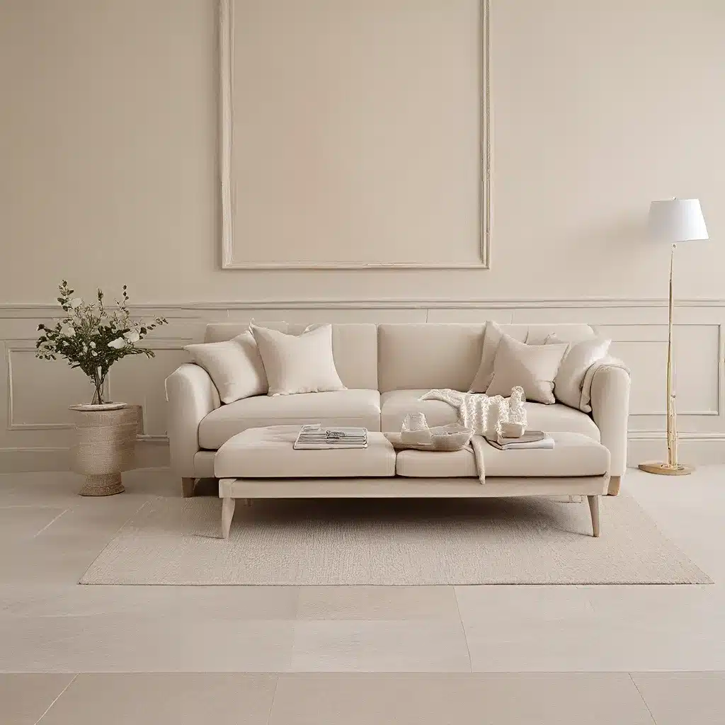
I learned this lesson the hard way when that client asked me to help them refresh their living room. They had a lovely beige sofa that was more on the pink side, and they wanted a wall color that would complement it. Easy enough, right? Wrong.
I scoured paint chips, trying to find the perfect neutral that would tie the whole room together. But no matter how “neutral” the colors seemed, they just didn’t sit right with that pink-toned sofa. It wasn’t until I started paying attention to the underlying undertones that things started to click.
“If you pick a yellow beige for your walls when your broadloom is actually a pink beige, you will wonder why your carpets look dirty and blame it on the boring beige you’ve picked,” Killam warns. And she’s absolutely right. When the undertones in your neutrals don’t align, the whole space can feel off, no matter how beautiful the individual elements are.
Finding Your Neutral Soulmate
So, how do you avoid this neutral nightmare? The key, according to Killam, is to “relate to the existing neutrals in your interior or exterior.” In other words, don’t just grab the first “nice neutral” you see and call it a day. Take a step back, assess the other neutrals in your space, and find a shade that harmonizes with them.
As design expert Jessica Gordon Ryan puts it, “When done properly, animal prints can have the same effect” as a classic black-and-white palette – they’re timeless, elegant, and can work with any decorating style.
The same goes for neutrals. Find the right undertone, and your room will sing. But get it wrong, and you might as well be staring at a sea of khaki. Trust me, I’ve been there, and it’s not a pretty sight.
Putting It All Together
So, how do you find your neutral soulmate? It all starts with a little detective work. Take a good, hard look at the existing neutrals in your space – your flooring, your furniture, your trim work. What undertones do you see? Is it more of a pink beige, a yellow beige, or something else entirely?
Once you’ve identified the dominant neutral undertone, the search for the perfect wall color becomes a whole lot easier. Sofa Spectacular has a wide range of neutral-toned sofas and accent pieces that can help you zero in on the right hue. And don’t be afraid to experiment with samples – it’s the only way to know for sure how a color will play with the other elements in your space.
Remember, the key to nailing your neutral palette is all about finding that perfect harmony. It may take a bit of trial and error, but trust me, it’s so worth it. Because when you finally land on that elusive “nice neutral,” your whole space will come alive in the most subtle and sophisticated way.
Beyond the Beige: Exploring the New Neutrals
But who says neutrals have to be boring? In recent years, we’ve seen a rise in what I like to call the “new neutrals” – subtler, more complex shades that go beyond the traditional beige and gray. Think rich, earthy tones like olive green, dusty rose, and even soft lavender.
As design blogger Melissa Fenlon notes, these new neutrals can add a touch of elegance and sophistication to any space. And the best part? They play incredibly well with pattern and texture – from animal prints to subtle tie-dye.
So, if you’re feeling stuck in a neutral rut, don’t be afraid to branch out and explore these fresh, modern takes on the classic palette. Who knows, you might just find the perfect shade to bring your space to life in a whole new way.
Putting It All Together: A Sofa Spectacular Success Story
Remember that client I mentioned earlier? Well, after our initial neutral debacle, we went back to the drawing board and really dove deep into understanding the undertones in their space. It wasn’t easy, but with a little patience and a lot of paint samples, we finally landed on the perfect greige that complemented their pink-toned sofa beautifully.
The transformation was nothing short of stunning. Suddenly, the living room felt cohesive, elegant, and oh-so-inviting. And the best part? My clients were over the moon with the results, raving about how much they loved their new “neutral oasis.”
So, if you’re on the hunt for the perfect neutral, remember: it’s all about finding that harmony, that soulmate shade that speaks to the other elements in your space. It may take some time and effort, but trust me, the payoff is more than worth it. Your home – and your sanity – will thank you.

