As someone who has always been drawn to the vibrant and unexpected, I can’t help but get excited about the prospect of color clashing and pattern mixing in interior design. It’s a bold and daring approach that challenges the traditional notions of what “goes together” and allows us to embrace the beauty and energy of seemingly contrasting elements.
Embracing the Clash
I’ll admit, when I first started experimenting with bold color combinations and mismatched patterns, it felt a bit intimidating. After all, we’re often told to stick to neutral palettes or to play it safe with our decor choices. But the more I explored, the more I realized that the key to pulling off this look is to embrace the clash wholeheartedly.
Think about it – nature is constantly showcasing the most breathtaking color combinations, from the vibrant greens and purples of a lush garden to the fiery oranges and reds of a sunset. And if we take a closer look, we’ll see that these hues and textures often exist in perfect harmony, despite their seemingly clashing qualities. So why shouldn’t we bring that same level of fearlessness and creativity into our homes?
Harnessing the Power of Patterns
Of course, color is only half the equation when it comes to creating a bold, visually striking interior. Patterns play a crucial role in adding depth, interest, and that all-important sense of clash. And the best part is, there are no rules when it comes to how you combine them.
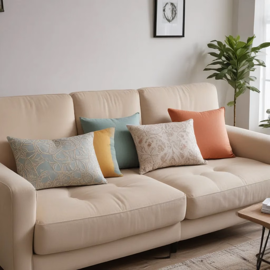
Want to pair a bold, geometric print with a delicate floral? Go for it. Craving a mix of stripes, polka dots, and abstract brushstrokes? Absolutely! The key is to find a common thread – whether it’s a shared color palette or a complementary scale – that ties the different patterns together, while still allowing them to stand out and create a sense of visual tension.
The Art of Balance
Now, I know what you’re thinking – won’t all this clashing and contrasting just end up looking like a chaotic mess? And that’s a valid concern. The trick is to find the right balance between the bold and the harmonious, to create a space that’s visually stimulating without feeling overwhelming.
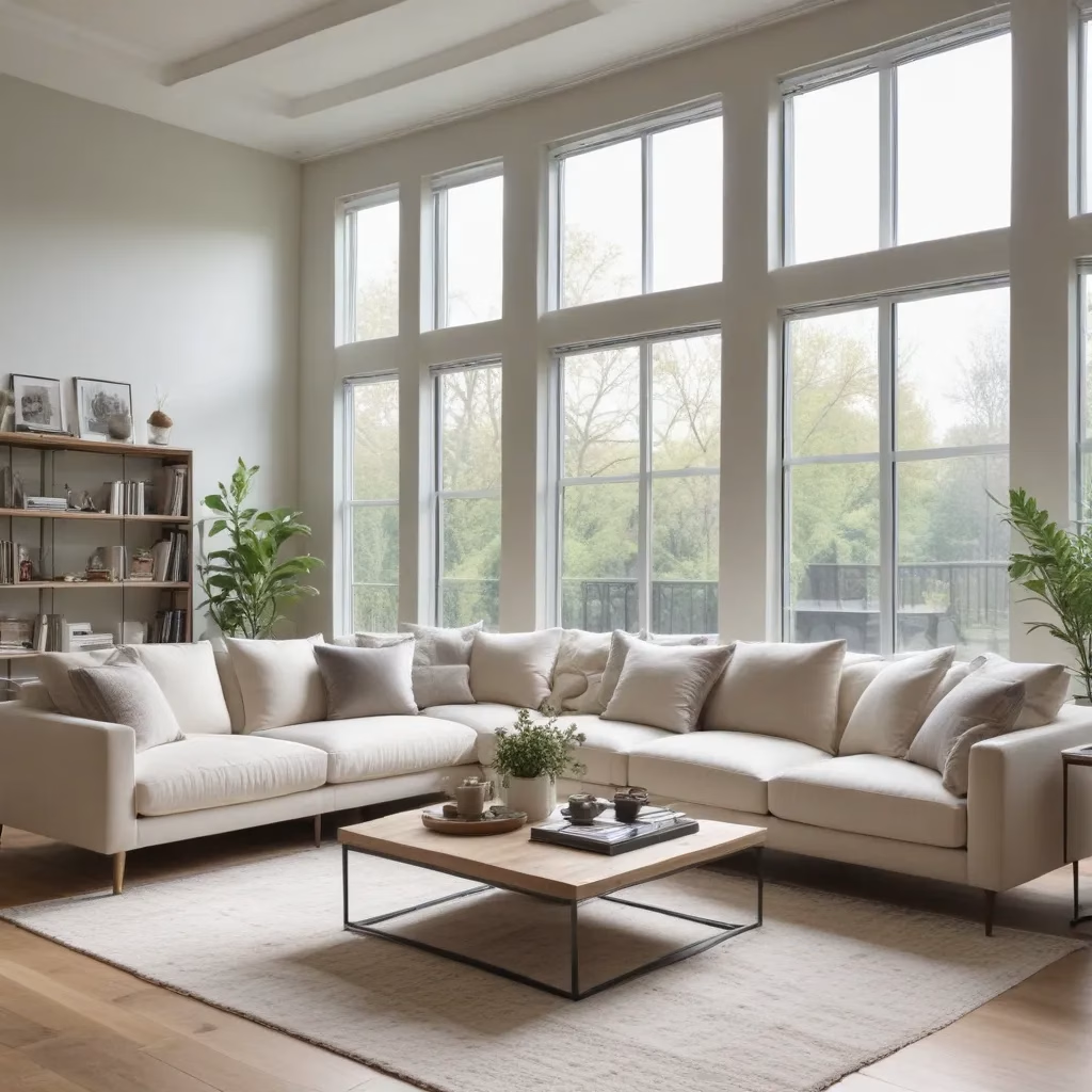
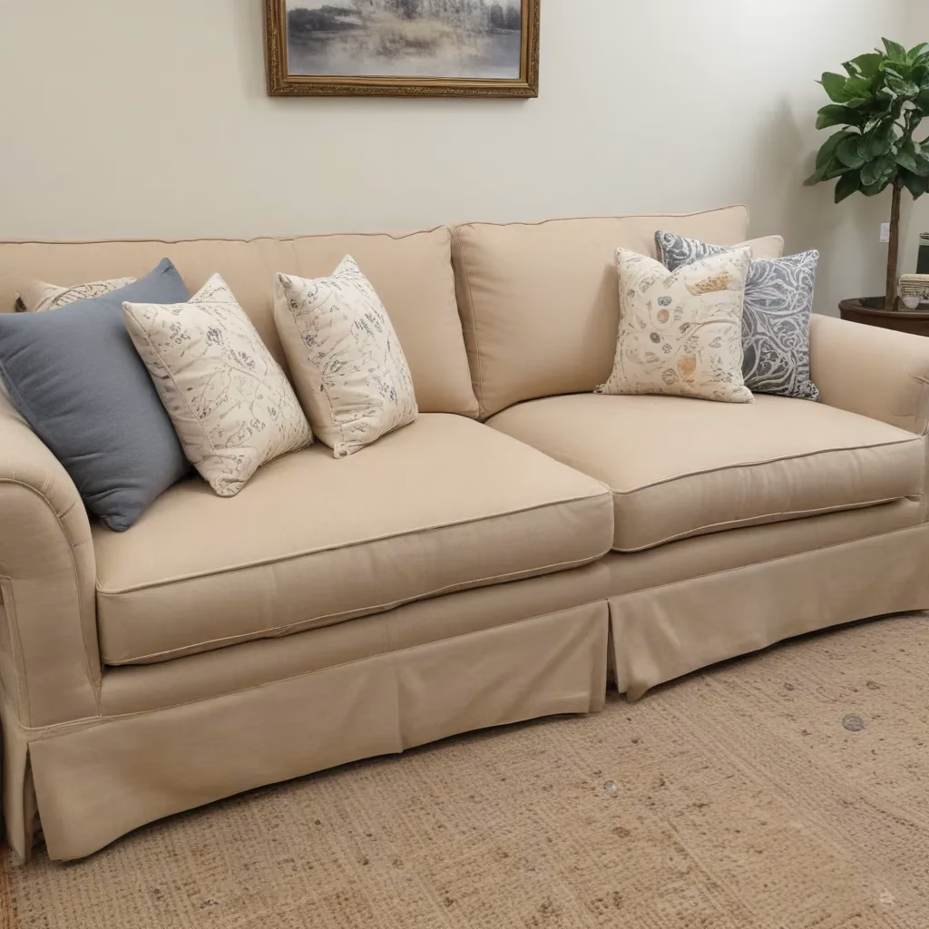
One of my go-to strategies is to choose one dominant color or pattern, and then use the other elements as accents or supporting players. This could mean having a large, statement-making sofa in a vibrant hue, and then layering in throw pillows, rugs, and accessories in complementary tones and prints. Or it could mean going for a more neutral base, like a Sofa Spectacular in a classic beige, and then letting your accessories do the talking.
Embracing Imperfection
Another key to making the color clash and pattern mix work is to embrace a bit of imperfection. Gone are the days of everything having to match perfectly – in fact, I’d argue that a little bit of mismatching is what gives a space its character and personality.
Think about it – when we look at those stunning Japanese kimonos or the textiles of various indigenous cultures, we’re often drawn to the subtle asymmetries, the unexpected color combinations, and the layers of history and tradition that are woven into each piece. And the same principles can be applied to our own interiors.
Bringing It All Together
So, how do you put all of this into practice? Well, the beauty of the color clash and pattern mix approach is that there’s no one-size-fits-all solution. It’s all about experimentation, trial and error, and trusting your own instincts.
Start by identifying the colors and patterns that you’re drawn to – maybe it’s a bold, graphic print in shades of purple and green, or a mix of stripes, florals, and abstract motifs. Then, begin layering them into your space, playing with scale, texture, and placement to create a visually dynamic and cohesive look.
And remember, the process should be fun. Embrace the unexpected, don’t be afraid to make mistakes, and trust that the more you experiment, the more you’ll discover about your personal style and what makes your heart sing.
After all, as the Japanese aesthetics suggest, the true beauty lies in the natural world around us – and it’s up to us to harness that inspiration and bring it into our homes in the most daring and creative ways possible.
Unlocking Your Creativity
Of course, I know that the prospect of color clashing and pattern mixing can feel a bit daunting, especially if you’re more accustomed to playing it safe with your decor choices. But I truly believe that it’s a skill that can be learned and honed over time.
One of the best ways to get started is to simply start paying attention to the world around you. Look at the way the colors and textures in nature intertwine and complement one another. Take note of the unexpected pairings you see in fashion and art. And don’t be afraid to experiment – try out new combinations, mix and match different elements, and see what sparks your creativity.
And remember, the Sofa Spectacular team is always here to help. Whether you’re looking for inspiration or just need a little guidance, we’re passionate about helping our customers create spaces that are truly unique and reflective of their personal style.
So, what are you waiting for? Embrace the clash, unlock your creativity, and let’s start building the bold, vibrant, and utterly spectacular interiors of your dreams!
