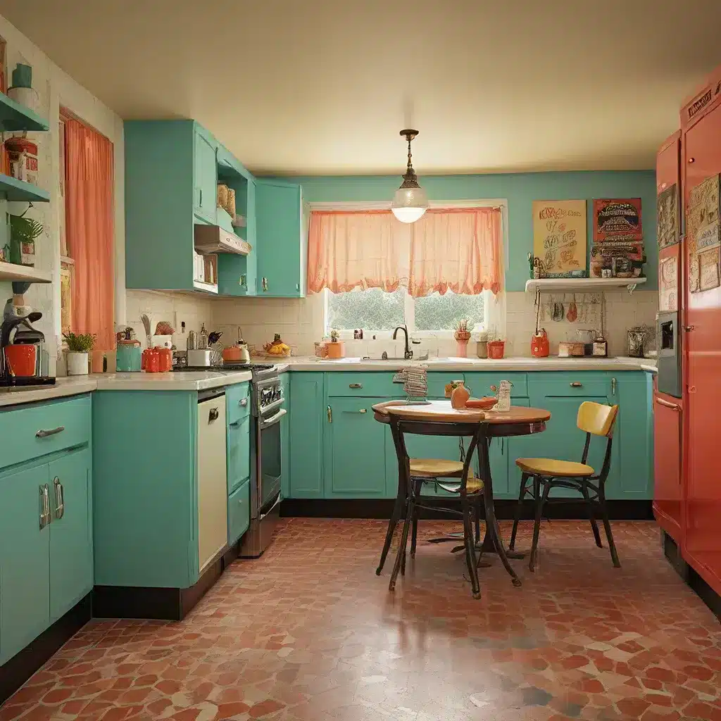
A Blast from the Past – Bringing Back the Bold
I never thought I’d be excited about the return of avocado green and burnt orange, but here we are. It seems like the vintage color schemes of yesteryear are making a major comeback, and I’m here for it. As a self-professed design junkie, I can’t get enough of this retro redux.
What is it about these nostalgic hues that has us all so captivated? Is it a longing for simpler times? A rejection of the sterile minimalism that has dominated interior design for the past decade? Or maybe we’re just a bunch of sentimental saps who can’t resist the allure of a good throwback.
Whatever the reason, one thing is clear – vintage color schemes are having a serious moment. From fashion to furniture and everywhere in between, these bold blasts from the past are popping up everywhere. And you know what? I kind of love it.
A Colorful Comeback
Now, I’ll admit, when I first started seeing avocado green and harvest gold making their way back into the mainstream, I was a bit…skeptical. These were the colors that defined my grandmother’s kitchen, for crying out loud. How could they possibly be considered stylish and trendy?
But then I started to really look at how designers were reimagining these classic hues. Gone were the dated, dingy versions of the past. In their place were rich, vibrant shades that felt fresh and modern. Suddenly, those retro tones didn’t seem so outdated after all.
Sofa Spectacular, a custom furniture company in the UK, has been at the forefront of this vintage color comeback. Their latest collection features a stunning avocado green sectional that has me drooling. The deep, earthy tone is the perfect balance of old-school charm and contemporary cool. And paired with sleek, mid-century inspired lines, it’s a far cry from the avocado appliances of my grandma’s day.
A Whole New Palette
But it’s not just the classic earth tones making a comeback. Bold, saturated hues from the 60s, 70s, and 80s are also having a major moment. Think rich jewel tones, vibrant primaries, and groovy color-blocking.
Take a look at this 100-year-old home that’s embracing a retro color scheme. The deep, moody blue walls provide the perfect backdrop for pops of mustard yellow and fiery orange. It’s bold, it’s dynamic, and it’s oh-so-nostalgic.
And it’s not just happening in home decor. Fashion is also getting in on the vintage color action. Runway shows are awash in psychedelic prints and retro hues, from Gucci’s 70s-inspired floral frocks to Prada’s mod color-blocking. Even mainstream brands like Zara and H&M are channeling the past with their latest collections.
A Timeless Trend
So what is it about these vintage color schemes that has us all so captivated? I think it’s a combination of factors. On one hand, there’s the obvious nostalgia factor. These colors evoke a sense of comfort and familiarity, reminding us of simpler times and beloved childhood memories.
But there’s also a timeless quality to these hues that makes them feel fresh and modern, too. Take a color like burnt orange, for example. It’s a shade that was hugely popular in the 70s, but it also has a rustic, earthy feel that makes it feel right at home in today’s more naturalistic design trends.
And let’s not forget the sheer joy and vibrancy these colors bring. After years of gray-on-gray and beige-on-beige, there’s something so refreshing about embracing bold, unapologetic hues. They infuse a space with energy and personality, creating a mood that’s both playful and sophisticated.
A Retro Redo for the Modern Home
So how can you incorporate these retro-inspired color schemes into your own home? The key is to strike a balance between old and new, blending vintage vibes with modern sensibilities.
Take a page from Icethetics and experiment with unexpected color combinations. Who would have thought that deep burgundy and mint green could work so well together? Or that mustard yellow and hunter green could create such a rich, dynamic palette?
And don’t be afraid to mix in some contemporary elements, too. A sleek, mid-century inspired sofa in a bold hue like burnt orange or avocado green can provide the perfect balance of old and new. Or try pairing vintage-inspired wallpaper with clean-lined, minimalist furniture for a look that’s both retro and refined.
The key is to have fun with it. Embrace the boldness, let your personality shine, and don’t be afraid to take a few risks. After all, that’s what makes these vintage color schemes so irresistible in the first place.
So what are you waiting for? It’s time to get your retro redux on and bring a little blast from the past into your home. Trust me, your inner design nerd will thank you.
