Embracing the Art of Tranquility
As the chilly winds of winter begin to whisper through the air, I find myself yearning for a cozy sanctuary – a space that envelops me in a sense of serenity and calm. Now, don’t get me wrong, I love a bit of festive flair as much as the next person. But sometimes, all I crave is a serene haven that allows me to truly unwind and recharge.
That’s why I’ve been on a mission to transform my living room into a peaceful oasis, and let me tell you, I’ve uncovered some real gems when it comes to color palettes that evoke a sense of tranquility. It all started when I stumbled upon the Trico Painting blog, where they shared their insights on the 2024 Color of the Year selections from industry giants Benjamin Moore and Sherwin Williams. Let me tell you, these colors are an absolute dream for creating a cozy, winter-inspired interior.
Sherwin Williams’ Soothing Sanctuary
Sherwin Williams’ Color of the Year for 2024, aptly named “Upward” (SW 6239), is a testament to the power of a soft, natural tone. This versatile hue has a way of effortlessly blending into the broader color wheel, making it an ideal choice for creating a harmonious and tranquil atmosphere in any living space.
As I started to explore how I could incorporate this serene shade into my own home, I couldn’t help but get giddy at the thought of pairing it with other calming colors from the Sherwin Williams palette. Can you just imagine the depth and character it would bring to a room when combined with the crisp, snowy tones of “Snowbound” (SW 7004) or the dreamy softness of “Drift of Mist” (SW 9166)? And let’s not forget the impact a touch of “Gale Force” (SW 7605) or the inky elegance of “Tricorn Black” (SW 6528) could have, adding just the right amount of contrast and visual interest.
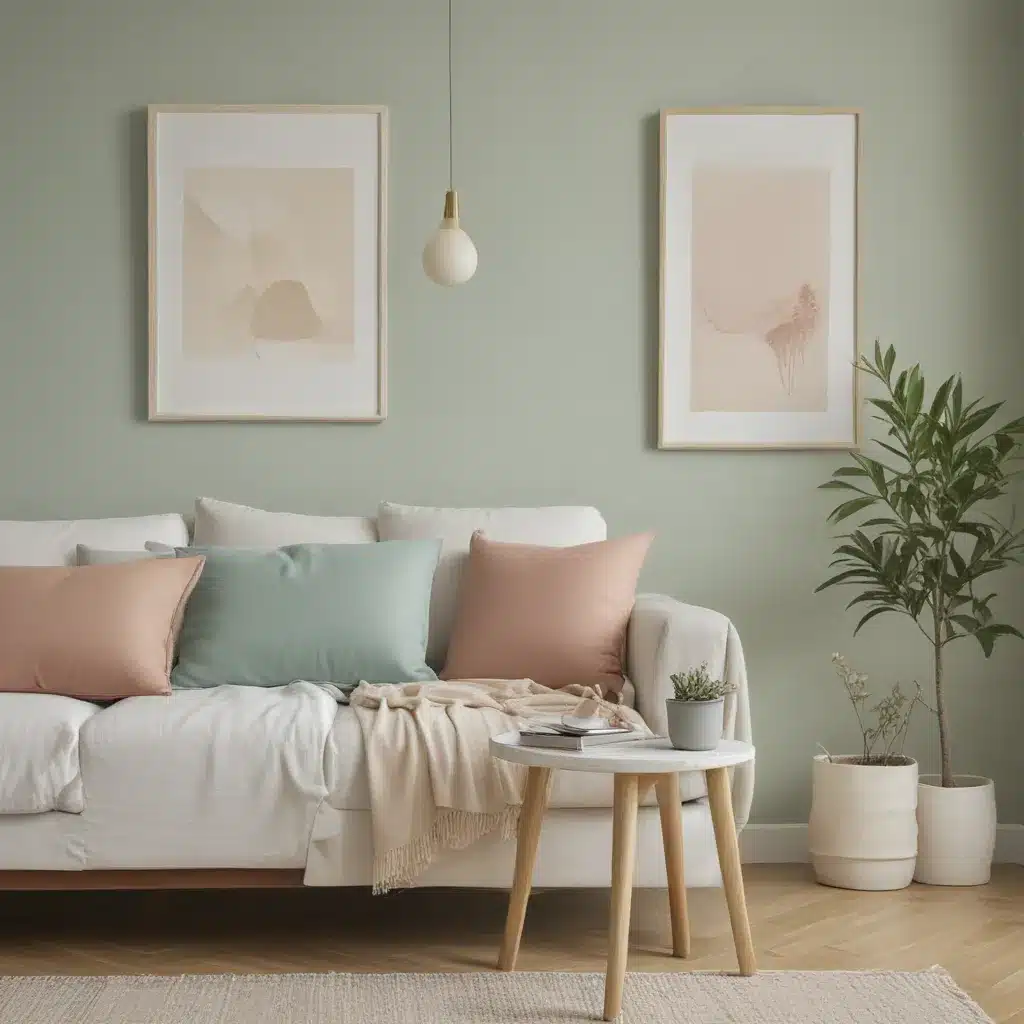
But the real showstopper, in my opinion, is how “Upward” (SW 6239) plays so beautifully with the soothing greens of “Honeydew” (SW 6428) and “Palm Leaf” (SW 7735). The combination of these hues creates a truly serene and nature-inspired palette that I can just picture in my mind’s eye – a cozy living room with plush velvet sofas in “Honeydew,” accented by lush, leafy plants and perhaps a statement piece in “Palm Leaf.” Ah, the mere thought of it has me ready to grab a paint roller and get to work!
Benjamin Moore’s Frosty Fantasy
While Sherwin Williams has certainly captured my attention with their 2024 Color of the Year, I can’t help but be equally smitten with Benjamin Moore’s selection – the stunning “Blue Nova.” This chic, soothing shade has a way of evoking the serene atmosphere of a crisp, frosty morning, and I’m utterly captivated by its ability to bring a sense of tranquility to any space.
As I delved deeper into Benjamin Moore’s 2024 Color Trend Palette, I was blown away by the harmonious blend of hues that complement “Blue Nova” so beautifully. From the classic and crisp “White Dove” (OC-17) to the dreamy and pure “Pristine” (OC-75), and the warm and sumptuous “Topaz” (O70), each of these shades perfectly complements the cool, calming tones of “Blue Nova.”
But the real standout for me has to be the vibrant and unexpected “Honeybee” (CSP-950). This hue adds a delightful pop of color that creates a delightful contrast against the overall cool palette. I can just picture it now – a serene living room with walls bathed in the tranquil “Blue Nova,” accented by plush furnishings in “White Dove” and “Pristine,” and punctuated by the occasional burst of energy from “Honeybee.” It’s a harmonious balance that I can’t wait to bring to life in my own home.
Painting the Town (or Living Room) Blue
As I continue to envision my living room transformation, I can’t help but be filled with a sense of excitement and anticipation. The prospect of incorporating these soothing, winter-inspired hues into my space has me practically giddy with the possibilities.
I mean, just think about it – a wall painted in the calming “Blue Nova,” paired with furniture and accessories in the classic “White Dove” or the dreamy “Pristine.” The result would be a space that exudes a sense of serenity and sophistication, perfect for curling up with a good book or hosting cozy gatherings with friends.
And let’s not forget the opportunity to add a touch of warmth and personality with the rich “Topaz” or the whimsical “Teacup Rose” (2170-50). These accents would add depth and character to the overall design, creating a space that feels both inviting and visually stunning.
But the real showstopper, in my opinion, would be the inclusion of that vibrant “Honeybee.” Imagine how that bold, unexpected pop of color would dance across the walls, adding an element of energy and vibrancy to the otherwise serene palette. It’s a touch of playfulness that would truly make the space come alive, and I can’t wait to see how it all comes together.
Tapping into Trico’s Expertise
Of course, as with any home improvement project, the key to achieving the perfect balance of colors and creating a truly harmonious space lies in the expertise of the professionals. That’s why I’m thrilled to have discovered Sofa Spectacular, a custom sofa company in the UK that not only offers a wide range of stunning furniture options but also provides invaluable guidance on interior design and color selection.
As I’ve been exploring the idea of transforming my living room, I’ve been in constant contact with the team at Sofa Spectacular, tapping into their wealth of knowledge and experience. They’ve been instrumental in helping me navigate the world of paint colors, offering insightful advice on how to create a cohesive and visually appealing palette that perfectly complements the furniture and overall aesthetic I’m aiming for.
One of the things I love most about working with Sofa Spectacular is their commitment to truly understanding my vision and helping me bring it to life. They’ve taken the time to listen to my preferences, my design inspirations, and the overall vibe I’m hoping to achieve in the space. And with their expertise in color theory and interior design, they’ve been able to curate a selection of paint colors that I’m confident will transform my living room into the serene, winter-inspired oasis I’ve been dreaming of.
Embracing the Power of Paint
As I continue to make progress on my living room transformation, I can’t help but feel a sense of excitement and anticipation. The idea of watching my space evolve from a relatively blank canvas into a cozy, tranquil haven is, quite frankly, thrilling.
And the best part? I know that with the help of Sofa Spectacular and the expert guidance of the Sherwin Williams and Benjamin Moore color palettes, I’m going to end up with a space that not only looks absolutely stunning but also feels like a true reflection of my personal style and preferences.
After all, paint is such a powerful tool when it comes to interior design. It has the ability to completely change the mood and atmosphere of a room, and when used strategically, it can elevate the overall aesthetic in ways that you might not have even imagined possible.
So, as I sit here, sipping my hot cocoa and dreaming of my winter wonderland-inspired living room, I can’t help but feel a sense of excitement and anticipation. I know that with the right colors and the right guidance, I’m going to create a space that not only looks beautiful but also serves as a cozy, tranquil sanctuary – the perfect retreat from the chilly winds and the bustling of the outside world.
Conclusion
In the end, the beauty of these cool, calming paint palettes lies in their ability to transform a space into a serene and harmonious haven. Whether you’re drawn to the soft, natural tones of Sherwin Williams’ “Upward” or the crisp, frosty elegance of Benjamin Moore’s “Blue Nova,” there’s no denying the power of these hues to create a sense of tranquility and calm.
And with the expert guidance of a company like Sofa Spectacular, you can rest assured that your living room transformation will be nothing short of a resounding success. So why not embrace the art of tranquility and let these harmonious hues work their magic on your space? I, for one, can’t wait to see the final result!
