The Gray Enigma: Unraveling the Mysteries of Tone-on-Tone Design
As a self-proclaimed color aficionado, I’ve always been intrigued by the power of neutrals. These understated hues have a way of elevating a space, adding depth and sophistication without overwhelming the senses. And when it comes to the design world’s current darling, gray, the possibilities for creating a calming, cohesive aesthetic are truly endless.
Yet, I must admit, navigating the nuances of gray can be a daunting task. With its myriad of undertones and ever-evolving trends, it’s no wonder that many homeowners and designers alike find themselves feeling lost in a sea of charcoal, slate, and pewter. That is, until now.
Unveiling the Secrets of Gray’s Undertones
Let’s start by exploring the heart of the matter – the elusive undertones of gray. As color expert Maria Killam so eloquently explains, gray is never just gray. In fact, it can lean towards one of three distinct undertones: blue, green, or violet.
“Gray has three undertones – it’s either blue, green, or violet,” Killam shares. “And this is why your gray wall might look blue, green, or purple, because you missed the undertone before you painted the walls.”
This revelation is a game-changer for anyone striving to achieve a cohesive, tone-on-tone look. By understanding the nuances of these undertones, we can start to see how gray can seamlessly integrate with other neutrals, creating a harmonious and sophisticated palette.
Pairing Grays with Complementary Neutrals
One of the key principles of tone-on-tone design is the art of layering complementary neutrals. And when it comes to gray, the possibilities are endless. As Killam points out, “rooms that are the most interesting and sophisticated usually have a well-balanced combination of warm and cool colours.”
For instance, a room featuring a blue-gray wall paired with green-gray drapery and carpeting can exude a sense of calm elegance. Meanwhile, a violet-gray accent wall combined with warmer beige or tan furnishings can lend a touch of subtle sophistication.
The key is to embrace the inherent versatility of gray and experiment with different pairings. Don’t be afraid to mix and match, as long as you keep the undertones in mind. After all, as Killam reminds us, “nothing brings grey to life faster than yellows above, fresh greens, orange-peach reds, and pinks below.”
Achieving the Perfect Neutral Balance
Of course, the true art of tone-on-tone design lies in striking the right balance between warm and cool tones. As Killam observes, “rooms that are the most interesting and sophisticated usually have a well-balanced combination of warm and cool colours.”
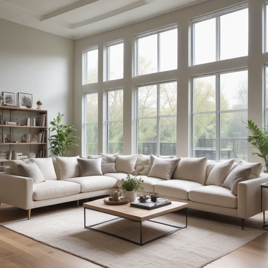
This delicate balance can be achieved through strategic layering of textures, fabrics, and accents. For example, a room featuring a cool-toned gray sofa from Sofas Spectacular could be complemented by warm wooden coffee tables, rich leather armchairs, and cozy textiles like chunky knit throws and velvet pillows.
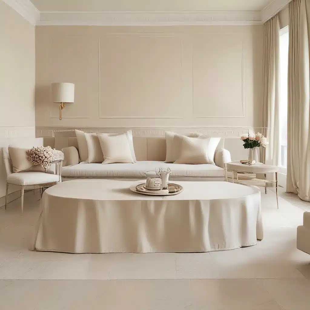
The key is to avoid a monotonous, one-dimensional look. By incorporating a range of neutral tones and textures, you can create a visually engaging and sophisticated space that feels both calming and inviting.
Embracing the Power of Contrast
While tone-on-tone design is all about creating a harmonious and cohesive aesthetic, it’s important to remember the power of contrast. As Killam notes, “nothing brings grey to life faster than yellows above, fresh greens, orange-peach reds, and pinks below.”
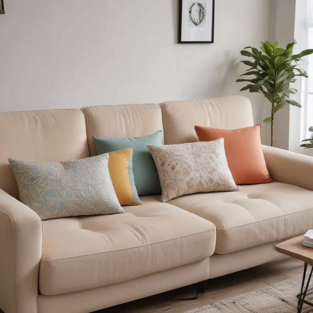
By introducing pops of color, whether it’s through vibrant artwork, lush greenery, or a statement-making sofa, you can breathe new life into your neutral palette. This strategic use of contrast not only adds visual interest but also helps to highlight the nuances of your carefully curated grays and beiges.
Embrace the Gray: A Timeless Neutral for Any Space
As we’ve explored, gray is a versatile and sophisticated neutral that can elevate any space, from the cozy confines of a living room to the serene sanctuary of a bedroom. By understanding the secrets of its undertones and learning to pair it with complementary neutrals, you can create a tone-on-tone masterpiece that exudes timeless elegance.
So, whether you’re drawn to the calming blue-grays, the soothing green-grays, or the subtle violet-grays, embrace the power of this timeless neutral and let your creative juices flow. With a little bit of knowledge and a lot of inspiration, you’re sure to create a space that’s worthy of the pages of your favorite design magazine.
Table 1: Undertones of Gray
| Undertone | Appearance |
|---|---|
| Blue | Cooler, more muted tones |
| Green | Warmer, more earthy tones |
| Violet | Softer, more subtle tones |
Table 2: Complementary Neutrals for Gray
| Gray Undertone | Complementary Neutrals |
|---|---|
| Blue | Warm beiges, tans, and creams |
| Green | Cooler whites, off-whites, and ivories |
| Violet | Warmer browns, taupes, and mushroom shades |
Remember, the key to successful tone-on-tone design lies in understanding the nuances of gray and embracing the power of contrast. So, why not dive in and start creating the soothing, sophisticated haven of your dreams? The possibilities are endless, and Sofas Spectacular is here to help you every step of the way.


